Remember, the philosophy of this book is that diving in and getting your hands dirty (metaphorically at least) is good for learning! So before we dive into too many details about plotting, let’s consider the case of a real engineering application, the tension test. Don’t worry, we won’t dive into too many of the details as you will learn all this in a later class, just the basics so we do not have to work on a contrived example.
Figure12.1.1.A typical tensile specimen with labels. The black dots indicate what is called the gauge length (\(L_0\)) and the red lines indicate the direction of the applied force (\(F\)).
When the tensile specimen is pulled, the material will deform and the initial \(L_0\) will increase to a new length \(L\text{.}\) We call this engineering strain and it is defined as:
Note that the units for engineering strain are \(\frac{Length}{Length}\) which means it is a unit-less quantity! It is just a ratio of the change in the length to the original length of the specimen.
You can probably intuit that as the force keeps increasing, the specimen keeps getting pulled further and further apart, and eventually, it will break. But before it breaks if you let go of the force, the material will return to its original shape and size. A property of the material (before it breaks) called elastic modulus can be determined by the ratio of the stress and strain:
Look at the equation to determine a material’s elastic modulus. What does each variable separately tell us about the tool? Why does this equation make sense? What is a practical application of this information?
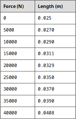
Let’s consider a specimen made of high-density polyethylene (HDPE). The specimen has a round cross-section with a radius of \(5 \;mm\) (this implies that the cross-sectional area is \(7.854*10^{-5}\;meters^2\text{,}\) make sure you can calculate this on your own! It is good units practice). Consider the following Force \(N\) and gauge length \(L\) data from a tensile test experiment shown below in figure 12.1.4.
Enter the values of Force in as a vector force, and enter the values for the length in as a vector variable len (Don’t use the variable name ‘length’ because that will overwrite the built-in function that we learned about the last chapter.) in a new script. Now that we have these in, we need to create vectors called e_stress and e_strain that correspond to the engineering stress and engineering strain respectively. Can you do this on your own? Try before reading on below! Don’t skip your brain workout!
Here is an interactive code box that functions similarly to the MATLAB command window. Note that this web version does NOT support graphics so you’ll need to copy this code into your MATLAB window!
10.3: What your script should look like, or should at least be VERY similar. I took a shortcut on line 7 and typed in the lengths in mm then converted them to meters at the end by dividing by 1000. Sneaky!
Now to the plotting! Since we have arrays e_strain and e_stress already defined in the MATLAB workspace, we simply need to tell MATLAB to plot them! Engineers typically look at stress vs strain plots with strain on the x-axis and stress on the y-axis. To accomplish this in MATLAB, add the following line to your script:
When you hit the run button, you should see the following figure pop up (see figure 12.1.7 above). Congratulations! You just plotted in MATLAB! Plotting in MATLAB is really that easy. The line isn’t perfectly straight because experimental data is never perfect. But here we can observe that there is a linear relationship between how much strain the specimen is under and how much it deforms! Just for fun, the slope of this line would be the elastic modulus for HDPE.
Now we just need to learn some of the details. For example, the plot in Figure 12.1.17 looks nice but it is missing labels, titles, and legends which we learned in Chapter 6 are important to have. For the next section, I will assume that you have vectors e_stress and e_strain loaded into your workspace so that you can follow along.
As you have just seen, MATLAB has a built-in plot() function that can accept single or multiple vector inputs. In our example the inputs were e_stress and e_strain but keep in mind they can be any variable that is a vector to generate plots.
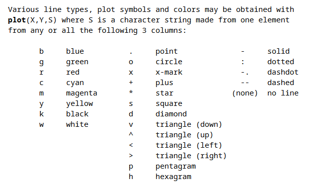
There are lots of advanced plotting functionalities, to see a comprehensive list of available options, type help plot at the command line and read the help text for the plot() function. Go ahead and take a second to skim through the help text. Don’t skip this step, it will help set up our discussion for the rest of this chapter. The most important section of the help text is displayed below in Figure 12.1.9. In this chapter, the three main options of the plot() function that we will concentrate on will be:
The default blue color is nice, but MATLAB includes easy-to-use commands to change the colors of your graphs. For example, let’s say we wanted the same plot that we just completed but we want the line to be green. You should have noticed from the help text that there is an optional third input to the plot() function that allows us to change the plot colors.
To change the color of your plot to green, simply add the third input to the plot() function as a character string (A character string is surrounded by single quotes. So for the color green, the third input to the function needs to be 'g'. So you need to change the line in your script from:
Take a moment to play around with some of the different color options to see what they look like. Note (see the help text or Figure 12.1.9 above) that some of the color codes are a little weird. For example, to make the line black, you need to use the character string 'k' because 'b' is reserved for blue.
Here is an interactive code box that functions similarly to the MATLAB command window. Note that this web version does NOT support graphics so you’ll need to copy this code into your MATLAB window!
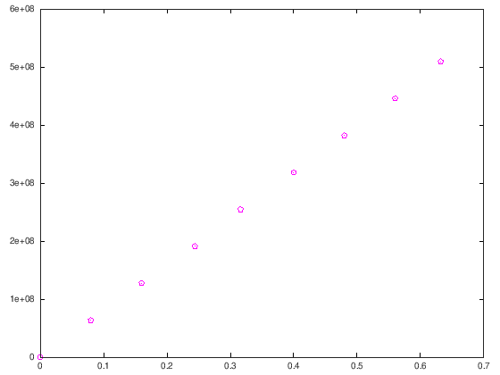
When you are displaying experimental data (as we are in this example), scientists and engineers usually prefer to represent each point of data with a symbol. This visual cue tells the reader of the plot that there is no continuity between the points, instead, each point represents a distinct measurement.
So let’s change our plot so that MATLAB displays each point as a magenta pentagram. Looking at the help text in Figure 12.1.9 above we can see that the character string, 'm' corresponds to the color magenta and that the character string 'p' corresponds to the pentagram symbol.
Don’t forget to take a moment and play around with some of the other symbol options! Notice that there are a bunch of different triangle options (triangle down, triangle up, etc). Play around with those symbols and see if you can see the difference!
Another thing to notice is that the order of the character strings does not matter. That means that plot(e_strain,e_stress,'mp') works the same as plot(e_strain,e_stress,'pm')!
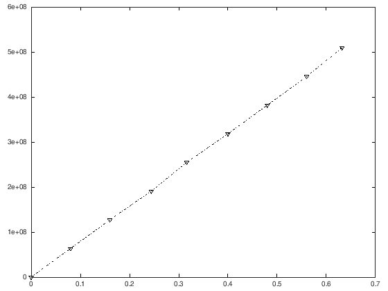
The last thing that we need to learn is how to change the plot line. Again, direct your attention to the help text for the plot function (and figure 12.1.9 above). Notice that we can add a character string to create solid, dotted, and other types of lines.
We can do so in the exact same way, by adding a character to the character string. So for this example, let’s say we wanted black (remember, that is character string 'k'), left triangle marks connected with a dash-dot line. Just like before we would change the last line of our script:
And that is all there is to it! Remember, the order of the character strings does not matter. You should also remember that you do not have to memorize these character string codes! Just remember that you can look them up at any time from the command window by typing in
Hopefully, you have been following along. This is what my script looks like up to this point. Notice that I commented out the plot commands I wasn’t using (lines 22–24) because they will overwrite each other and it is nice to keep a record of what you did for studying later. You should also notice how my comments make my script easy to read!
Here is an interactive code box that functions similarly to the MATLAB command window. Note that this web version does NOT support graphics so you’ll need to copy this code into your MATLAB window!