To learn how to create graphs in Excel, let’s continue the spring experiment example. The last thing to note before we get started is that there are 102098489127459745 different ways to do the exact same thing in Excel. I am going to show you a long way, but a way that will always work the way that you expect it to. When you start to get more experienced and play around with Excel, you will find other ways to create charts and graphs. Feel free to use those ways but you can always fall back on this technique if you need to!
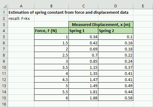
To get started, recreate the spreadsheet shown below in Figure 6.4.1. It would be helpful for you if your rendition is exactly the same as mine (that means that the numbers look the same and they are in the same cells). That is OK because it is good practice to remind yourself how to use the formatting tools. Remember, we are here to work out our brains!
In this case, we want to create two plots on the same axes showing the different springs. Since we are plotting the raw data, we will want to use a scatter plot to visualize the data and identify any trends. The process for creating the graph is a little bit complicated so I suggest that you follow along closely:
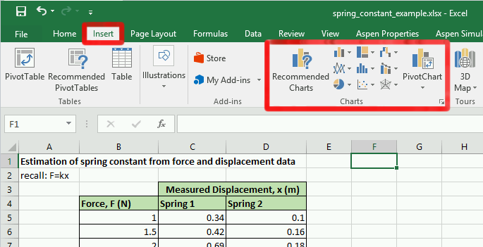
You will see a lot of different trash chart options. Click the “Scatter Plot” chart type button. If you have a hard time figuring out which button is which, hover your cursor over the buttons and a small tooltip of text will pop up and let you know which chart option that button relates to.
When you click the “Scatter Plot” button you will get a drop-down list with a bunch of options. Pick the option in the upper left-hand corner, the “Scatter Plot”. At this point, Excel should have automatically generated a chart and inserted it randomly into your spreadsheet. You can click on the chart and move it around if it is covering up your data.
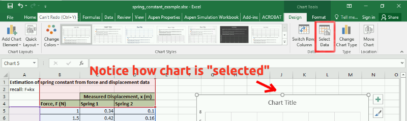
Now that you have your blank chart, we need to tell Excel where to look for the data. To do that, make sure that the chart is selected by clicking on it. Notice that the navigation banner has a new option category called “Chart Tools”. Underneath the “Chart Tools” designation is a “Design” tab. Click on the “Select Data” button in the design tab.
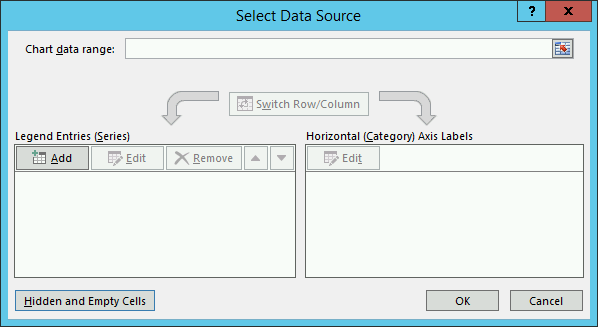
A “Select Data Source” wizard box should pop up that looks similar to Figure 6.4.4 below. Notice that Excel has attempted to guess what you want to plot. Go ahead and remove any of the items under the legend entries area of the wizard by selecting them and hitting the remove button. We want to add the data manually.
Now that you have removed any auto-added entries, your “Select Data Source” wizard box should look exactly like Figure 6.4.4 below. Click on the “Add” button under the “Legend Entries (Series)” section of the box.
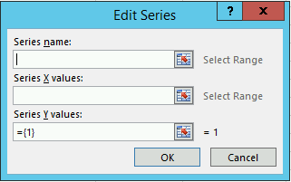
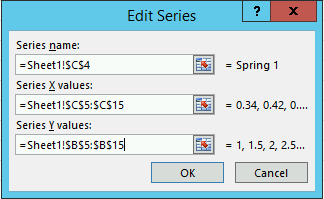
At this point a new box pops up titled “Edit Series” (Figure 6.4.5 to the right). We are finally at the point where Excel wants us to tell it where our data lives. FINALLY. The way the “Edit Series” box works is that you click the text box inside the “Edit Series” box for the area that you want. Let’s start with the “Series Name”. So click inside the blank text box under the series name. Next, click on the Excel cell that contains the text you want the data series to be named after. Since we already have a nice label for Spring 1 in box C4 (see Figure 6.4.3 above), we can now just click on the cell C4 in the spreadsheet. The correct Excel equation should automatically populate in the text area.
We still need to add the X and Y values for our scatter plot. The process is very similar except this time we are going to be selecting a range of cells. We will plot the displacement values, \(x\text{,}\) on the x-axis and the force values, \(F\text{,}\) on the y-axis. To do so, click inside the text box under the “Series X values:” label. Next click on cell C5, without lifting your finger off the mouse, drag all the way down to C15. Repeat the process for the y-values but make sure you erase the ={1} that Excel automatically applies before clicking and dragging. When you are complete, your “Edit Series” box should look identical to Figure 6.4.6 above. Click the “Ok” button to return to the “Select Data Source” window.
Important Note: When you are selecting x and y data this way, Excel does not function the way you are used to word processors functioning. If things get messed up, do not despair! Instead, select everything inside of a text box, delete it, and try again.
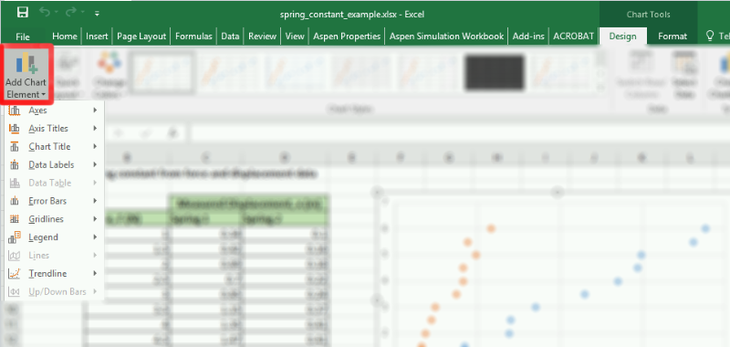
You will notice that leaves us with a nice chart but it is still lacking components that are necessary according to the graphing guidelines that we established above. Luckily, the rest of the required components are available to add from one menu button, the “Add Chart Element” button (see Figure 6.4.8 below).
Figure6.4.8.Add chart element button. Notice that it is under the “Design” tab under the “Chart Tools” section of the main navigation bar. Remember, this menu only shows up if the chart is selected!
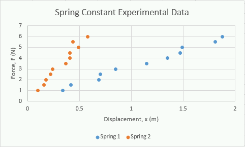
To finish our chart, we are going to use the “Axis Titles”, “Chart Title”, and “Legend”. We will investigate the “Trendline” in the next section of this chapter. For now, go ahead and add the titles and legend. You can just select the appropriate item from the menu, then edit the field by double clicking on it. When you are finished your chart should like identical to the one below (Figure 6.4.9). Good work!
Just because this chapter does not explicitly cover the other options (namely; “Axes”, “Data Labels”, and “Error Bars”) does not mean that you shouldn’t know how they work. There are cases where these options can be useful. Go ahead and save a copy (go to “File” then “Save as”) of your spreadsheet to this point and play around with those options to see what they do and how they work!
We are going to jump into how to make a column chart next but we will be returning to the spring example in the next chapter. Don’t forget to save your Excel file somewhere where you will remember so we can refer back to it!