Sometimes people create misleading graphs as a way to deliberately mislead the people trying to interpret the graph. Other times, it is because the people making the graphs do not understand how to make graphs correctly. In any case, the three major ways that people mislead through graphs are:
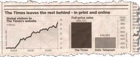
Notice how at an initial glance the bar chart looks like The Times has almost 2x the number of subscribers as the Daily Telegraph! But wait, when you look at the numbers it looks like they only have 38,766 more subscribers or an 8.7% increase over the Daily Telegraph. Sneaky sneaky. This is a classic graph manipulation technique, changing the vertical scale so that it doesn’t start at zero.
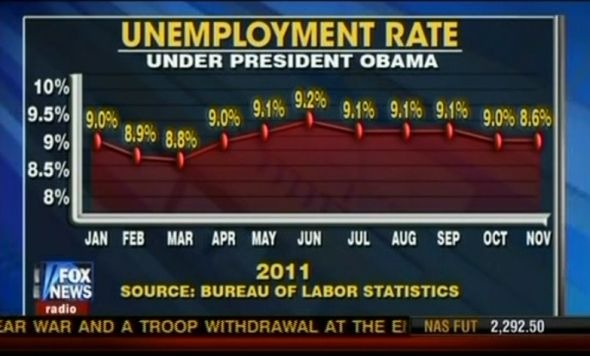
As another example, look at the Fox News graph below (during my search for misleading graphs there are SO many Fox News examples. Seems like they really enjoy a good misleading chart…).
In this example, Fox News is using a few misleading tactics. One, the last data point (8.6%) is plotted at the same level as the previous data point (9.0%) and therefor misrepresented to hide the fact that the unemployment rate actually decreased a little bit. Furthermore, the data also appears as if the unemployment rate has gone up dramatically since March but in reality, it has held pretty stably at 9% throughout the whole graph.
For this ethics discussion post, I would like you to consider misleading graphs. Do you think they are a big problem or do you think it is up to people to be smarter and more critical about reading graphs? If a future boss of yours asked you to “change the axes” to make the data look better for a presentation, would you? Is there a specific instance or case where you would draw the line and refuse?