Skip to main content
Contents
Search Book
Search Results:
No results.
Read aloud Readability settings Prev Up Next Scratch ActiveCode Profile title here \(\newcommand{\N}{\mathbb N} \newcommand{\Z}{\mathbb Z} \newcommand{\Q}{\mathbb Q} \newcommand{\R}{\mathbb R}
\newcommand{\lt}{<}
\newcommand{\gt}{>}
\newcommand{\amp}{&}
\definecolor{fillinmathshade}{gray}{0.9}
\newcommand{\fillinmath}[1]{\mathchoice{\colorbox{fillinmathshade}{$\displaystyle \phantom{\,#1\,}$}}{\colorbox{fillinmathshade}{$\textstyle \phantom{\,#1\,}$}}{\colorbox{fillinmathshade}{$\scriptstyle \phantom{\,#1\,}$}}{\colorbox{fillinmathshade}{$\scriptscriptstyle\phantom{\,#1\,}$}}}
\)
Section 6.2 Graphing Guidelines
Label axes clearly and make sure you include the name, symbol, and units.
Provide grid lines so that readers can make estimations of the data points.
If there is more than one line or data set on the graph, you must include a legend.
Measurements of data points should be represented as points on a graph. Never connect the dots.
Lines are reserved for theoretical values.
Use a different symbol color and shape for each different data set.
Ensure that the font, size, and color of the text are easy to read.
The nice thing about learning and remembering these graphing guidelines before we start learning how to graph is it will inform us on what is important to learn. We will also learn about what the mathematical model (the trendline and equation) on the graphs means, how to select an appropriate one, and how to interpret
\(R^2\) values.
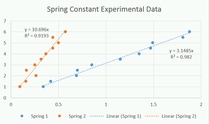
Figure 6.2.1. Please use this graph to answer the checkpoint below
Checkpoint 6.2.2 A Similar Experiment.
According to the graphing guidelines, what is missing from this graph?
Legend
Incorrect. The graph already includes a legend.
Axes labels
Correct. The graph is missing axis labels.
Different color for data sets
Incorrect. The graph already uses different colors to distinguish the data sets.
Title
Incorrect. The graph already includes a title.