Now, let’s return to the Excel worksheet we were working on in the previous chapter. When we left off, we had a chart with two series plotted on it (we called them Spring 1 and Spring 2).
We know that these are springs and that they should obey Hooke’s Law so we can use Excel to add a linear trendline which will effectively mathematically model these equations.
The process for adding a trendline is identical regardless of the mathematical model being used. Let’s see how to add a trendline to our spring data and start with the spring 1 data. The process is also very similar to adding a legend or other chart element so this should be easy for you.
Incorrect. A power trendline is used for models of the form \(y=ax^b\text{.}\) Hooke’s Law is directly proportional to displacement.
Linear
Correct. Hooke’s Law, \(F=kx\text{,}\) is a linear relationship between force and displacement. The slope of the line is the spring constant \(k\text{.}\)
Exponential
Incorrect. Exponential trendlines are used for relationships where the rate of change increases or decreases exponentially. Hooke’s Law is linear.
Click on one of the data points for the spring 1 dataset. You can click on any of them within the graph and you should notice that they are all selected. You can tell they are selected because Excel will put little circles around all the data points in the series (Figure 8.2.3)
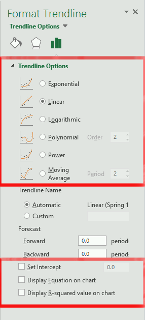
In the sub-menu that presents itself, you can choose the type of trendline you want, in this case, it is the “Linear” type. Select the “Linear” option and the trendline should automatically be added to the plot!
We have the trendline, but we are still missing the mathematical model that represents the line. To get the model, you need to double-click on the actual trendline itself. That will bring up the “Format Trendline” options (a menu should pop up similar to the one to the left in figure 8.2.5). It is here that you can change the trendline type if you need to.
THINK AGAIN. We know this mathematical model should be linear so we don’t need to change that. But should we set the intercept? Does that make sense in this case? Recall: \(F=kx\) and \(y=mx+b\text{.}\) See what I am getting at here? Notice how in Hooke’s Law we are assuming that before the spring has mass added to it, we are expecting it to stretch 0 meters. Does that sound like an intercept?
Yes! Check the “Set Intercept” box and make sure that the value is \(0\text{.}\) The b = 0 in Hooke’s Law so we should set the intercept = 0. Any deviation from that in our mathematical model will be from measurement errors, it would not be representing actual physical phenomena!
Now you can see the mathematical equation displayed on the graph! Notice that the equation is \(y=3.1485x\text{.}\) The equation is giving us \(k\text{,}\) the spring constant! In this case, we can say that the spring constant is: \(k \approx 3.1\)
Hint: make sure that you set the y-intercept = 0 so that you get the same answer I did! Also, round to 1 decimal place. It doesn’t make sense to include those non-significant figures. There is no way our measurements had that much precision.
What is the relationship between variables that follow a linear mathematical model? You can write your own scenario or use examples you have learned in other classes.