Before we dive into how to make graphs in Excel, it is useful to first understand what makes a good graph. For this example, let’s consider Hooke’s Law. You might recall from your physics class that Hooke’s Law is a law of physics that describes that the force \(F\) required to displace (stretch or compress) a spring by some distance \(x\) is linearly proportional to the distance \(x\text{.}\) That sentence translates to a mathematical equation:
Where \(F\) is the force, \(x\) is the distance, and \(k\) is what is called the “spring constant” which is characteristic of the spring and can vary depending on the spring. For example, a spring that has a very low spring constant would deform a lot when a little force is applied.
Let’s imagine that you are working as a professional engineer and are reverse engineering a competitor’s product (yes, this is a real thing that actually happens in professional environments). You find a spring on the product and need to determine its spring constant. You devise an experiment that consists of loading the spring with several different masses such that when it is oriented vertically, it applies a stretching force. Then you measure all of the distances, \(x\text{,}\) that arise from the different forces. Aren’t you so clever?!
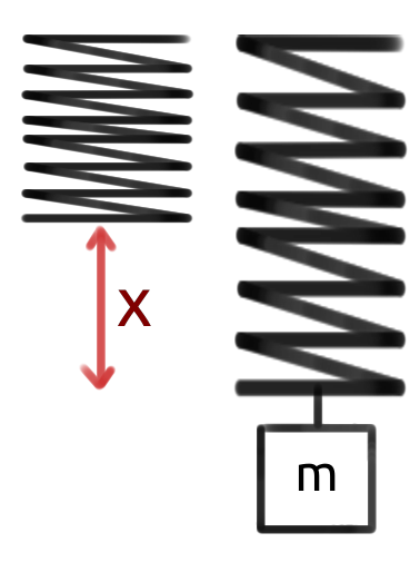
Figure6.1.2.In this figure, the spring is the black squiggly line. At first, the spring is unstretched. When a mass, \(m\text{,}\) is added (creates a force \(F\) that is not shown) to the spring, it stretches \(x\) meters.
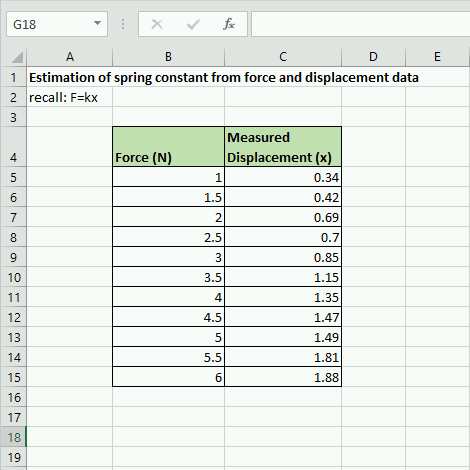
Next, you realize that Excel would be excellent for this type of data! Good thing you were paying attention in your introductory engineering courses! You enter your data into Excel as shown in figure 6.1.3 below.
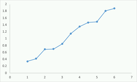
Finally, you realize that you can plot this data and that it should look relatively linear based on the form of the Hooke’s Law equation. When you were reading Chapter 6 in your Hands-On Engineering textbook your freshman year (meta, I know), you skimmed that particular chapter because you were so confident in your Excel graphing skills. So this is the plot you come up with.
You look at the plot, realize that it looks fairly linear (which is what you expect from the relationship \(F=kx\)) and you submit this to your boss explaining that you solved the mystery of the spring constant! Your email explains that it isn’t perfectly linear because of measurement errors but that you can derive the spring constant from this graph.
Is your boss happy with your work? Or is your boss upset at your graph? I’ll go ahead and tell you she would be upset. Why? She would not be upset about the non-perfect measurements. She understands that your plot will not be perfectly linear. She would be upset because this plot, while technically incorrect, is too difficult to read. There are no grid lines so it is impossible to get a good feel for the data. There are no axes labels so it is not possible to know what is being plotted. The data points are connected which makes no sense. There is no title…the problems with this graph could take up the rest of the chapter.
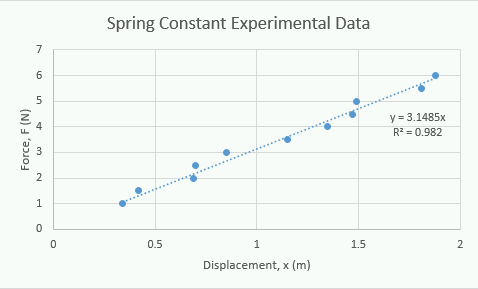
The plot in Figure 6.1.5 above is clearly better. We don’t even have to dive into physics or math, it is much easier to understand on its own. It displays more information, is easier to read, and is much easier to understand what the data is saying. Before we learn how to graph it is important to keep the following guidelines in mind.