Section28.7Technology Exploration: The Regression Effect
ExercisesThe Study
In the 2018 Masters golf tournament, Jordan Spieth had a score of 66 in the first round but a score of 74 in the second round. Keep in mind that in golf, lower scores are better than higher scores. Is this evidence that he choked? The data file Masters18.txt contains golfers’ scores in the first two rounds of the 2018 Masters.
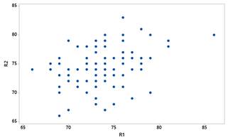
Use technology to construct a scatterplot of second round score vs. first round score (see the Technology Detour — Scatterplots in Investigation 5.6). Also calculate the correlation coefficient between these two variables. Does it reveal an association between scores in these two rounds? If so, is it positive or negative? Would you call it weak, moderate, or strong?
Scatterplot of second round score (R2) versus first round score (R1) for the 2018 Masters golfers, showing a scattered cloud of points with a weak to moderate positive association.
You can change from ascending to descending order if you like, and you can check the Replace Table box if you wish to overwrite the original table (not recommended).
List the ten golfers who scored lowest in the first round, along with their scores in both rounds. Then list the ten golfers who scored highest in the first round, along with their scores in both rounds.
How many of the “top ten” from the first round improved (scored lower) in the second round than the first? How many of the “bottom ten” from the first round improved?
Determine the median second round score for the two groups (the “top ten” from round one and the “bottom ten” from round one). Which group tended to score better (lower) in the second round?
The median (sorting first) round 2 score for the top ten is 74 and for the bottom ten it’s 77. The top ten golfers tended to score better than the bottom ten golfers in the second round.
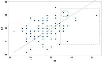
Click the red Bivariate Fit arrow and select Fit Special; Check the box for Constrain Intercept to: and put 0 in the box; Check the box for Constrain Slope to: and put 1 in the box; Click OK.
Identify any golfers by name who improved in the second round after scoring in the top ten of the first round. Identify any golfers by name who did worse in the second round after scoring in the bottom ten of the first round.
Scatterplot of R2 versus R1 with the y equals x line added; the top-ten golfers are boxed at the lower left with one point below the line, and two bottom-ten points are marked above the line at the right.
One golfer from the original top ten (on the left) is below the line (Patrick Reed, the eventual champion) and two from the original bottom ten are above the line (Mark O’Meara and Lin Yuxin). [Two golfers in the original top ten had identical scores in the two ground.]
Do you think the “\(y = x\)” line does a good job of summarizing the relationship? How do you think the regression line will compare? Will the slope be greater or smaller?
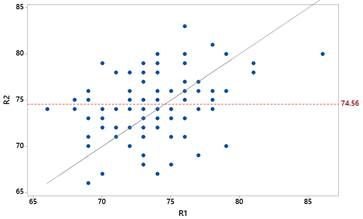
Do you think this line does a good job of summarizing the relationship? How do you think the regression line will compare? Will the slope be greater or smaller?
This line does not summarize the relationship well either. It’s a little too high for lower round 1 scores and too low for higher round 1 scores. We expect the regression line to have a larger slope.
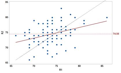
Scatterplot of R2 versus R1 with three lines: the steep y equals x line, the horizontal mean line at 74.56, and the red regression line falling between them.
Explain why your answer to Question 10 suggests that golfers with poor first round scores will tend to improve but golfers with good first round scores will tend to worsen.
We expect poor first round scores to be below the mean but not by as much. We expect good (low) first round scores to be followed by second round scores that are above the mean but not by as much (by a fraction).
This phenomenon is sometimes called the regression effect or regression to the mean. Sir Francis Galton first discussed this effect in the late 1880s when he examined data on the heights of parents and children, calling it regression to mediocrity.