Section28.2Investigation 5.11: Running Out of Time (cont.)
Exercises28.2.1The Data Cont.
In the previous investigation, we analyzed the statistical significance of our sample data by replicating how often we might get a random sample of 247 runners (after removing an extreme outlier) with a slope this extreme from a larger population of runners that did not have an association between finishing time and age. In other words, we assumed there was no association between finishing time and age and the pairing of these values for our runners was just arbitrary. This suggests another way of assessing the statistical significance of our results.
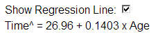
Press Use Data (twice). This applet can now handle the multiple columns and text fields within double quotes, but change the explanatory variable to Age and the response variable to Time.
Another way to investigate whether the association observed in these sample data could have arisen by chance is a randomization test that shuffles the outcomes for one of the variables and reexamines the correlation coefficient and/or sample slope for the shuffled or re-randomized data.
Do you ever find a negative association? Are any of the associations as strong as the one observed by the student group? What pattern is beginning to emerge in the blue regression lines on the scatterplot?
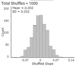
Change Number of Shuffles to some large number (like 1000 or the difference between how many you have done so far and 1000) and press the Shuffle Y-values button.
Describe the shape, center, and variability of the resulting distribution of re-randomized slopes. How does this distribution compare to the one you found in Investigation 5.10, Question 11?
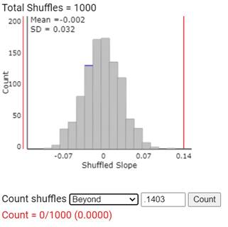
Use the applet to estimate the p-value by using the Count Samples box: choosing to count “beyond” (for the two-sided p-value) and specifying the observed sample slope.
Histogram of 1000 shuffled slopes with vertical lines at the observed slope in each tail; counting shuffles Beyond .1403 gives Count = 0/1000 (0.0000).
You should see many similarities between the statistic distributions from random sampling (Inv 5.10) and random shuffling. So let’s again consider applying the t-probability model to the standardized statistics.
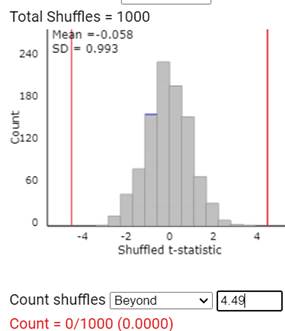
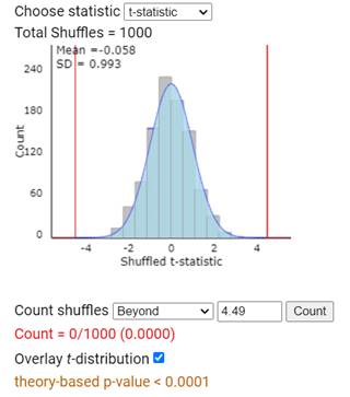
Use the applet to estimate the p-value corresponding to the observed t-statistic. How does it compare to the p-value you found in Investigation 5.10? (Note: The applet may complain due to rounding, estimation of the standard error.)
Histogram of 1000 shuffled t-statistics with an overlaid t-distribution curve; the simulated count beyond 4.49 is 0/1000 and the theory-based p-value is less than 0.0001.
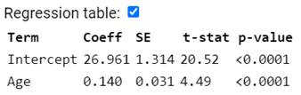
Applet regression table: Intercept coefficient 26.961 with SE 1.314, t-stat 20.52, p-value less than 0.0001; Age coefficient 0.140 with SE 0.031, t-stat 4.49, p-value less than 0.0001.
Note: the two simulation models agree because we are getting a similar standard deviation of the sample/shuffled slopes. If the association had been stronger, this would not necessarily be the case. Also keep in mind the distinction between strength of evidence (which is strong here because the sample size is rather larger) and strength of association. This regression model explains less than 8% of the variability in finishing times!
It is interesting to compare these two analysis approaches. In Investigation 5.10, we modeled repeated random sampling from a population but this required us to make certain assumptions about the data in the population (which we will spell out in more detail in the next Investigation). In Investigation 5.11, we didn’t make any assumptions about a larger population; instead we modeled what the sample data could look like if the observed response values had been randomly paired, over and over again, with the observed explanatory variable values. This approach is sometimes referred to as “conditioning on the observed data.” It is not surprising that the results are similar for both approaches, but some consider the second approach to be more “flexible” and “less restrictive” in the assumptions it makes. However, the first approach allows for more elegant mathematical derivations predicting how the sampling distribution of sample slopes will behave.
If we had had a stronger association in our sample (and \(s\) and \(s_y\) were less similar in value), you would have seen more differences between these two approaches. In particular, the random shuffling will have a larger standard deviation of the sample slopes than the random sampling. We saw with random sampling that the variability in the slopes is controlled by \(\sigma\text{,}\) not by SD(Y). However, with random shuffling, any \(x\)-value can be paired with any \(y\)-value, so the slopes are able to “swing around” a little more freely especially with smaller sample sizes. When you view the Regression Table, the SD(\(b_1\)) reported there will correspond to random sampling.