Section 28.4 Example 5.4: Comparing Popular Diets

Try these questions yourself before you use the solutions following to check your answers.
Dansinger, Griffith, Gleason et al. (2005) report on a randomized, comparative experiment in which 160 subjects were randomly assigned to one of four popular diet plans: Atkins, Ornish, Weight Watchers, and Zone (40 subjects per diet). These subjects were recruited through newspaper and television advertisements in the greater Boston area; all were overweight or obese with body mass index values between 27 and 42. Among the variables measured were
  • Which diet the subject was assigned to
  • Whether or not the subject completed the twelve-month study
  • The subject’s weight loss after two months, six months, and twelve months (in kilograms, with a negative value indicating weight gain)
  • The degree to which the subject adhered to the assigned diet, taken as the average of 12 monthly ratings, each on a 1-10 scale (with 1 indicating complete non-adherence and 10 indicating full adherence)
Data for the 93 subjects who completed the 12-month study are in the file ComparingDiets.txt.
Some of the questions that the researchers studied are given below. For each of these research questions, first identify the explanatory variable and the response variable, and classify each as categorical or quantitative. Then use graphical and numerical summaries to investigate the question, and summarize your findings. Next, identify the inference technique that can be used to address the question, and apply that technique. Be sure to include all aspects of the procedure, including a check of its technical conditions. Finally, summarize your conclusions for each question.

Checkpoint 28.4.1. Weight Loss by Diet Plan.

Do the average weight losses after 12 months differ significantly across the four diet plans?
Solution.
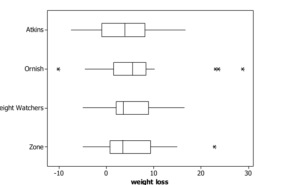
Effect of diet plan on average weight loss: The explanatory variable is diet plan, which is categorical. The response variable is amount of weight loss after 12 months, which is quantitative. Boxplots and numerical summaries follow:
described in detail following the image
Side-by-side boxplots of weight loss (kilograms) for the Atkins, Ornish, Weight Watchers, and Zone diets; the four distributions overlap substantially, with the Ornish diet showing one low and three high outliers.
diet         N  Mean  StDev  Median   IQR
Atkins      21  3.92   6.05    3.90  9.15  (all in kilograms)
Ornish      20  6.56   9.29    5.45  6.81  (all in kilograms)
Wgt Watch   26  4.59   5.39    3.60  6.85  (all in kilograms)
Zone        26  4.88   6.92    3.40  8.63  (all in kilograms)
These boxplots and statistics seem to indicate that the four diets do not differ substantially with regard to weight loss after 12 months. The mean and median weight loss are both positive for all four diets, indicating that subjects did tend to lose some weight on these diets, roughly 4-6 kilograms on average. The boxplots also show substantial overlap between the four distributions. The means and medians are very similar for three of the diets, with the Ornish diet having a somewhat larger mean and median weight loss (6.56 and 5.45 kilograms, respectively) than the others. All four distributions of weight loss appear to be fairly symmetric, perhaps a bit skewed to the right. The variability in weight losses is also similar across all four diet plans, with the Ornish diet having the most variability, largely due to its one small and three large outliers.
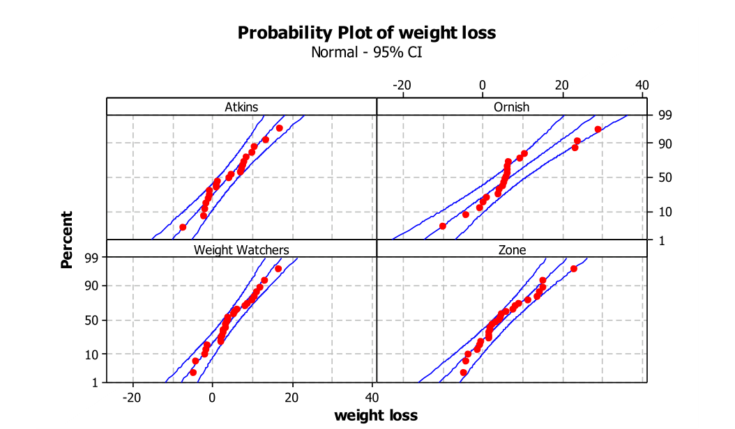
Because we have a categorical explanatory variable and a quantitative response variable, we will apply ANOVA to these data. The technical conditions appear to be met: The subjects were randomly assigned to diet plans, the distributions look fairly normal (see the following normal probability plots), and the standard deviations are similar (ratio of largest to smallest is 9.29/5.39, which is less than 2).
described in detail following the image
Panel of normal probability plots of weight loss for the Atkins, Ornish, Weight Watchers, and Zone groups; in each panel the points follow the line within the 95 percent confidence bands.
The hypotheses are:
\(H_0\text{:}\) \(\mu_A = \mu_O = \mu_W = \mu_Z\text{,}\) where \(\mu_i\) represents the underlying treatment mean weight loss after 12 months with diet \(i\text{.}\) This hypothesis says that the treatment mean is the same for all four diets.
\(H_a\text{:}\) that at least two of the treatment means differ; in other words, that at least one diet does have a different treatment mean than the others
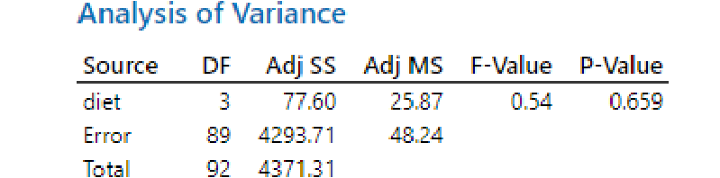
Minitab produces the following ANOVA table:
described in detail following the image
Analysis of Variance table: diet DF 3, Adj SS 77.60, Adj MS 25.87, F-Value 0.54, P-Value 0.659; Error DF 89, Adj SS 4293.71, Adj MS 48.24; Total DF 92, Adj SS 4371.31.
The small F-statistic (\(F = 0.54\)) and large p-value (0.659) reveals that the experimental data provide essentially no evidence against the null hypothesis. The p-value reveals that differences among the group means at least as big as those found in this experiment would occur about 66% of the time by randomization alone even if there were no true differences among the diets. In other words, the treatment means do not differ significantly, and there is no evidence that these four diets produce different average amounts of weight loss.
Checkpoint 28.4.2. Completion Rates by Diet Plan.

Is there a significant difference in the completion/dropout rates across the four diet plans?
Hint.
To determine the completion rate for each diet, count how many of the 93 subjects who completed the study are in each diet group and compare those counts to the 40 that were originally assigned to each diet.
Solution.
Effect of diet plan on completion rate: The explanatory variable is diet plan, which is categorical. The response variable is whether the subject completed the study or dropped out, which is also categorical.
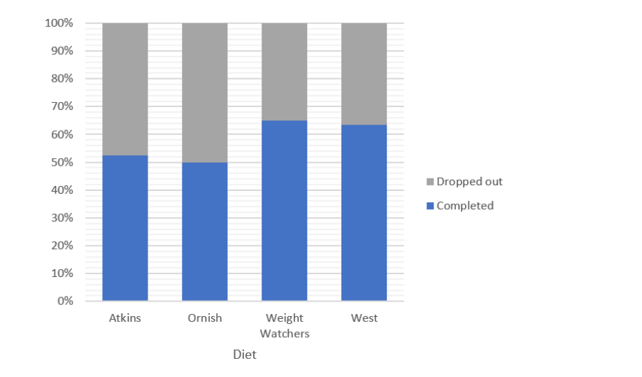
The two-way table of completion/dropout status by diet plan, followed by completion proportions and a segmented bar graph:
Atkins Ornish Weight Watchers Zone
Completed 21 20 26 26
Dropped out 19 20 14 14
Completion proportion .525 .500 .650 .650
described in detail following the image
Segmented bar graph of completed versus dropped out by diet; completion rates are near 52 percent for Atkins, 50 percent for Ornish, and 65 percent for Weight Watchers and Zone.
This preliminary analysis appears to reveal that the completion rates are very similar across the four diet plans. Weight Watchers and Zone tied for the highest completion rate (62.5%), with Ornish having the lowest completion rate (50%), but these do not seem to differ substantially.
To test whether these differences in the distributions of the categorical response variable are statistically significant, we can apply a chi-squared test of the hypotheses:
\(H_0\text{:}\) \(\pi_A = \pi_O = \pi_W = \pi_Z\text{,}\) where \(\pi_i\) represents the underlying completion rate after 12 months with diet \(i\) (diet does not have an effect on completion rate)
\(H_a\text{:}\) at least two of the underlying completion rates differ (there is a difference in underlying completion rates across the 4 diets)
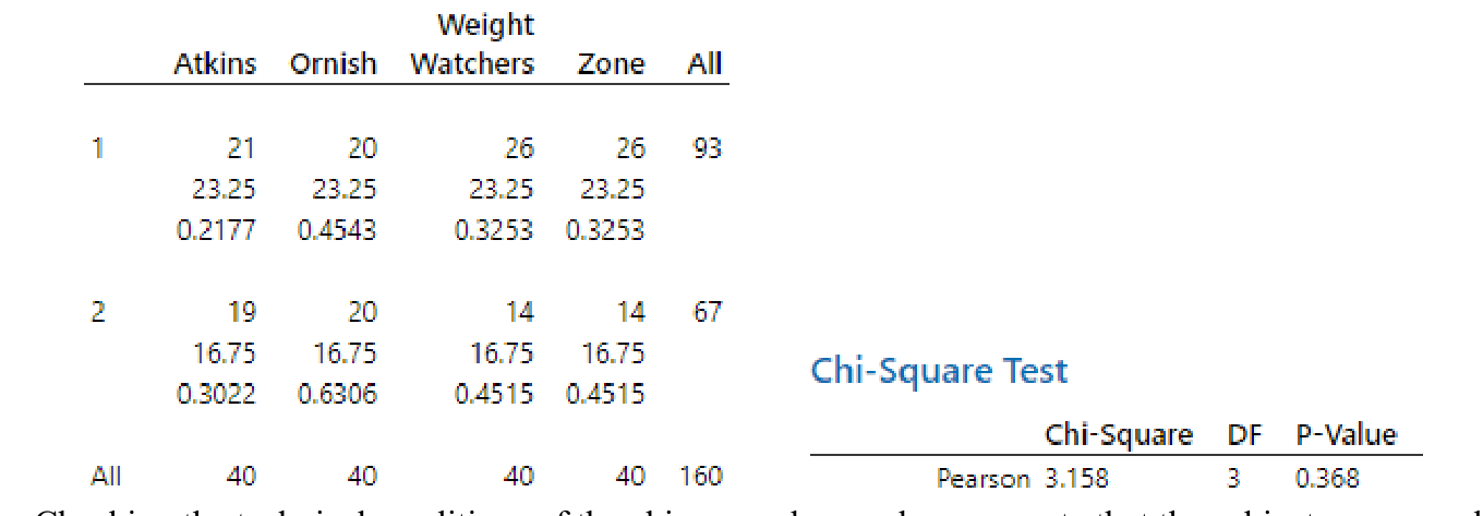
Minitab produces the following output:
described in detail following the image
Chi-square output: a table of observed counts, expected counts (23.25 for completers and 16.75 for dropouts in each diet), and cell contributions, with the Chi-Square Test panel reporting Pearson chi-square 3.158, DF 3, p-value 0.368.
Checking the technical conditions of the chi-squared procedure, we note that the subjects were randomly assigned to a diet plan group and that all expected counts in the table are larger than 5 (smallest is 16.75), so we are justified in applying the chi-squared test. The p-value of 0.368 says that if there were no difference in the underlying completion rates (i.e., no treatment effect) of completion among the four diet plans, then it would not be surprising (probability 0.368) to obtain experimental completion proportions that differ as much as these do. Because this p-value is not small, we can conclude only that the experimental data do not provide evidence to suggest that the completion proportions differ across these four diet plans.

Checkpoint 28.4.3. Adherence and Weight Loss.

Is there a significant positive association between a subject’s adherence level and his/her amount of weight loss?
Solution.
Association between adherence and weight loss: The explanatory variable is adherence level. This variable is quantitative. (It could be considered categorical if it were simply on a 1β€”10 scale, but it is the average of 12 such values and so should be treated as quantitative.) The response variable is weight loss, which is quantitative.
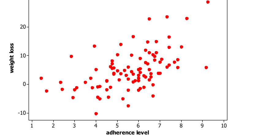
A scatterplot of weight loss vs. adherence level follows:
described in detail following the image
Scatterplot of weight loss (kilograms) versus adherence level showing a moderately strong positive association.
This graph reveals a moderately strong, positive, linear relationship between weight loss and adherence level. The correlation coefficient can be found to be \(r = 0.518\text{.}\) The scatterplot and correlation coefficient both suggest that there is a positive association between these variables, that subjects with higher adherence levels tend to lose more weight.
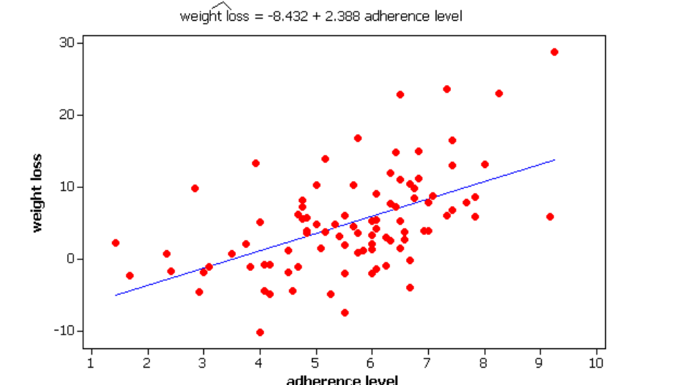
We can fit a regression line for predicting weight loss from adherence level:
described in detail following the image
Scatterplot of weight loss versus adherence level with the fitted line weight loss = -8.432 + 2.388 adherence level superimposed.
This model indicates that for each additional step on the adherence level scale, the subject is predicted to lose an additional 2.4 kilograms of weight.
Whereas there is a moderately strong positive linear relationship between weight loss and adherence level, we cannot draw a causal link between these two variables. Even though the study was a randomized comparative experiment, the variable imposed by the researchers was the diet plan, not the adherence level. Therefore, for the purpose of relating adherence level and weight loss, this study is essentially observational. However, we still might be interested in investigating whether the relationship observed in this sample is strong enough to convince us that it did not arise by chance. However, these subjects also were not a random sample from a larger population. (They volunteered for this study in response to advertisements.) Still, we might cautiously consider them representative of overweight men and women from the Northeast who would consider enrolling on these diets. With this consideration, we can proceed with a test to determine whether the observed level of association is higher than would be expected by random variation alone.
\(H_0\text{:}\) \(\beta_1 = 0\text{,}\) where \(\beta_1\) represents the population slope coefficient. This null hypothesis indicates that there is no linear relationship between adherence level and amount of weight loss.
\(H_a\text{:}\) \(\beta_1 \neq 0\) There is a linear relationship in the population.
Minitab produces the following output:
Coefficients

Term             Coef  SE Coef  T-Value  P-Value
Constant        -8.43     2.31    -3.66    0.000
adherence level 2.388    0.397     6.01    0.000
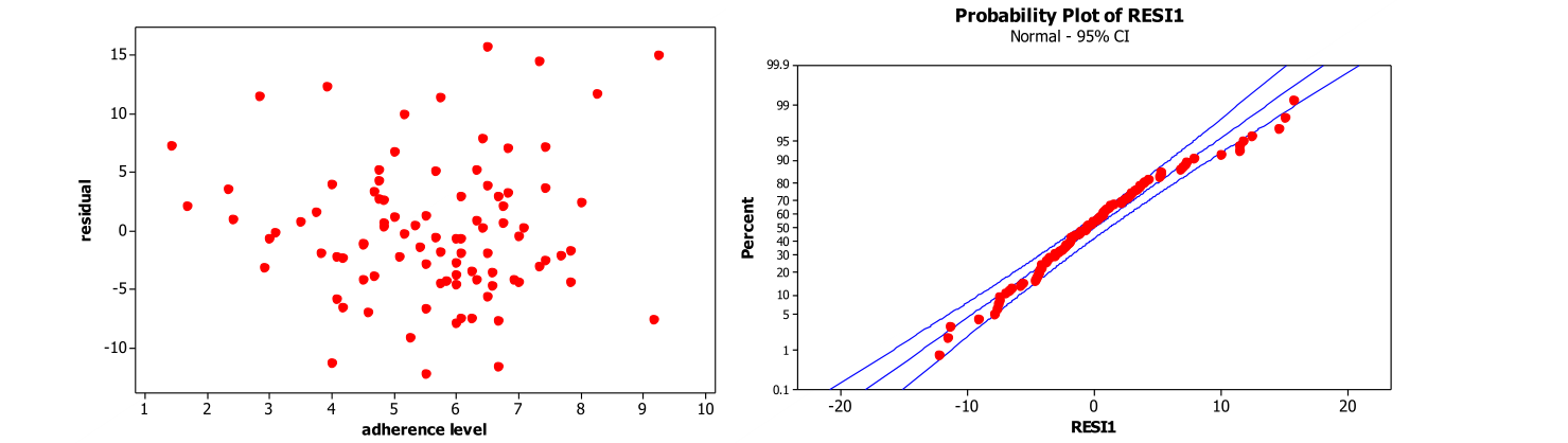
Checking the other technical conditions for the regression model, we find the following residual plots:
described in detail following the image
Two plots: residuals versus adherence level showing random scatter with a slight suggestion of increasing variability at larger values, and a normal probability plot of the residuals (RESI1) with points close to the line, bending slightly at the right tail.
The plot of residuals vs. the explanatory variable does not reveal any serious problems, although there is a (slight?) suggestion of increasing variability with larger values. The normal probability plots suggests a bit of a skew to the right but not too much. This last condition is a bit less problematic with the large sample size in this study. We could consider a transformation to account for the increasing variability, but the increase does not seem substantial enough to warrant a transformation here. These technical conditions seem to be fairly well met.
The standardized statistic is very large (\(t = 6.01\)) and the p-value very small (0.000 to three decimal places), and so we can conclude that the experimental data provide extremely strong evidence that there is an association between adherence level and weight loss. The p-value reveals that it would be almost impossible to obtain such large sample correlation and slope coefficients from random sampling variation alone. At any reasonable significance level, we conclude that this association is statistically significant.
We can follow up with a 95% confidence interval for the population slope \(\beta_1\text{.}\) We obtain \(2.388 \pm 1.986(0.397)\text{,}\) which is \(2.388 \pm 0.788\text{,}\) or \((1.600, 3.176)\text{.}\) This interval suggests that the additional predicted weight loss for each additional step of adherence to diet is between 1.6 and 3.2 kilograms.
But remember the caveat that we mentioned earlier: the subjects’ adherence levels were observed and not imposed, so we cannot draw a cause-and-effect conclusion between adherence level and weight loss. Furthermore, we must be cautious in stating to what population we are willing to generalize these conclusions.

Checkpoint 28.4.4. Do Dieters Tend to Lose Weight?

Is there strong evidence that dieters actually tend to lose weight on one of these popular diet plans?
Solution.
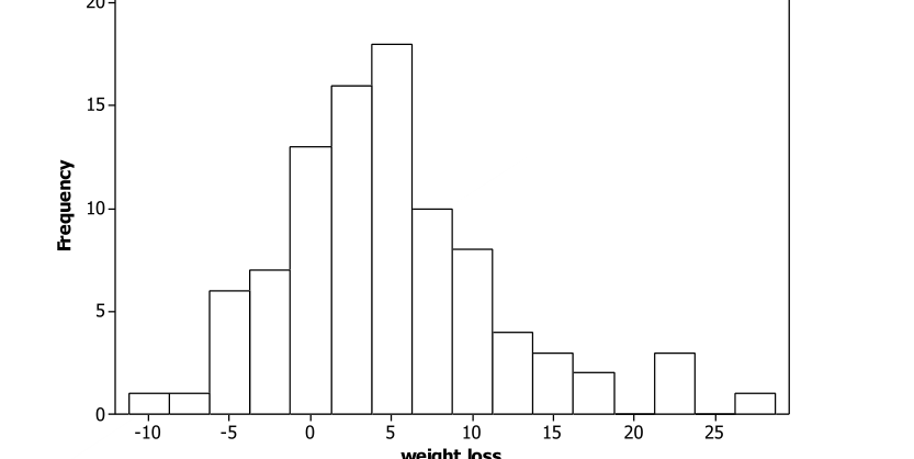
Mean weight loss: To address the question of whether dieters who complete 12 months on one of these popular diet plans actually tend to lose weight, we can begin by combining the weight loss diet across all four diet plans. This step seems reasonable because of our conclusion in Question 1 that the there is no evidence of an effect of diet plan on weight loss. Although the adherence level does appear to be related to amount of weight lost, the completion rate did not vary significantly across the diets, providing further justification for pooling across the diets. A histogram of the weight loss amounts (in kilograms) for the 93 subjects who completed the 12-month study follows:
described in detail following the image
Histogram of weight loss (kilograms) for the 93 subjects, a bit skewed to the right, with most values between -5 and 15 and a few values above 20.
This histogram reveals that the distribution of weight loss amounts is a bit skewed to the right. The mean weight loss is 4.95 kilograms, with a standard deviation of 6.89 kilograms. The median is 3.90 kilograms, and most of the subjects had a positive weight loss; in fact, 71 of 93 (76.3%) did.
To perform statistical inference with these data, we need to again consider the volunteer nature of the sample and that any randomness here is hypothetical. We will proceed to conduct tests and make inferences, which will tell us whether the sample results are extreme enough to be unlikely to occur by random variation alone, but we need to keep in mind that the sample may not be representative of any population.
Even though the distribution is a bit skewed, the large sample size (\(n = 93\)) allows us to perform a t-test of the hypotheses:
\(H_0\text{:}\) \(\mu = 0\) (the mean weight loss in the population of dieters who could use one of these popular plans is zero)
\(H_a\text{:}\) \(\mu > 0\) (the mean weight loss in the population of dieters who could use one of these popular plans is positive)
The standardized statistic turns out to be to \(t_0 = \dfrac{4.95 - 0}{6.89/\sqrt{93}} = 6.92\text{,}\) producing a p-value of essentially zero. This suggests that the sample data provide overwhelming evidence that the population mean weight loss exceeds zero, that is, that dieters on these plans do tend to lose weight on average. A 95% confidence interval for \(\mu\) turns out to be (3.53, 6.36), so we can be 95% confident that the population mean weight loss is between 3.53 and 6.36 kilograms.
We can cautiously follow this up with a 95% prediction interval for the weight loss of an individual dieter: \(4.95 \pm 1.986(6.89)\sqrt{1 + \dfrac{1}{93}}\text{,}\) which is \(4.95 \pm 13.76\text{,}\) which is \((-8.81, 18.71)\text{.}\) This interval implies that, with 95% confidence, we can assert only that an individual dieter is predicted to see a weight change anywhere between a gain of 8.8 kilograms and a loss of 18.7 kilograms. However, the slight skewness in the sample data leads us to question the validity of this prediction interval because the normality condition is essential for this procedure.
We could also perform a β€œsign test” of the hypotheses. A sign test reduces the analysis to counting how many β€œpositive” and β€œnegative” differences there are and determining whether we have significantly more of one that then other.
\(H_0\text{:}\) \(\pi = 0.5\) (half of the population of all potential dieters would lose positive weight on one of these diet plans)
\(H_a\text{:}\) \(\pi > 0.5\) (more than half of the population of all potential dieters would lose positive weight on one of these diet plans)
The data reveal that 71 of 93 subjects had positive weight loss. The binomial distribution (with parameters \(n = 93\) and \(\pi = 0.5\)) reveals that the p-value of \(P(X \geq 71)\) equals essentially zero (\(z \approx 5.08\)). Thus, this sign test leads to a similar conclusion: overwhelming evidence that more than half of the population would lose positive weight.
Because of the volunteer nature of the sample, it is not completely clear to what population we can generalize these results. Moreover, even though we concluded that the mean weight loss is significantly larger than zero, we cannot attribute the cause to the diet. Without the use of a comparison group of people who did not participate in a diet plan, we cannot conclude that the diet alone is responsible for the tendency to lose weight. Perhaps even the power of suggestion from being in the study was a sufficient cause for these individuals to lose weight on average.

Checkpoint 28.4.5. Summarize Your Findings.

Write a paragraph summarizing your findings from these four analyses.
Solution.
Summarizing our findings from this study:
  • We do not have convincing evidence to suggest that one of these popular diet plans produces more weight loss on average than another.
  • We do not have convincing evidence to suggest that completion rates differ among the four diet plans.
  • We do have very strong evidence to suggest that dieters on one of these plans will lose weight, between 3.5 and 6.5 kg on average, subject to the caveat that the dieters in this study may not be representative of a larger population of overweight people.
  • We do have significant evidence that those who adhere to a diet more closely do tend to lose more weight (subject to the same caveat).
You have attempted of activities on this page.