Section1.1Investigation A: Distributions and Variability
These first three investigations give you a very brief introduction to some big ideas for the course. Some of you will have seen some of these ideas before and can use the investigations to refresh your memory. Some of the ideas may be new and you will see them again in later chapters. For now, try to focus on the bigger picture of analyzing data, evaluating models, and drawing appropriate conclusions.
Exercises1.1.1Investigation A: Hurricanes and Climate Change
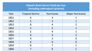
One of the concerns with climate change is an increased number of tropical storms (including hurricanes and major hurricanes). In particular, in the "Atlantic Basin," scientists have tracked the number of "named storms" since 1851. According to the National Hurricane Center:
Hurricane: A tropical cyclone with maximum sustained winds of 74 mph (64 knots) or higher. In the western North Pacific, hurricanes are called typhoons; similar storms in the Indian Ocean and South Pacific Ocean are called cyclones.
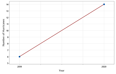
Does this convince you that climate change is leading to an increase in the number of hurricanes (in the Atlantic)? If so, explain why. If not, explain what additional information you would want to know.
Just because one year saw a large increase doesn’t necessarily reflect an increasing trend. It’s also hard to know whether this is a "large" increase when we don’t have information on how much this value tends to vary from year to year. We can’t draw any causal conclusions because other things could have changed in that time frame. We also need to keep in mind that "number of hurricanes" is just one possible reflection of "climate change."
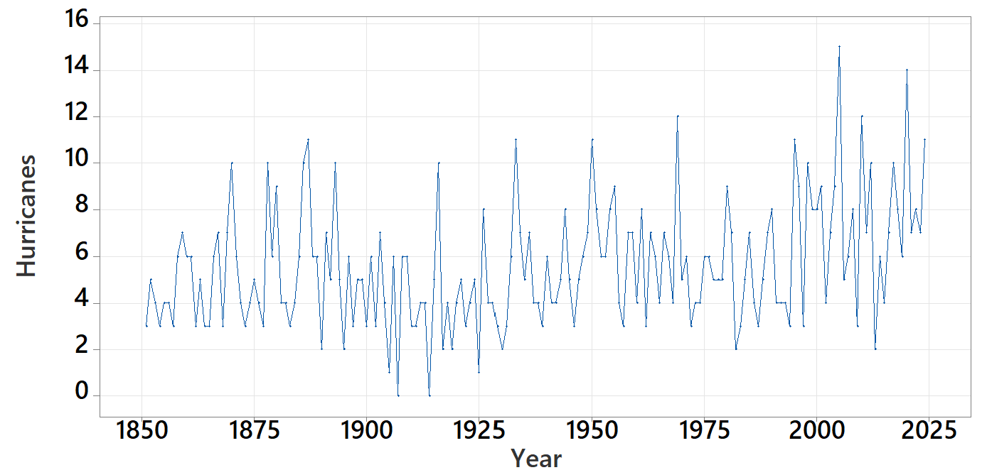
A year with 14 hurricanes is certainly close to record setting, but we expect there to be some variation from year to year. Below is a time plot of the number of hurricanes each year.
Now we know which year each value corresponds to and we might see a gradual increasing trend overall since about 1970. We also see that the change from 6 to 14 is a rather large change between years.
The stormfax website reports the mean number of hurricanes between 1991-2020 to be 7. Does that appear consistent with the graph? Why do you think they chose that subset of years?
This is consistent with the time plot. If we were to put a horizontal line at a height that goes through the middle of the values, 7 appears a reasonable value for that height. Perhaps they wanted to look at more recent data for more direct comparison with current data (opinions may vary).
Oftentimes a mean or average is reported, but with no measure of spread or variability. If all the years between 1991-2020 had between 6 and 8 hurricanes, we would react very differently to 14 hurricanes in one year than if all the years between 1991-2020 had between 2 and 15 hurricanes.
We can roughly interpret the standard deviation as the average "deviation" of the data values in the distribution from the mean of the distribution. Another interpretation: If we were to predict 7 as the number of hurricanes in a year between 1991-2020, the standard deviation would approximate the average "prediction error" for those years.
Conjecture: The mean of these 31 observations is 7.2 hurricanes. Do you think 7.2 is larger or smaller or quite similar to the mean for the full dataset? Explain your reasoning.
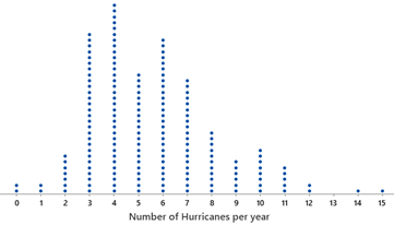
About half or a little more than half of the values appear to fall between 4 and 10, so a reasonable estimate of the standard deviation would around 3 hurricanes.
The largest values (e.g., 14, 15) are in this subset and the spread in the values does appear larger in the more recent years than overall (fewer values in the 3 to 7 range compared to the full dataset).
If we use a mean of 7.2 and a standard deviation of 3.3 hurricanes, how many standard deviations away from the mean is a value of 14 hurricanes? Above or below the mean?
In this investigation, you have just touched on one piece of information related to climate change. In fact, scientists are less concerned about the number of storms but in the intensity of the storms and how warming of the surface ocean may be leading to more destructive storms. Looking at a single year in isolation or even a pair of years creates a very incomplete picture of trends over time, and while we expect some natural variation from year-to-year, the question to scientists is whether the overall trend being observed is larger than what we can reasonably attribute to natural variation.
It’s important to determine which variables are most relevant to the research question and whether you can collect the data you need to answer the question.
Simple graphs can be very informative, but you should also take care in considering the most meaningful variable representation of what you are studying even before you begin graphing.
It is imperative to consider variability and to think about possible sources of variation. Sometimes you may be able to explain and "control for" a source of variation. Often you will have to dig deeper into reasons for unusual observations and whether it is appropriate to remove them from the analysis.
The quality of your inferences will depend A LOT on the quality of the data that are collected. Not much can be learned from poorly or improperly collected data or data from a completely different time period.
When exploring a research question, one of the first steps is to define the variable involved (e.g., the number of hurricanes). This is an example of a quantitative variable, as opposed to a categorical variable like whether the storm has winds over 74 mph. Dotplots are good choices for visualizing a quantitative variable for a small dataset. When looking at a distribution of a single quantitative variable like this, we are often interested in four key features:
To summarize the center of the distribution, we often report the mean (the arithmetic average of all the numerical values in the data set) and/or the median (a middle value such that 50% of the data values are smaller and 50% are larger).
With most investigations we will also provide a follow-up practice problem or two for you to try on your own to assess your understanding of the material.
The skewness statistic measures the lack of symmetry in a distribution (do values above the mean extend further than values below the mean on average) using a \((y_i-\bar{y})^3\) term. Positive values indicate a skewed right distribution, negative values indicate skewed left, and values near 0 indicate a symmetric distribution.
Based on the graph, would you consider the "number of hurricanes" distribution to be symmetric, skewed to the right or skewed to the left? Check the Skewness statistic box, does the value agree with your judgement from the graph?
Look at the tails of the distribution. Which side extends further? A positive skewness value indicates right skew, negative indicates left skew, and values near 0 indicate symmetry.
The distribution appears to be skewed to the right, with a longer tail extending toward the higher values. The skewness statistic should be positive, confirming this visual assessment.
In the applet, check the box for Guess for the standard deviation. Use your mouse to move one of the edges of the red rectangle to a distance that you think is representative of a "typical distance from the mean" (some values are closer, some are further). Then check the Actual box. How did you do?
How does the standard deviation of the full dataset compare to the 3.3 value for the years 1991-2020? Summarize what this tells us about the behavior of hurricanes.