Section27.2Investigation 5.7: Drive for Show, Putt for Dough
Exercises27.2.1The Study
Some have cited “Drive for show, putt for dough” as the oldest cliché in golf. The message is that the best way to improve one’s scoring average in golf is to focus on improving putting, as opposed to, say, distance off the initial drive, even though the latter usually garners more ooh’s and aah’s.
To see whether this philosophy has merit, we need to examine whether there is a relationship between putting ability and overall scoring, and whether that relationship is stronger than the relationship between scoring average and driving distance. The file golfers18.txt contains the 2018 statistics (through September 2018, downloaded May 2019) on the top 100 PGA golfers (based on scoring), downloaded from http://www.pgatour.com/stats/. Three of the variables recorded include:
Scoring average: A weighted average which takes the stroke average of the field into account. It is computed by adding a player’s total strokes to an adjustment, and dividing by the total rounds played. This average is subtracted from par to create an adjustment for each round. Keep in mind that in golf low scores, as measured by number of strokes, are better than high scores.
Driving distance: Average number of yards per measured drive. These drives are measured on two holes per round, carefully selected to face in opposite directions to counteract the effects of wind. Drives are measured to the point where they come to rest, regardless of whether or not they hit the fairway.
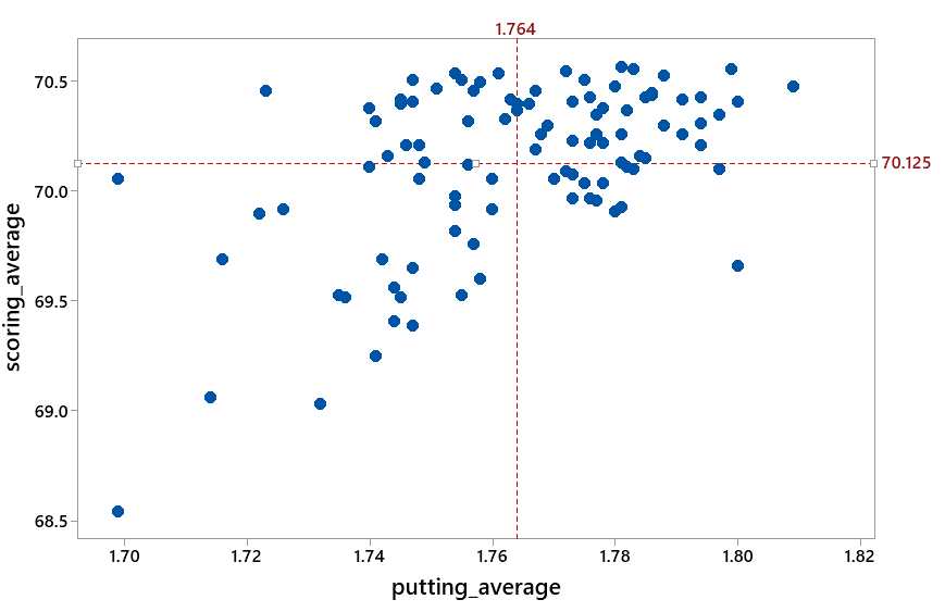
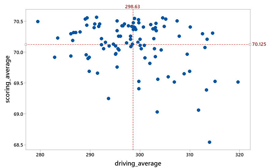
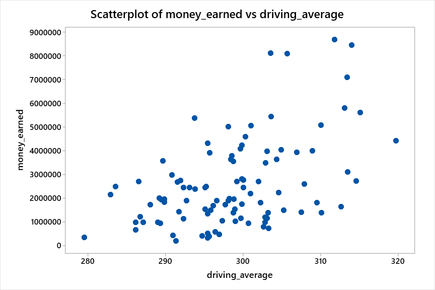
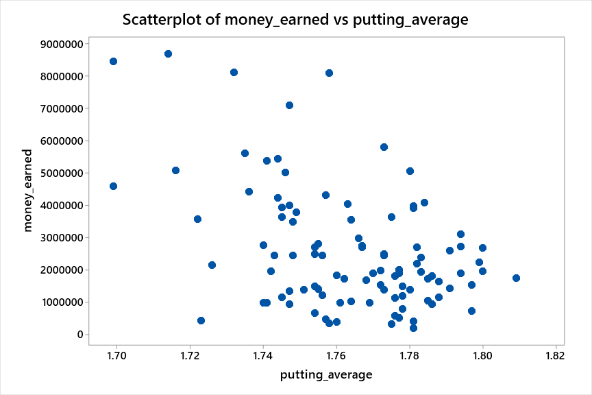
Open the data file and examine a scatterplot of average score vs. driving distance and a scatterplot of average score vs. average putts. Describe each scatterplot. Do the relationships confirm your expectations in Question 1 and Question 2? Does one relationship appear to be stronger than the other? If so, which?
The relationship between average score and average driving distance does appear to be negative. The relationship between average score and putting average appears positive and to be stronger than the first relationship. (Both graphs have some outliers worth investigating.)
To further analyze these data, we need a numerical way of measuring the strength of the association between the two variables. We will do this with the correlation coefficient.
Scatterplot of scoring average versus putting average with vertical and horizontal mean lines dividing it into four quadrants; most points fall in the lower-left and upper-right (quadrants III and I).
Scatterplot of scoring average versus driving average with vertical and horizontal mean lines dividing it into four quadrants; points are spread more evenly across the four quadrants.
For the average score vs. average putts scatterplot, in which quadrants are most of the points located? For the average score vs. driving scatterplot? Which scatterplot seems to have fewer points in the “non-aligned” quadrants?
where \(\bar{x}\) and \(s_x\) are the mean and standard deviation of the explanatory variable, respectively, and \(\bar{y}\) and \(s_y\) are the mean and standard deviation of the response variable.
Notice that when a point \((x_i, y_i)\) is in quadrant I or III, the term \((x_i - \bar{x})(y_i - \bar{y})\) will be positive. When a point is in quadrant II or IV, this term is negative. Where there is a positive association, most of the points are in quadrants I and III, so the correlation coefficient is positive. Similarly, when there is a negative association, most of the points will be in quadrants II and IV, so the correlation coefficient turns out to be negative. The more observations that are in the “aligned” quadrants, and the closer the points fall to a straight line, the larger the value of the correlation coefficient.
Let \(x\) represent the average number of putts and \(y\) represent the average number of strokes. Use the definition of the correlation coefficient above to determine the measurement units of the correlation coefficient \(r\) in terms of putts and strokes.
the points will have random scatter, observations with below average \(x\) values will have both below and above average \(y\) values, observations with above average \(x\) values will have both below and above average \(y\) values.
Suppose we find the correlation coefficient of a variable with itself. Substitute \(x_i\) in for \(y_i\) (and so \(\bar{x}\) and \(\bar{y}\) and \(s_x\) for \(s_y\)) in the above equation. Simplify. What is the correlation coefficient equal to?
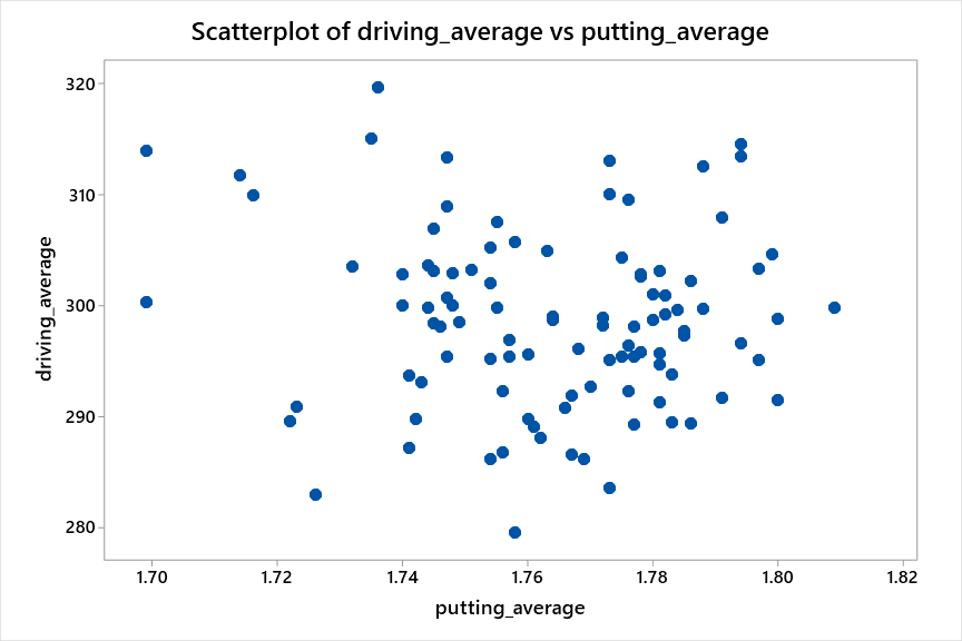
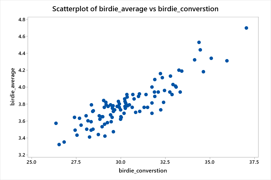
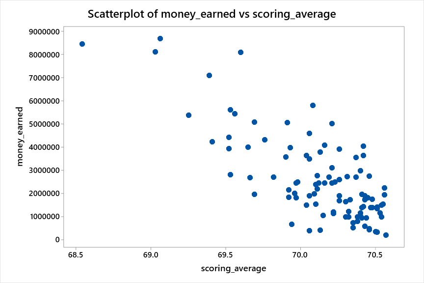
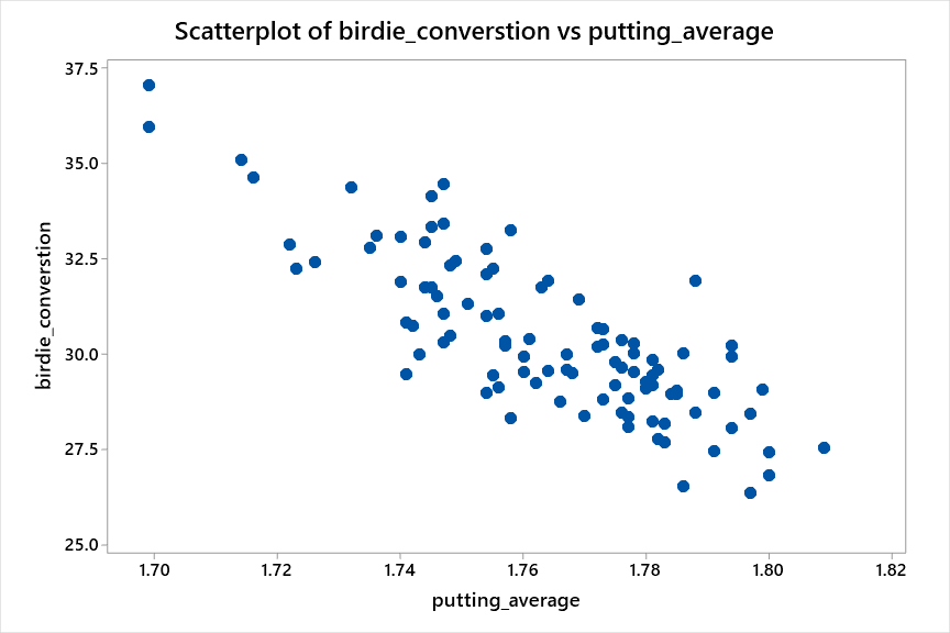
The following scatterplots display 7 pairs of variables for these golfers. Rank these graphs in order from strongest negative correlation to strongest positive correlation.
In the Two Quantitative Variables applet, use the pull-down menus to change the response and explanatory variable pairs. Check the Correlation coefficient box.
Select Analyze > Multivariate Methods > Multivariate and specify two columns (or more) in the Y, Columns box and press OK. The numbers are the correlation coefficients for that row variable and that column variable.
From strongest negative to strongest positive: \(-0.819\text{,}\)\(-0.765\text{,}\)\(-0.451\text{,}\)\(-0.090\text{,}\)\(0.485\text{,}\)\(0.632\text{,}\)\(0.888\text{.}\)
Based on these correlation coefficient values and/or the definition/formula, what do you think is the largest value that \(r\) can assume? What is the smallest value?
The correlation coefficient for scoring average and average putts indicates a moderately strong positive linear association (\(r = 0.516\)) whereas the correlation coefficient for scoring average and driving indicates a weaker negative association (\(r = -0.321\)). This appears to support that putting performance is more strongly related to a PGA golfer’s overall scoring average than the golfer’s driving distance, as the cliché would suggest. We must keep in mind that these data are only for the first 2.5 months of the season (when most golfers have played only around 6–8 events) and may not be representative of the scores and money earnings later in the year.
The correlation coefficient, \(r\text{,}\) provides a measure of the strength and direction of the linear relationship between two variables. This is a unitless quantity which has the advantage that it will be invariant to changes in scale (if we started looking at money in British pounds instead of American dollars, our measure of the strength of the relationship will not change) or if we reverse which we call the explanatory and response variables. A value of \(r\) close to zero indicates that the variables do not have a strong linear relationship. However, this does not preclude them from having a very strong but non-linear relationship. A scatterplot should be examined before interpreting the value of \(r\text{.}\) If the relationship is not linear, there are alternative measures of the strength of the association that can be used or the variables can be transformed and the transformed variables analyzed instead. If the relationship is linear, a correlation coefficient close to 1 or \(-1\) indicates a very strong relationship. The values of \(r\) form a continuum: as the linear association becomes weaker, the value of \(r\) becomes closer to zero.
The correlation coefficient will always be a number between \(-1\) and 1, inclusive. It will obtain the value of 1 or \(-1\) if the points fall along a perfect line (with positive or negative slope, respectively).
Suppose that we record the midterm exam score and the final exam score for every student in a class. What would the value of the correlation coefficient be if every student in the class scored (explain your answer in each part; you might first want to draw yourself a scatterplot of hypothetical data that fit the stated conditions):
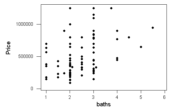
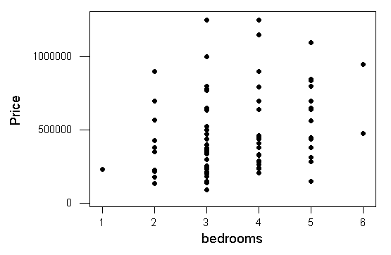
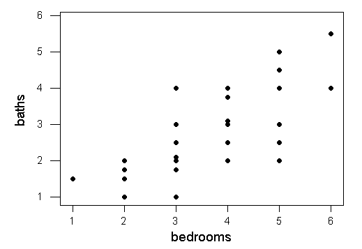
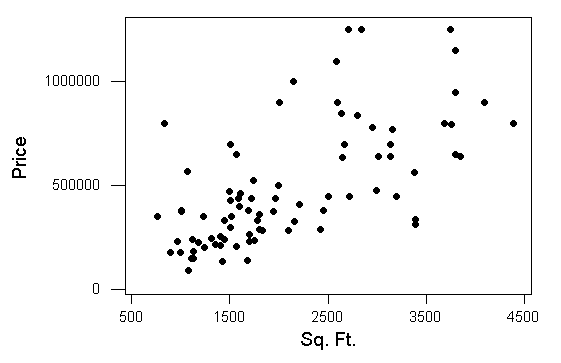
The following scatterplots look at the relationships between house prices and four other variables. How does the strength of the linear relationship between price and square footage compare to the strength of the relationships in the first 3 graphs?
The correlations for these four graphs are 0.284, 0.394, 0.649, 0.760. Which correlation coefficient do you think corresponds to which graph? Explain your reasoning. (Note: Each graph has the same number of houses, but you may have multiple houses indicated by an individual dot.)