Section8.2Investigation 2.2: How Long Can You Stand It?
Exercises8.2.1The Study
Diekmann, Krassnig, and Lorenz (1996) conducted a field study to explore whether driver characteristics are related to an aggressive response (Thanks to Jeff Sklar for pointing us to this article).
The study was conducted at a busy intersection in Munich, West Germany, on two afternoons (Sunday and Monday) in 1986.The experimenters sat in a Volkswagen Jetta (the "blocking car") and did not accelerate after the traffic light turned green, and timed how long before the driver of the blocked car reacted (either by honking or flashing headlights). The response time (in seconds) is our variable of interest. Some values were "censored" in that the researcher stopped timing before the driver actually honked. This can happen if there is a time limit to the observation period and "success" has not been observed within that time period.
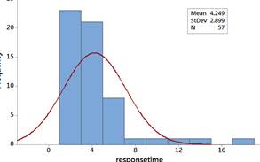
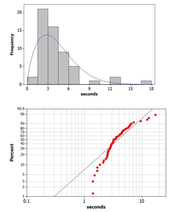
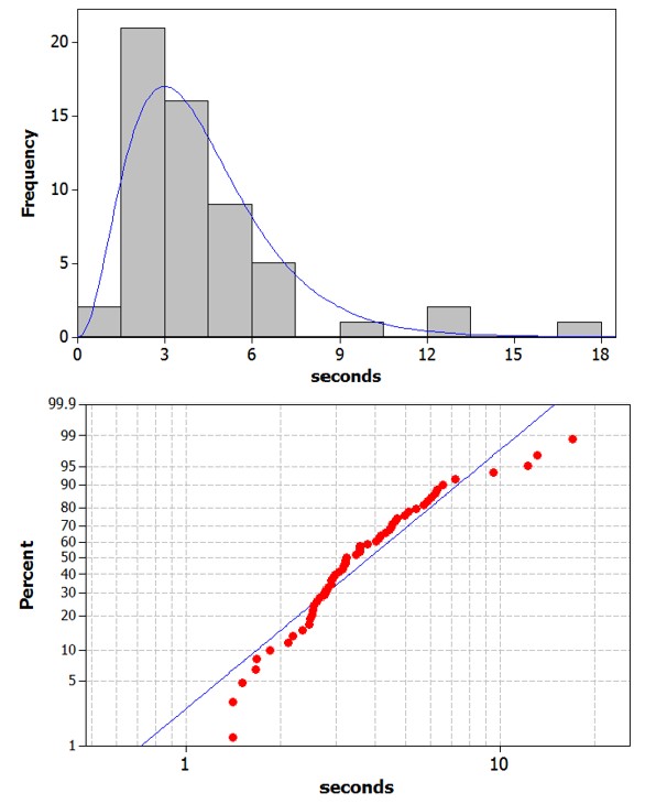
Then overlay a normal probability model. Do these data behave like a normal distribution? If not, how do they deviate from normality? Does the shape make sense in this context?
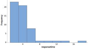
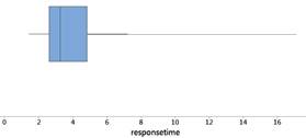
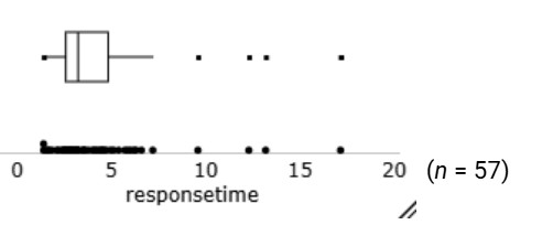
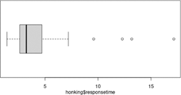
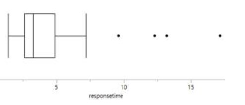
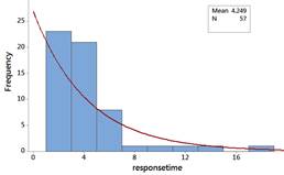
The distribution of response times are skewed to the right. Most people waited less than 5 seconds, but a couple waited more than 15 seconds. There is one outlier 17.15 seconds.
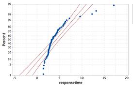
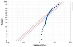
The data do not behave like a normal distribution. The probability plot confirms that the largest response times are larger than we would expect from a normal distribution and the lowest response times are larger than we would expect.
When data are skewed, we might often prefer to report the median as a "typical" value in the data set, rather than the mean because the mean is pulled in the direction of the longer tail. In addition, you might not want to cite the standard deviation as a measure of spread in a skewed distribution.
The lower quartile is a value such that roughly one-fourth of all the observations fall below it; the upper quartile is a value such that roughly one-fourth of all the observations fall above it. The IQR then measures the width of the interval containing the middle 50% of the observations.
When the data are skewed, the median and interquartile range are often considered better numerical summaries of the center and variability of the distribution than the mean and standard deviation. When working with the median and interquartile range, we often report the five number summary which consists of the minimum, lower quartile, median, upper quartile, and maximum values.
Another graph is based on the five-number summary, called a boxplot (invented by John Tukey in 1970). The box extends from the lower quartile to the upper quartile with a vertical line inside the box at the location of the median. Whiskers then typically extend to the min and max values.
Although boxplots are a nice visual of the five-number summary, they can sometimes miss interesting features in a data set. In particular, shape can be more difficult to judge in a boxplot, and they usually don’t provide information about the size of a data set.
Definition: Outlier Criterion and Modified Boxplot.
A value is an outlier according to the 1.5IQR criterion if the value is larger than the upper quartile + 1.5 × box length or smaller than the lower quartile – 1.5 × box length.
boxplot(responsetime, ylab="time until reaction",    # Adds labels
        horizontal=TRUE)                              # Makes horizontal
# OR
iscamboxplot(responsetime, xlab="time until reaction")  # Uses quartiles
These data are not well modelled by a normal distribution. So can we still make predictions? There are a couple of strategies. One would be to consider whether a rescaling or transformation of the data might create a more normal-looking distribution, allowing us to use the methods from Investigation 2.1: Birth Weights. In this case, we need a transformation that will downsize the large values more than the small values. Log transformations are often very helpful in this regard.
A data transformation applies a mathematical function to each value to re-express the data on an alternative scale. Data transformations can also make the data more closely modeled with a normal distribution, which could then satisfy the conditions of the Central Limit Theorem.
Create a new variable which is log(responsetime). (You can use either natural log or log base 10, but so we all do the same thing, let’s use natural log here, which is the default in most software when you say "log.")
Create a histogram of these data and a normal probability plot. Does log(responsetime) approximately follow a normal distribution? What are the mean and standard deviation of this distribution?
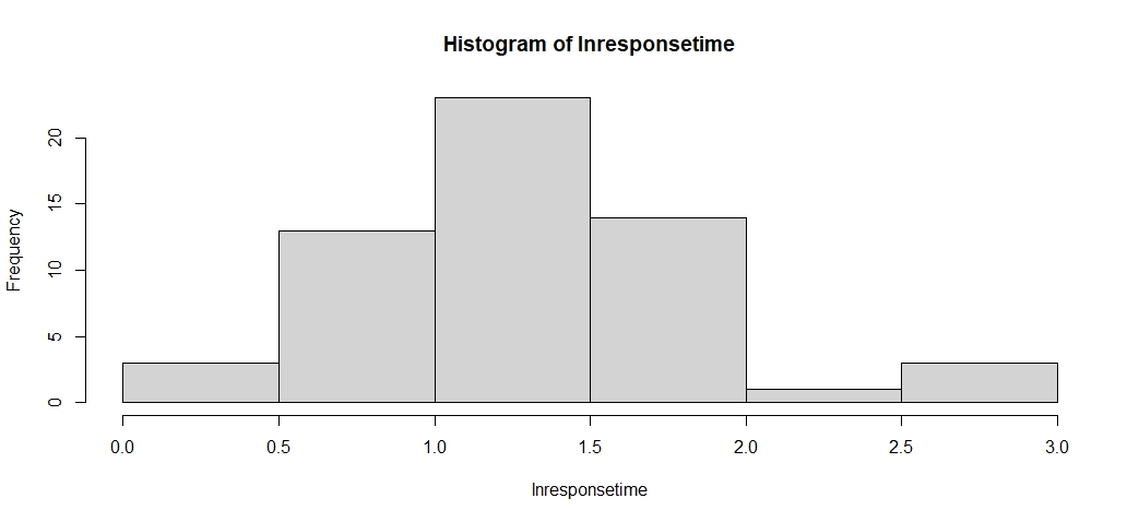
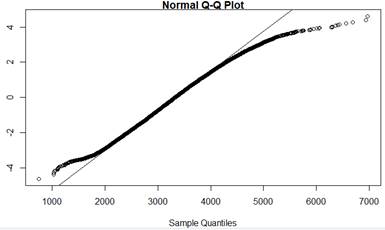
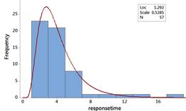
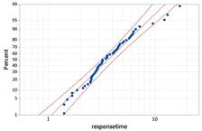
This histogram of the ln response times is more symmetric and the normal probability plot is more linear. This is definitely more normal looking than before (but we might be able to do better). The mean is 1.292 and the SD = 0.5285. The skewness statistic is closer to zero (0.676).
10.Predict using normal distribution on log scale.
Aside:Normal Probability Calculator.
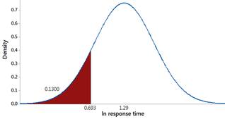
Use a normal distribution with mean 1.29 ln-sec and standard deviation 0.53 ln-seconds for the logged response times and predict how often someone will honk within the first 2 seconds.
Another approach is to fit a different mathematical model to the original data. Use technology to overlay an exponential probability model (often used to model wait times) to these data and/or create a probability plot using the exponential distribution as the reference distribution.
theoquant = qexp(ppoints(12))      # Generates 1/n quantiles for 12 observations
                                    # from exponential distribution
hist(theoquant)
qqplot(responsetime, theoquant)    # Your data vs. quantiles. Look for a line.
iscamaddexp(responsetime)          # overlay exponential model
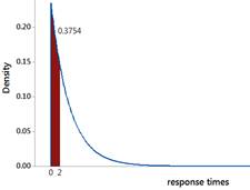
The exponential is skewed to the right with its peak at zero. This does not appear to be as good of a fit. We have more observations around 4-5 seconds than the exponential distribution would predict and fewer observations less than 1 second (we don’t have any, the times could be rounded in the dataset?).
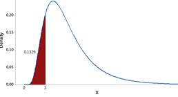
Using the Distribution Calculator, select the Exponential distribution. Specify a scale parameter of 1/4.25. Choose X <= Qa and enter 2 for Qa (we don’t need to worry about strict vs. non-strict inequalities here)
The log normal has the skewed right behavior but not as severely as the exponential and provides a better fit to our data. Now the prediction is 0.1326.
There are of course, many other probability models we could look into. One limitation of the exponential distribution is that it assumes the same value for the mean and the standard deviation, clearly not the case for these data. There are other more flexible distributions (e.g., Gamma and Weibull) that use two parameters to characterize the distribution rather than only one.
We don’t have a lot of information about how these participants were selected other than two afternoons in West Germany, so we should be cautious in generalizing these results too far beyond that time period and country. "Waiting time" can be very distinct across cultures.
In this study, we found that the amount of time a blocked driver waits before responding follows a skewed right distribution with a mean of 4.25 seconds and a median of 3.24 seconds, with a few drivers waiting more than 10 seconds. Although the dataset is small, we might consider using these data to build a mathematical model for these skewed data, either using a transformation or a probability model other than the normal distribution, to help predict future results (e.g., a wait time of less than 2 seconds). These researchers were actually interested in whether the "social status" of the blocked car was related to how long it took before people honked. They found that "the mean and median response times decreased monotonically with the status of car, except when the blocked car was very small." Similar results had been found in an earlier study by Doob and Gross in the United States ( 1968) which varied the status of the blocking car. However, neither study was replicated by a Swiss study (Jann, Suhner, and Marioni, 1995), perhaps due to cultural differences.
A group of Cal Poly students (Sasscer, Mease, Tanenbaum, and Hansen, 2009) conducted the following study: volunteers were to say "go," and then to say "stop" when they believed 30 seconds had passed. The researchers asked the participants to not count in their heads and recorded how much time had actually passed. The data are in 30seconds.txt.
Checkpoint8.2.1Examine distribution of 30-second estimates.
Examine graphical and numerical summaries of these data. Describe the shape of the distribution. How do the mean and median compare? Is the skewness statistic positive or negative? What does this tell you about whether people tend to over or underestimate the length of 30 seconds?
Does a log transformation succeed in creating a normal distribution? Explain how you might have predicted this answer based on the first graph you looked at in Checkpoint 8.2.1.