Measures of central tendency, variability, and spread summarize a single variable by providing important information about its distribution. Often, more than one variable is collected on each individual. For example, in large health studies of populations, it is common to obtain variables such as age, sex, height, weight, blood pressure, and total cholesterol on each individual. In this section, we consider bivariate data, which consists of two quantitative variables for each individual. Our primary interest is in summarizing such data in a way that preserves the underlying relationship between the two variables.
To illustrate bivariate data, consider something familiar: age. Do people tend to marry other people of about the same age? Looking at a sample of spousal ages for 10 White American couples (Table 4.3.1), we see that husbands and wives tend to be of about the same age, with men having a tendency to be slightly older than their wives:
In a larger dataset consisting of 282 pairs of spousal ages, summarizing each variable separately using histograms or summary statistics (such as the mean and standard deviation) causes critical information to be lost. For this sample, the mean age for husbands is 49 (standard deviation = 11) and for wives is 47 (standard deviation = 11), with both distributions being fairly skewed with a long right tail.
However, not all husbands are older than their wives. This fact is lost when we separate the variables. Even though summary statistics are provided on each variable, the pairing within couples is lost. Based on the means alone, we cannot say what percentage of couples has younger husbands than wives; we have to count across pairs. Only by maintaining the pairing can meaningful answers be found about couples per se, such as finding the average age of husbands with 45-year-old wives or identifying the overall relationship between a husband’s age and a wife’s age.
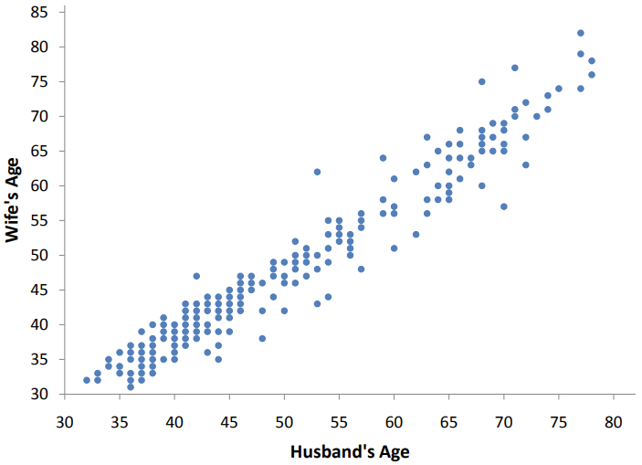
We can learn much more by displaying bivariate data in a graphical form that maintains the pairing: a scatter plot. In a scatter plot, each pair is plotted as a point defined by its horizontal (\(x\)) and vertical (\(y\)) coordinates (Figure 4.3.2).
A scatter plot showing a strong positive association between the ages of husbands and wives. The horizontal axis, labeled "Husband’s Age," ranges from 30 to 80. The vertical axis, labeled "Wife’s Age," also ranges from 30 to 85. The plot contains hundreds of data points in a light blue color. The points cluster very tightly along an upward-sloping diagonal line, indicating that as the husband’s age increases, the wife’s age increases at a nearly identical rate. While most points follow the diagonal trend, there is a slight tendency for points to sit just below the diagonal for older age groups, reflecting that husbands are sometimes slightly older than their wives.
Positive vs. Negative Association: When one variable (\(y\)) increases with the second variable (\(x\)), \(x\) and \(y\) have a positive association. In the spousal age plot, the older the husband, the older the wife. Conversely, when \(y\) decreases as \(x\) increases, they have a negative association.
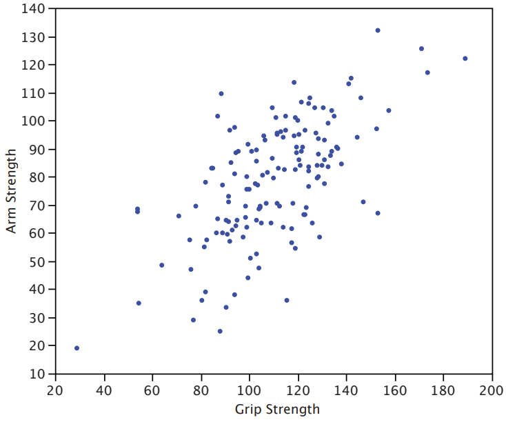
Another example of a linear relationship is shown in a study of 149 individuals working in physically demanding jobs (such as electricians, construction and maintenance workers, and auto mechanics), shown in Figure 4.3.3.
A scatter plot showing the relationship between physical strength measurements. The horizontal axis, labeled "Grip Strength," ranges from 20 to 200. The vertical axis, labeled "Arm Strength," ranges from 10 to 140. The plot displays a large collection of dark blue data points representing individuals. There is a clear positive association visible; as grip strength increases, arm strength generally increases as well. However, the points are spread out in a wide, diffuse cloud around the diagonal trend, showing much more variability than the spousal age graph. This spread indicates a moderate positive linear relationship, rather than a perfect or tight fit.
As expected, the stronger someone’s grip, the stronger their arm tends to be, showing a positive association. Although the points cluster along a line, they are not clustered quite as closely as they are for spousal age.
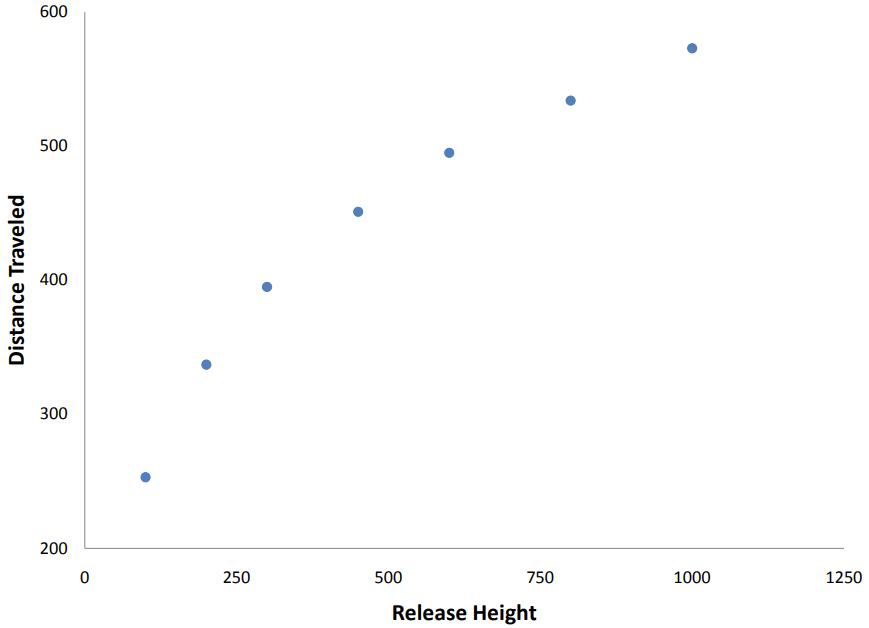
Not all scatter plots show linear relationships. Consider Galileo’s experiment on projectile motion (Figure 4.3.4), where he rolled balls down an incline and measured how far they traveled as a function of release height.
A scatter plot illustrating Galileo’s data on projectile motion, showing a distinct non-linear trend. The horizontal axis, labeled "Release Height," ranges from 0 to 1250. The vertical axis, labeled "Distance Traveled," ranges from 200 to 600. The plot contains only seven distinct data points plotted as light blue dots. The points follow a clear upward curve. Because the slope of the trend becomes shallower as the release height increases, the data creates a convex, parabolic shape. A straight line drawn through the data would leave the middle points sitting far above it, demonstrating that the relationship between release height and distance traveled is not linear.
The relationship between “Release Height” and “Distance Traveled” is not described well by a straight line: if you drew a line connecting the lowest point and highest point, all remaining points would sit above the line. These data are better fit by a parabola (nonlinear relationship).
Scatter plots that show linear relationships can differ in their slope and in how tightly points cluster around the line. A statistical measure of the strength of the linear relationship between two quantitative variables is the Pearson product-moment correlation coefficient (referred to as Pearson’s correlation or simply the correlation coefficient).
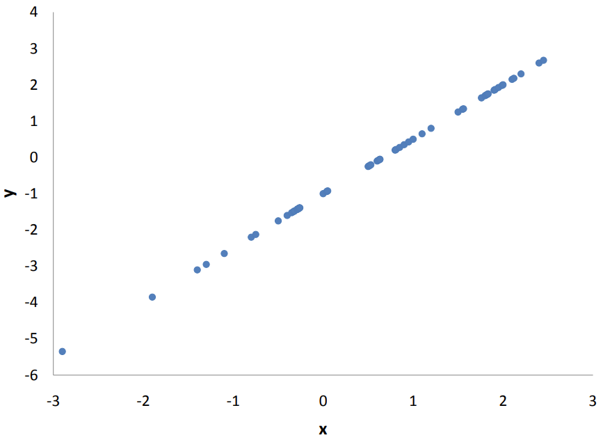
Perfect Positive Linear Relationship (\(r = 1\)): Indicates a perfect positive linear relationship where all points fall exactly on an upward straight line (Figure 4.3.5).
A scatter plot demonstrating a perfect positive linear correlation. The horizontal axis is labeled "x" and ranges from -3 to 3. The vertical axis is labeled "y" and ranges from -6 to 4. The plot contains a series of light blue data points that fall precisely and exactly on a straight diagonal line moving from the bottom left to the top right. There is no scatter or deviation from this line, meaning that for every unit increase in x, y increases by a perfectly consistent amount. This visual represents a correlation coefficient of exactly r = 1.
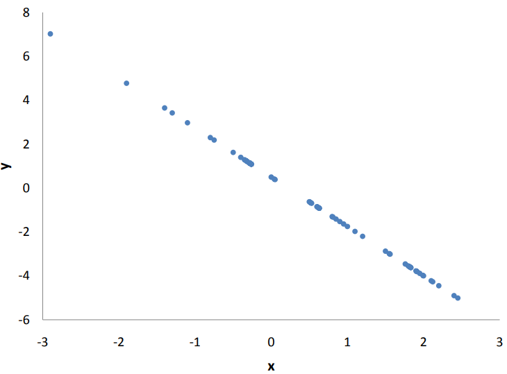
Perfect Negative Linear Relationship (\(r = -1\)): Indicates a perfect negative linear relationship where points fall on a downward straight line (Figure 4.3.6).
A scatter plot demonstrating a perfect negative linear correlation. The horizontal axis is labeled "x" and ranges from -3 to 3. The vertical axis is labeled "y" and ranges from -6 to 8. The plot consists of light blue data points that lie perfectly and exactly on a straight diagonal line moving from the top left to the bottom right. There is no scatter or deviation from this line, meaning that for every unit increase in x, y decreases by a perfectly consistent amount. This visual represents a correlation coefficient of exactly r = -1.
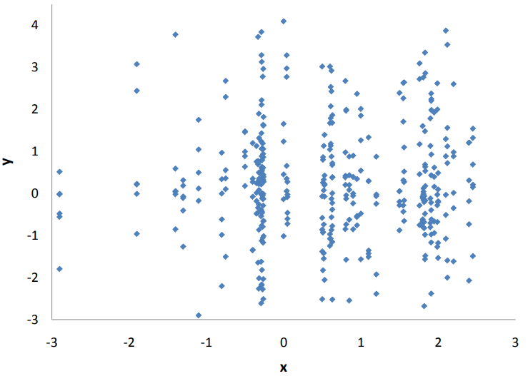
A scatter plot illustrating a dataset with no linear relationship. The horizontal axis is labeled "x" and ranges from -3 to 3. The vertical axis is labeled "y" and ranges from -3 to 4. The data is plotted using dark blue diamond-shaped points. Instead of following a line, the points are distributed randomly and widely across the entire plotting area. While there are two distinct vertical clusters of points around x = -0.5 and x = 2, the points within these columns are scattered vertically with no clear upward or downward trend. This random, directionless scatter represents a correlation coefficient of approximately r = 0.
Strict Bounds (\(-1\) to \(+1\)): The value of \(r\) always stays between \(-1\) and \(+1\text{.}\) The sign indicates direction (positive or negative), while the absolute magnitude reflects strength.
Symmetry: Correlation works identically in both directions. The correlation of \(x\) with \(y\) is the exact same as \(y\) with \(x\)—measuring weight versus height yields the same value as height versus weight.
Invariance to Scale Changes: Pearson’s \(r\) is completely unaffected by linear transformations (adding, subtracting, multiplying, or dividing by a constant). For instance, the correlation between height and weight remains identical whether height is measured in inches, feet, or meters. Similarly, adding five bonus points to every student’s test score will not alter how those scores correlate with GPA.
Explained Variance (\(r^2\)): Squaring the correlation coefficient (\(r^2\)) gives the coefficient of determination, which measures the proportion of variance in one variable that is predictable from the other:
High Shared Variance: In the spousal age dataset (\(r = 0.97\)), \(r^2 = 0.94\text{,}\) meaning 94% of the variance in wives’ ages is accounted for by their husbands’ ages.
Moderate Shared Variance: For arm and grip strength (\(r = 0.63\)), \(r^2 \approx 0.40\text{,}\) leaving 60% of the variance unexplained by grip strength alone.
Across the general high school population, standardized admissions test scores and academic performance share a strong positive correlation. However, if an analysis focuses solely on students admitted to an elite university—where test scores fall within a restricted, highly competitive band—the observed correlation between test scores and college GPA drops significantly, hiding the true strength of the broader relationship.
When two variables consistently move together, it is natural to assume that one must be driving the other. In everyday thinking, we tend to link strong patterns directly to cause-and-effect relationships: if \(x\) and \(y\) always change together, \(x\) seems like the obvious cause of \(y\text{.}\) However, this instinct can be misleading. A strong correlation between two variables does not mean that a causal relationship exists between them. The primary pitfall in inferring causation from observational data is known as the third-variable problem, which occurs when an unmeasured third factor is actually responsible for the observed connection between the two main variables.
An excellent example comes from a study in Taiwan in the 1970s that found a strong positive correlation between the use of contraception and the number of electric appliances in a person’s house. Of course, using contraception does not induce someone to buy electrical appliances, nor does buying appliances cause people to use contraception. Instead, a third variable—education level (or socioeconomic status)—affects both factors independently.
Does the possibility of a third-variable problem make it impossible to draw causal inferences without doing an experiment? One approach is to simply assume that you do not have a third-variable problem. This approach, although common, is not very satisfactory. However, be aware that the assumption of no third-variable problem may be hidden behind a complex causal model that contains sophisticated and elegant mathematics.
A better, though admittedly more difficult, approach is to find converging evidence, where multiple independent lines of evidence point to the same causal relationship. This was the approach taken to conclude that smoking causes cancer. The analysis included converging evidence from retrospective studies, prospective studies, lab studies with animals, and theoretical understandings of cancer causes.
A second major obstacle in non-experimental data is determining the direction of causality. A correlation between two variables does not indicate which variable is causing which. For example, Reinhart and Rogoff (2010) found a strong correlation between public debt and GDP growth. Although some argued that high public debt slows economic growth, most evidence supports the alternative direction: slow GDP growth increases public debt.
Subsection4.3.6Establishing Causation in Experiments
Because non-experimental correlations are vulnerable to the third-variable problem and directionality issues, establishing a clear causal connection often requires a controlled experiment.
Consider a simple experiment where people are chosen at random from a population and assigned randomly to either an experimental group or a control group. To make this concrete, imagine the experimental group receives a drug for insomnia, the control group receives a placebo, and researchers measure how many minutes each person sleeps that night. If the experimental group sleeps significantly longer on average than the control group, does that prove the drug caused the difference?
An obvious obstacle to drawing a causal conclusion is that many unmeasured variables affect sleep: stress levels, genetics, caffeine intake, or sleep quality from the night before. Could differences in these background factors be the real reason one group slept longer?
At first glance, it might seem that random assignment—the process of randomly assigning participants to different groups—eliminates these outside factors. However, random assignment only ensures that differences in unmeasured variables are chance differences—it does not remove them entirely. By pure luck, more subjects in the control group might happen to be under high stress. That stress could prevent them from sleeping, creating a difference between the two groups that has nothing to do with the drug.
While researchers cannot measure every individual background factor, they can measure the combined effect of all unmeasured variables. Because everyone within the same group receives the exact same treatment, any differences in sleep duration among people in that same group must be caused by these unmeasured individual differences.
By calculating the overall spread (or variance) of scores within each group, researchers can estimate how much natural noise exists in the data. Inferential statistics uses this background noise to calculate a simple probability: How likely is it that chance alone produced a difference this big between the two groups? If that probability is very low, researchers infer that the treatment had a genuine causal effect rather than a lucky fluke. Because that probability is never strictly zero, total certainty is never possible—but it gives us a reliable way to separate real cause-and-effect from pure chance.
A researcher collects data on 200 employees and calculates the correlation between years of work experience and annual salary. The researcher finds a Pearson’s correlation of \(r = 0.85\text{.}\)
The researcher then converts all salary values from dollars to thousands of dollars and adds 2 years to every employee’s work experience to account for previous unpaid internships. The researcher also restricts the analysis to only employees with 10–15 years of experience and recalculates the correlation for this subgroup.
The correlation will remain \(0.85\) because Pearson’s \(r\) is unaffected by linear transformations, and it will remain unchanged in the restricted subgroup because subgroups preserve the original correlation.
Restriction of range can artificially deflate the calculated correlation. Limiting the data to only employees with 10–15 years of experience reduces the variability in work experience. How might reduced variability affect the correlation?
The correlation will change because converting salary to thousands of dollars is not a linear transformation, and it will remain unchanged in the restricted subgroup.
Pearson’s \(r\) is completely unaffected by linear transformations such as multiplying or dividing by a constant.
The correlation will remain \(0.85\) because Pearson’s \(r\) is unaffected by linear transformations, but it will decrease in the restricted subgroup due to restriction of range.
Correct! Converting salary from dollars to thousands of dollars and adding 2 years to work experience are both linear transformations, so Pearson’s \(r\) remains \(0.85\text{.}\) However, restricting the data to only employees with 10–15 years of experience reduces the variability in work experience, which typically weakens the correlation (restriction of range).
The correlation will change because adding 2 years to work experience is not a linear transformation, and it will decrease in the restricted subgroup due to restriction of range.
Pearson’s \(r\) is completely unaffected by linear transformations such as adding, subtracting, multiplying, or dividing by a constant.