Graphing data is the first and often most important step in data analysis. In this day of computers, researchers all too often see only the results of complex computer analyses without ever taking a close look at the data themselves. This is all the more unfortunate because computers can create many types of graphs quickly and easily. This section covers some effective ways of graphing distributions (a mathematical function that describes how the possible values of a variable are spread out and how frequently they occur).
All of the graphical methods shown in this section are derived from frequency tables. Table 4.2.1 shows a frequency table for the results of a study to find out whether the iMac was expanding Apple’s market share. To find out, 500 iMac customers were interviewed. Each customer was categorized as a previous Macintosh owner, a previous Windows owner, or a new computer purchaser. The table shows the frequencies of the various response categories and the relative frequencies, which are the proportion of responses in each category. For example, the relative frequency for “none” is \(85 / 500 = 0.17\text{.}\)
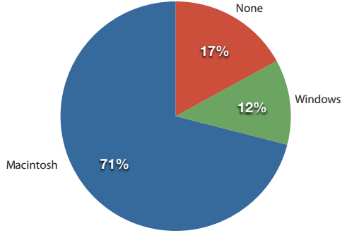
In a pie chart, each category is represented by a slice of the pie. The area of the slice is proportional to the percentage of responses in the category. Although most iMac purchasers were Macintosh owners, Apple was encouraged by the 12% of purchasers who were former Windows users, and by the 17% of purchasers who were buying a computer for the first time (Figure 4.2.2).
A standard circular pie chart divided into three slices showing previous computer ownership among iMac buyers. The largest slice represents previous Macintosh owners at 71%, followed by buyers who previously owned no computer at 17%, and former Windows users making up the smallest slice at 12%.
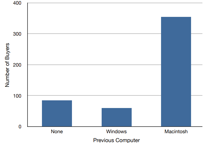
Bar charts can also be used to represent frequencies of different categories. A bar chart of the iMac purchases is shown in Figure 4.2.3. Frequencies are shown on the vertical axis and the type of computer previously owned is shown on the horizontal axis. Typically, the vertical axis shows the number of observations in each category rather than the percentage of observations in each category as is typical in pie charts.
A vertical bar chart displaying the frequency of iMac purchases based on previous computer ownership. The horizontal axis lists three categories: None, Windows, and Macintosh. The vertical axis measures the number of buyers, ranging from 0 to 400. The bar for Macintosh is the tallest at 355 buyers, followed by None at 85 buyers, and Windows at 60 buyers.
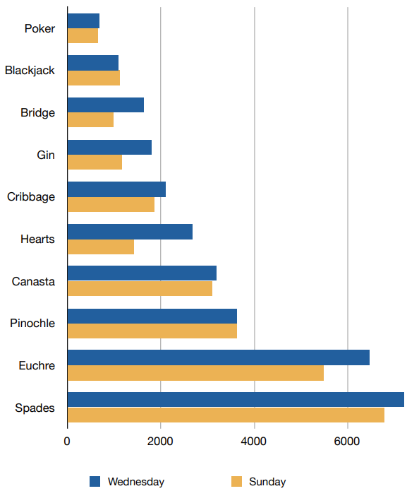
Often we need to compare the results of different surveys, or of different conditions within the same overall survey. Bar charts are often excellent for illustrating differences between two distributions. Figure 4.2.4 shows the number of people playing card games at the Yahoo website on a Sunday and on a Wednesday in the spring of 2001. We see that there were more players overall on Wednesday compared to Sunday. The number of people playing Pinochle was nonetheless the same on these two days. In contrast, there were about twice as many people playing Hearts on Wednesday as on Sunday. Facts like these emerge clearly from a well-designed bar chart.
Here the bars are oriented horizontally rather than vertically. The horizontal format is useful when you have many categories because there is more room for the category labels.
A horizontal bar chart comparing player counts for various card games on Sunday (represented in yellow) and Wednesday (represented in blue). The horizontal axis indicates player volume, scaled from 0 to over 7,000, while the vertical axis lists ten card games ordered by overall popularity from top to bottom.
Poker and Blackjack record the lowest participation, with fewer than 1,000 players each and minimal difference between days. Bridge and Gin show moderate increases, with Wednesday participation visibly exceeding Sunday’s. Cribbage centers around 2,000 players per day. Hearts shows a notable contrast, with Wednesday participation (approximately 3,000 players) nearly doubling Sunday’s total. Canasta and Pinochle reach mid-tier volumes, with Pinochle showing equal turnout for both days at approximately 3,500 players. Euchre and Spades draw the largest audiences by a wide margin: Euchre ranges from 5,500 on Sunday to 6,300 on Wednesday, while Spades peaks as the most played game, reaching about 6,600 players on Sunday and over 7,000 on Wednesday.
Ahistogram is a graphical method for displaying the shape of a distribution. Histograms are particularly useful when there are a large number of observations. We begin with an example consisting of the scores of 642 students on a psychology test. The test consists of 197 items, each graded as “correct” or “incorrect.” The students’ scores ranged from 46 to 167.
The first step is to create a frequency table. Unfortunately, a simple frequency table would be too big, containing over 100 rows. To simplify the table, the range of scores was broken into intervals, called class intervals. The first interval is from 39.5 to 49.5, the second from 49.5 to 59.5, etc. Next, the number of scores falling into each interval was counted to obtain the class frequencies.
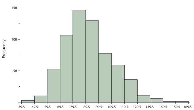
Next, we put this data into a histogram (Figure 4.2.5). The class frequencies are represented by bars, where the height of each bar corresponds to its class frequency.
A vertical histogram illustrating the distribution of student scores on a psychology test. The horizontal axis represents test scores divided into 10-point class intervals ranging from 39.5 to 169.5. The vertical axis measures student frequency, scaled from 0 to 150.
The distribution is right-skewed, rising sharply from low frequencies at the low end to a prominent peak in the middle before tapering off gradually across a long upper tail:
The lowest interval (39.5–49.5) contains only 2 to 3 students. Frequencies increase rapidly in subsequent bins, with approximately 12 students in the 49.5–59.5 range, 50 in 59.5–69.5, and just over 100 in 69.5–79.5. The distribution reaches its peak in the 79.5–89.5 interval at nearly 150 students. Beyond the peak, frequencies steadily decline: just over 125 students in 89.5–99.5, around 75 in 99.5–109.5, 60 in 109.5–119.5, 35 in 119.5–129.5, 15 in 129.5–139.5, and 8 in 139.5–149.5. The final two high-score intervals each contain only a single student.
The histogram makes it plain that most of the scores are in the middle of the distribution, with fewer scores in the extremes. You can also see that the distribution is not symmetric: the scores extend to the right farther than they do to the left. The distribution is therefore said to be skewed to the right. If the opposite was true, the distribution would be left-skewed.
Subsection4.2.5Frequency Polygons and Cumulative Polygons
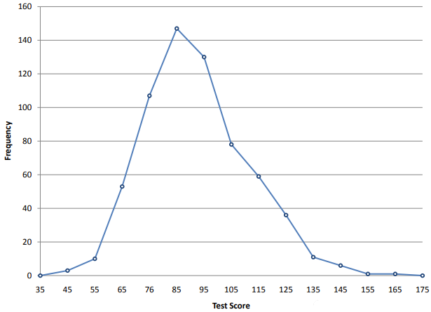
Frequency polygons serve the same purpose as histograms, but are especially helpful for comparing sets of data. They are also a good choice for displaying cumulative frequency distributions.
A line-based frequency polygon displaying the distribution of psychology test scores. The horizontal axis is labeled with score points from 35 to 175 in increments of 10, while the vertical axis represents student frequency scaled from 0 to 160.
The line tracks the exact same right-skewed pattern as the histogram: starting near zero at 35, rising sharply through 45, 55, and 65 to reach a peak of nearly 150 students at 85, and then steadily descending through 95, 105, and 115 before tapering off near zero between 145 and 175.
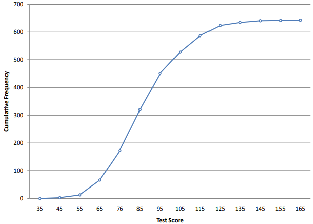
A cumulative frequency polygon for the same test scores is shown in Figure 4.2.7. The graph is similar to the frequency polygon except that the vertical value for each point is the number of students in the corresponding interval plus all numbers in lower intervals. For example, there are no scores in the interval labeled “35,” three in the interval “45,” and 10 in the interval “55.” Therefore, the vertical value corresponding to “55” is 13. Since 642 students took the test, the cumulative frequency for the last interval is 642.
A line graph displaying the cumulative frequency distribution of psychology test scores. The horizontal axis lists test scores labeled from 35 to 165, while the vertical axis represents total accumulated student frequency marked in increments of 100 up to 700.
Starting near zero at a score of 35, the curve stays below the 100-mark through scores 45, 55, and 65. It then climbs steeply through the most common score range, crossing above 150 near score 75, passing 300 by score 85, and hitting 450 around 95. Above 95, the upward trajectory slows down as it crosses 500, steadily flattening out as it approaches its total count of just over 600 near score 165.
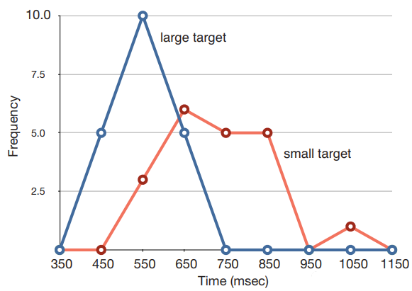
Frequency polygons are useful for comparing distributions. This is achieved by overlaying the frequency polygons drawn for different data sets. The data in Figure 4.2.8 comes from a task in which the goal is to move a computer cursor to a target on the screen as fast as possible. On 20 of the trials, the target was a small rectangle; on the other 20, the target was a large rectangle. Time to reach the target was recorded on each trial. The two distributions (one for each target) are plotted together. The figure shows that, although there is some overlap in times, it generally took longer to move the cursor to the small target than to the large one.
An overlayed line graph comparing movement time distributions (in milliseconds) for two different target sizes: a large target (represented by a blue line) and a small target (represented by a red line). The horizontal axis measures time in milliseconds from 350 to 1150 in 100-msec intervals, while the vertical axis measures frequency from 0 to 10 in increments of 2.5.
The blue curve for the large target sits further to the left, indicating faster movement times. It begins at 0 at 350 msec, rises rapidly to a peak frequency of 10 at 550 msec, and drops back to 0 by 750 msec.
In contrast, the red curve for the small target is shifted further to the right, showing longer movement times. It remains at 0 through 450 msec, rises to a peak around 650 msec, and maintains moderate frequencies between 650 and 850 msec before tapering off and reaching zero near 1150 msec.
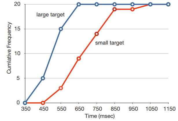
An overlayed line graph showing the cumulative frequency distributions of movement times (in milliseconds) for large targets (blue line) and small targets (red line). The horizontal axis measures response time in milliseconds from 350 to 1150, while the vertical axis measures total accumulated trials from 0 to 20.
The blue curve for the large target ascends steeply between 350 and 650 msec, reaching its total of 20 trials much earlier. In contrast, the red curve for the small target is shifted to the right, beginning its rise around 550 msec and climbing more gradually until reaching 20 trials near 1050 msec.
Once you know how to read a distribution, you can easily summarize a mountain of raw numbers using just its visual shape, its center (averages), and its spread (variation). But looking at one variable at a time only tells us half the story. In the next section, we will look at pairs of data to see how they move together. We will learn how to spot trends, measure how closely two things are linked, and explore correlation versus causation.
Checkpoint4.2.10.Frequency Polygon and Cumulative Frequency Polygon.
A researcher administers a math proficiency test to 800 students. The test scores range from 0 to 200. The researcher creates a histogram with class intervals of 10 points (e.g., 39.5–49.5, 49.5–59.5, etc.) and observes that the distribution is skewed to the left. The researcher then creates a frequency polygon and a cumulative frequency polygon from the same data.
The frequency polygon will peak in the interval 39.5–49.5, while the cumulative frequency polygon will rise most steeply in the interval 149.5–159.5.
If a distribution were skewed to the right, the peak would be on the left (lower values) and the tail would stretch to the right. How does left-skew differ from that?
The frequency polygon will peak in the interval 149.5–159.5, while the cumulative frequency polygon will rise most steeply in the interval 149.5–159.5.
Correct! In a left-skewed distribution, the data are concentrated on the right (higher scores), so the frequency polygon peaks in the higher interval. The cumulative frequency polygon rises most steeply where the frequency is highest, which is also in that same higher interval.
The frequency polygon will peak in the interval 149.5–159.5, while the cumulative frequency polygon will rise most steeply in the interval 39.5–49.5.
If the cumulative frequency polygon rises most steeply in a particular interval, that means many data points are being added in that interval. Would you expect that to happen in a low-frequency interval or a high-frequency interval?
The frequency polygon will peak in the interval 39.5–49.5, while the cumulative frequency polygon will rise most steeply in the interval 39.5–49.5.
In a left-skewed distribution, the tail is on the left. Is a peak also on the tail, or is the peak somewhere else? Where would a left-skewed distribution’s peak be located?