
Motivating Scatterplots
Weather is something that changes based on location. Cities closer to the north and south pole are generally pretty cold, while cities close to the equator are generally pretty warm. But what if you wanted to quantify this relationship in order to make specific predictions? Instead of saying “cities are generally colder closer to the north pole,” you could say, “as latitude increases by 10 degrees, temperature decreases by 20 degrees.”
Given the following dataset with latitude, longitude, and weather data for different cities in the United States, you can use histograms to plot latitudes and temperatures independently as shown below.
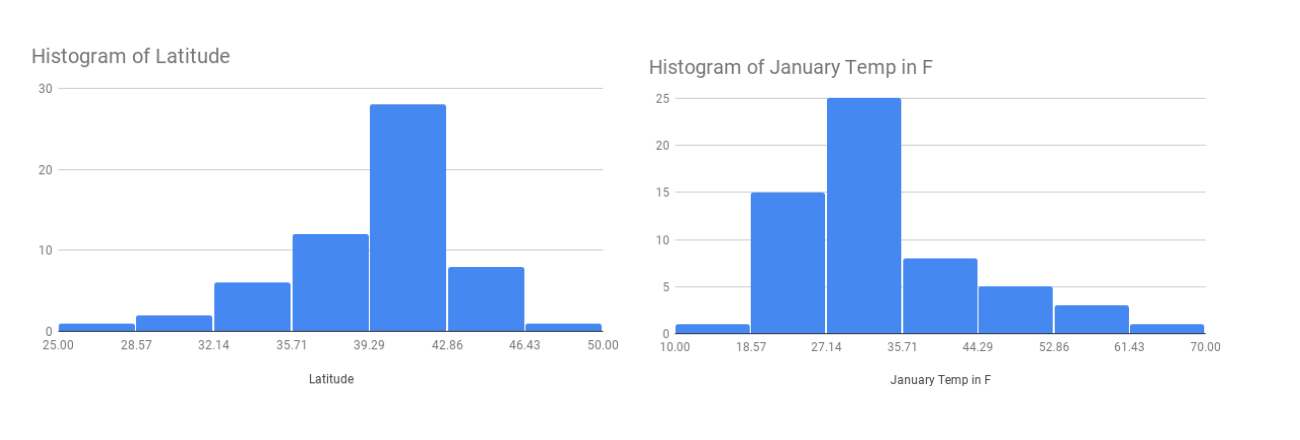
Notice that this shows you the distribution of each variable alone, but tells you nothing about the overall relationship between latitude and temperature. How can you investigate the relationship with the tools you have?
Since you know that temperature is related to location, you could group the cities based on their latitude, and then compare the mean temperature for each group. Comparing the means for each group will quantify if and how much latitude impacts temperature.
A latitude closer to 0 degrees means a city is closer to the equator, and a latitude closer to 45 degrees means a city is closer to the poles. For cities in the northern hemisphere, like those in the USA, smaller latitudes indicate southern cities, and larger latitudes indicate northern cities. See here for a map of the USA with latitude and longitude lines.
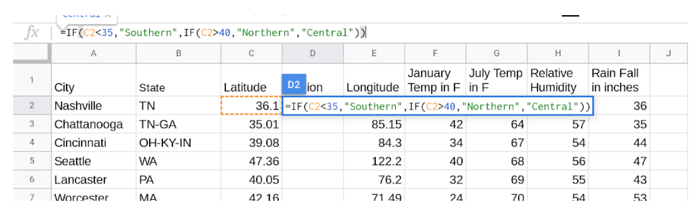
You can split up cities in the United States into three regions, “Northern,” “Southern,” and “Central” to more easily analyze the data. Most cities in the continental states are between 25 and 50 degrees, so to group these, you can label cities south of 35 degrees latitude “Southern”, cities north of 40 degrees latitude “Northern,” and those in the middle “Central.” This choice is somewhat arbitrary, but it breaks the cities into three fairly even groups.
Break down these cities into these three separate groups by using the IF
function. Add a new column labelled location. Then create a formula as shown in
the screenshot below to group the cities.
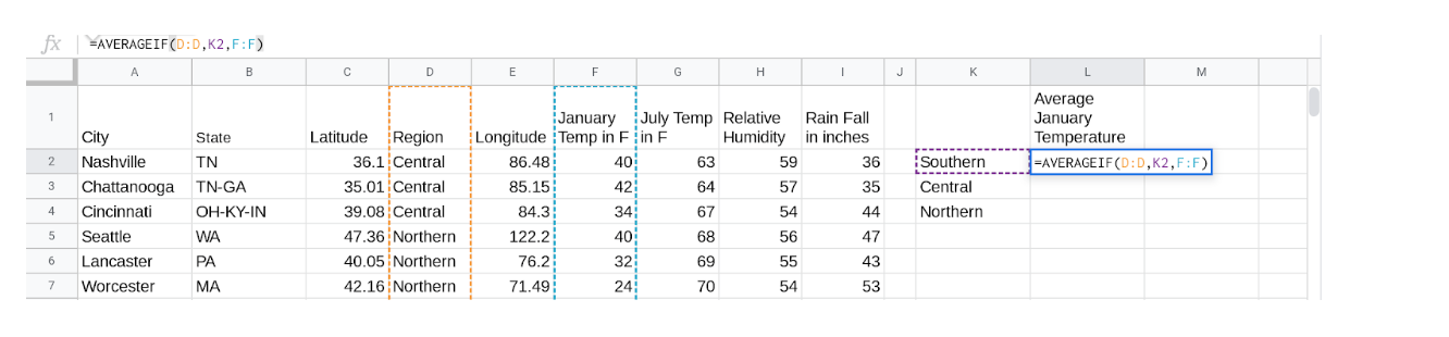
Which region do you think will have the highest January temperatures? What about
the lowest July temperatures? Now, double check your predictions by finding the
mean temperatures of each of the three regions. You can do this by using the
AVERAGEIF function (from the section on grouping).
Now that you have found the mean temperature answer the following questions:
36
-
Correct
20
-
Incorrect
27
-
Incorrect
33
-
Incorrect
Q-1: What was the mean January temperature for cities in the Central region? (Rounded to the nearest whole number)
75
-
Correct
71
-
Incorrect
68
-
Incorrect
77
-
Incorrect
Q-2: What was the mean January temperature for cities in the Central region? (Rounded to the nearest whole number)
Northern
-
Correct
Central
-
Incorrect
Southern
-
Incorrect
Q-3: Which region has the largest difference between its January mean temperature and its July mean temperature?
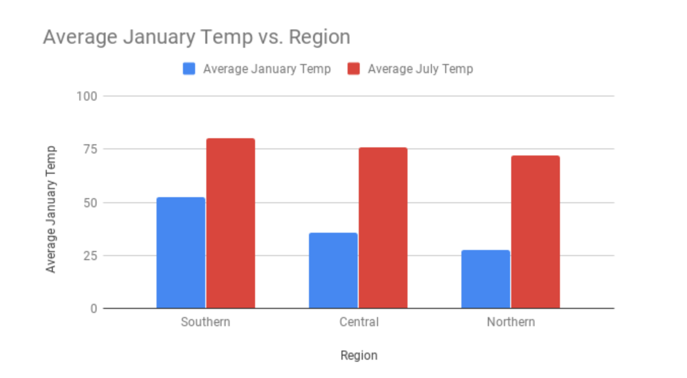
Functions like AVERAGEIF are a great way to calculate the mean for a
specific region and/or month. But what if you want to see, in one visualization,
the mean temperature for January and July across all regions? To do this, you
can use a bar chart.
January
-
Correct
July
-
Incorrect
Q-4: Looking at the visualization, which month has a bigger regional difference in temperatures?
Although the above method is useful to determine the mean temperatures of different regions in the United States, it is not the most accurate since it applies over the whole region. For example, take the two cities Dayton, Ohio and Memphis, Tennessee. Both of these cities are in the Central region, but Dayton has a latitude of 39.54 degrees, while Memphis has a latitude of 35.07 degrees, which are quite different. Based on what you’ve learned, you could probably make an educated guess about which of these locations are colder in January, but how could you get a better prediction of what the temperature may be? This is where scatterplots will come in handy.