
Introduction
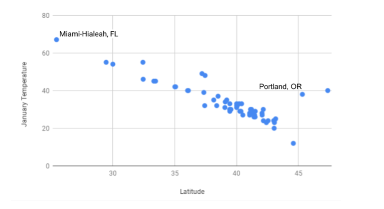
You have already learned about histograms and bar charts, which are data visualizations that are useful for understanding data. However, sometimes these visualizations are not the most intuitive for looking at individual pieces of a larger data set. This is where scatter plots come in. Scatter plots are a type of data visualization that show the relationship between two quantitative variables. An example of a scatter plot is shown below. As you can see in the screenshot, each data point is plotted individually onto a graph. By organizing data this way, it becomes easier to understand trends in larger data sets.
In this section, you will learn how to create, read, and analyze scatter plots. You will first begin by working through an example to see why scatter plots are useful.