
Creating a Scatter Plot in Sheets
In this section, you will learn how to make a scatter plot in Sheets. You will work with the temperature data. Latitude will be the explanatory variable, and July mean temperature will be the explained variable.
How to make a scatter plot
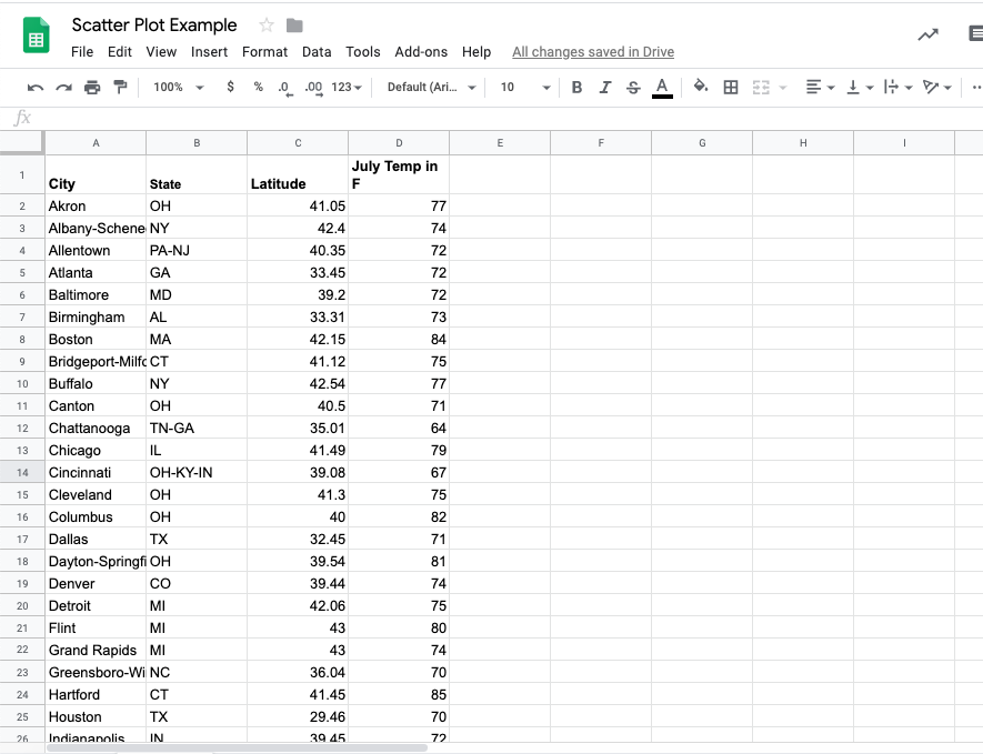
First, copy over the city, state, latitude and July mean temperature columns from the weather data here into a new sheet.
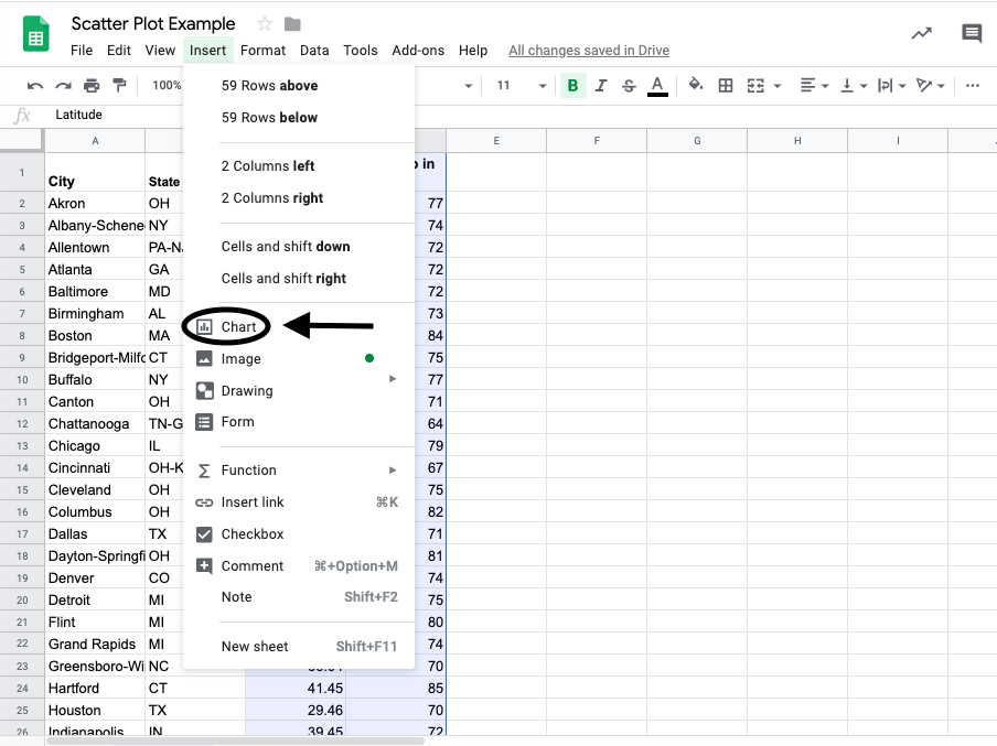
Afterwards, select the two columns containing the latitude and mean temperature data then click “Insert > Charts.”
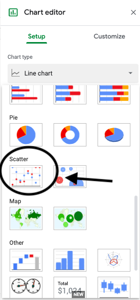
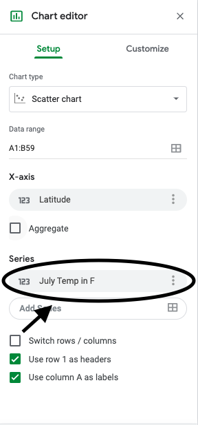
Then in the chart editor click “Setup > Chart type > Scatter.”
Sometimes Sheets will correctly assign the columns to be either the explanatory variable or the explained variable, but it is always good to know how to manually assign them.
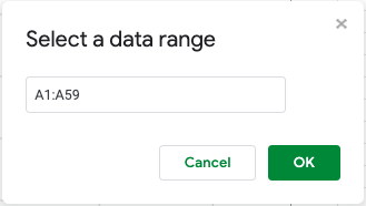
Go to “Chart Editor > X-axis > Edit ” to choose which column of data will be the explanatory variable.
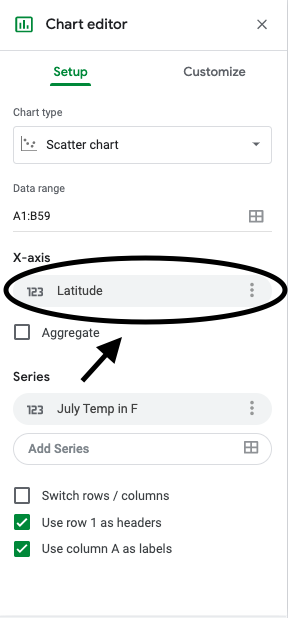
Then put in the range of cells where you put the latitude data (the explanatory variable).
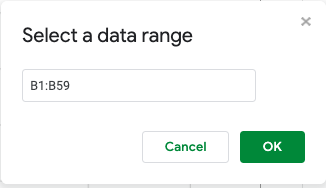
To choose which column of data will be the explained variable, you will go through a similar process. Go to “Chart Editor > Series > Edit.”
Then put in the range of cells where you put the weather data (the explained variable).
To add a title, go to “Chart Editor > Customize > Title.”
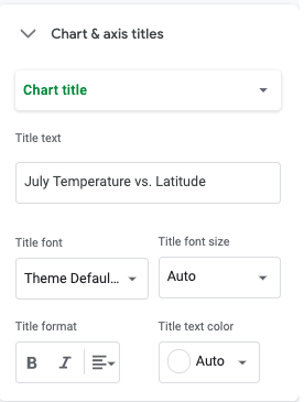
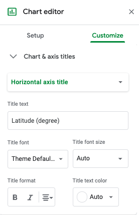
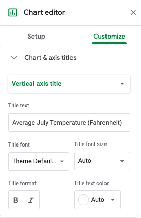
To choose the horizontal and vertical axis labels, go to “Chart Editor > Customize > Chart & axis title.”
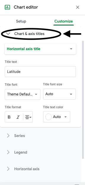
Then select “Horizontal axis title” and “Vertical axis title” respectively to add a descriptive horizontal axis label and a descriptive vertical axis label.
You now have a scatter plot for latitude versus July mean temperature. Using the scatter plot, answer the questions below.
Q-1: What city represents the point furthest to the right on the scatter plot?
Q-2: What city represents the point closest to the y-axis on the scatter plot?