
Outliers
As you saw in Module A, some statistics are very sensitive to extreme values, also called outliers. This is also true for lines of best fit. One outlier can significantly change what the line of best fit is for a graph.
You can see this very clearly by returning to the scatter plot of mean January temperature and latitude for US cities. Here’s what that graph looked like:
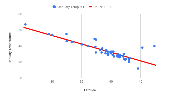
First you should note the slope of this graph before an outlier is added. The slope of this line is \(-2.1x + 116\). You can practice interpreting what slope means by answering the following question:
Drops by -2.1 degrees
-
Incorrect
Drops by 2.1 degrees
-
Correct
Drops by 116 degrees
-
Incorrect
Drops by 1 degree
-
Incorrect
Q-1: Fill in the blank by interpreting the slope: When the latitude increases by 1, the predicted January temperature __.
This line fits the data well, and the correlation coefficient between the two variables is -0.85, so any predictions are likely to be reliable.
Now compare this to what happens when you add a data point for Juneau, Alaska, where the average January temperature is 31 degrees. Also imagine that there was a data entry error and someone entered 331, rather than 31. Here’s what the graph with the added outlier (the green dot) looks like:
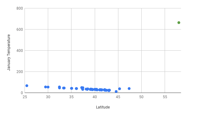
Looking at the scatter plot above, it’s easy to identify the outlier because it’s visually far removed from all of the other data points. Outlier identification makes scatter plots a good place to start when analyzing quantitative data. If you find a data point that looks far from others like the one for Juneau, it’s a good idea to investigate. It’s reasonable to guess that there wouldn’t be cities that are so unusual and so far outside the line of best fit. Now imagine you find the line of best fit and create the following graph:
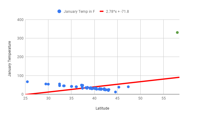
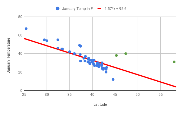
Once you’ve calculated the line of best fit and include the outlier of Juneau, the line of best fit is way off. The slope is now positive and the correlation coefficient has gone from -0.85 to 0.43! Correlation coefficients and lines of best fit are very sensitive to outliers. Now, imagine you’ve fixed the Juneau data point to create the following graph:
The line of best fit will have a steeper slope, and the correlation coefficient will be closer to 0.
-
Incorrect
The line of best fit will have a shallower slope, and the correlation coefficient will be closer to 0.
-
Incorrect
The line of best fit will have a steeper slope, and the correlation coefficient will be closer to -1.
-
Correct
The line of best fit will have a shallower slope, and the correlation coefficient will be closer to -1.
-
Incorrect
Q-2: If Juneau, Portland, and Seattle are excluded (all cities with fairly high January temperatures in the Northern region, indicated in green on the scatter plot above) from the dataset, what do you think will happen to the line of best fit and the correlation coefficient?
You’ve seen that the line of best fit is very useful for making predictions and for understanding the relationship between two variables. Here are some important considerations to keep in mind.
To ensure that your predictions are accurate, make sure you aren’t extrapolating. For example, if all of your cities have a latitude between 25 and 45 degrees, a prediction made about a city at 12 degrees won’t be very accurate.
Be careful if your dataset contains outliers as lines of best fit are very sensitive to extreme values. Even one outlier can change the direction of the line of best fit and dramatically reduce the \(r^2\) value. For example, if the January temperature for Boston is accidentally recorded as 678 degrees, the line of best fit won’t fit the rest of the data, and won’t be useful for making predictions.
Report relationships between variables without assigning causation. For example, you can’t state that increased latitude causes lower January temperature, but you can say that there is a strong relationship between latitude and temperature, and that greater latitudes are associated with lower January temperatures.