
Non-Linear Regression
Up to this point you’ve only fit straight lines to data, but Sheets can fit other trendlines to data as well, including exponential, polynomial, logarithmic and more. You can access these other options from the chart editor.
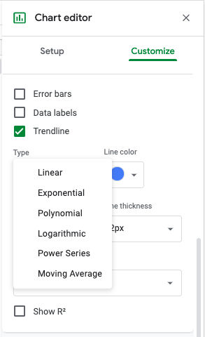
To change the type of a trendline in sheets you can go to “Chart Editor” > “Customize Menu” > “Series,” and after checking the trendline option, you can select “Type.” Then you will see a dropdown menu with different types of trendlines.
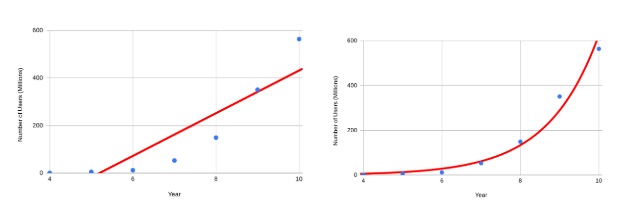
For example, the number of users of a certain popular website grew dramatically between 2004 and 2010. In this case, the linear trendline, on the left, does not fit the exponential growth seen in number of users. The exponential curve, on the right, fits this example much better.
You should be careful when choosing trendline type. For example, a polynomial curve can be fit to the latitude and January temperature data.
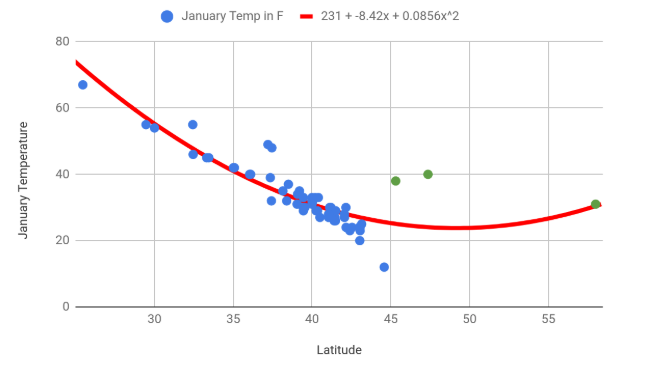
But, in this case, switching to a polynomial curve doesn’t help explain the relationship between latitude and January temperature since the temperature should get colder as the latitude of the city increases, not warmer as the curve indicates. This curve, like the line of best fit, is sensitive to the outlier of Juneau, which is much further north than the other cities. It is better to first try linear regression and check if it fits the data, before moving on to non-linear regression.
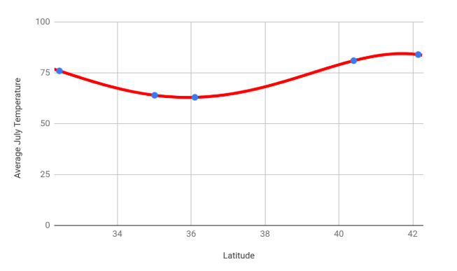
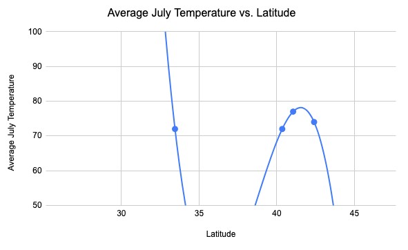
Overfitting is when your predictive line or curve fits too closely to a particular set of data, and may not make reliable predictions for other sets of data. For example, consider a set of temperature and latitude data with only five cities. When looking at only these five data points, the trend seems curved, and this fourth degree polynomial curve fits nicely!
But as more cities are added in, it becomes apparent that this trendline doesn’t fit new cities at all. The polynomial curve was overfit to the data, and a linear regression line would have predicted the other cities better. This can be seen below when comparing the top and bottom graph.
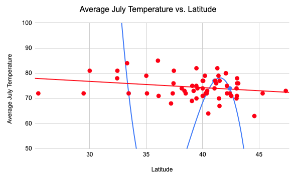
The complete set of July temperatures, in red, has a strong, linear trend. The dataset with only five cities appeared to have a curve because the number of cities was so small. When you only have a few data points in your sample, you can always find a polynomial curve that passes through that small number of points. But these curves often don’t describe the larger collection of numbers any better than a straight line. Unless you have a good reason to think the data should be curved (for example, if you have some domain knowledge which predicts a polynomial relationship), a straight line is the best choice.