
Creating a Line of Best Fit
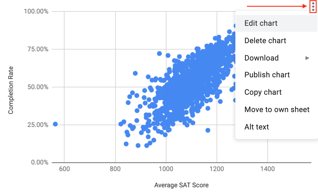
In order to analyze a line of best fit for a scatter plot, you will first need to make one. You can do this in Sheets through an option in the chart editor. After making a scatter plot, you can add a line of best fit by opening the chart editor by clicking the three dots in the top right corner.
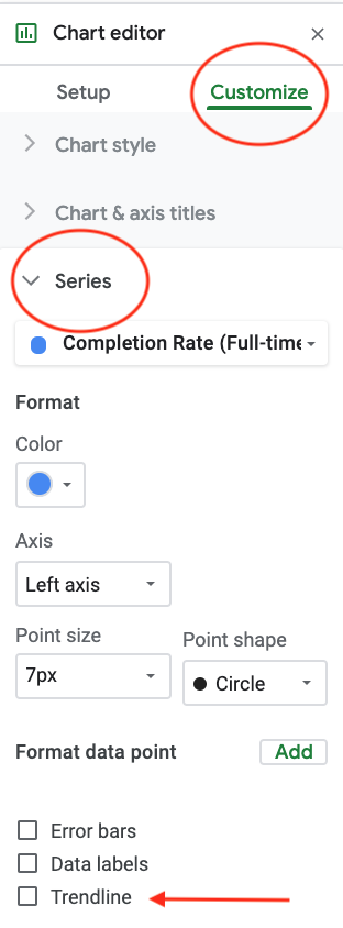
Once the chart editor is open, make sure customize is selected. Under “Series”, there is a checkbox to add a trendline. You can change the color and thickness of the line, display the \(R^{2}\) value, (this is the same as the coefficient of determination), and display the equation of the line.
Once you have added a trendline, it will appear on your graph.
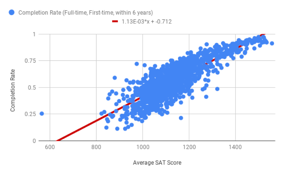
Now that there is a trendline and equation of a line on the graph, you can use this information to analyze data and predict results given your data. In particular you can use the slope and y-intercept. Don’t worry if you don’t remember how to find this information from the equation of a line, the next section will guide you through this.