
8.6. Graphing Relationships Between Data
One thing that we might expect to come out of a bunch of people at the United Nations making speeches is that one country might mention another country. In fact, this probably happens quite frequently. In this section, we are interested in how we might visualize the relationship of one country talking about another country. We will do this in two ways: first as a “heatmap”, second as a graph.
8.6.1. Preparing the Data
Both of these visualizations rely on us processing the data in the speeches, to create pairs of countries based on one country mentioning the other in a speech. In fact, what we are going for will be a table that looks like this.
speaking_c |
referenced_c |
ref_count |
USA |
CAN |
1234 |
USA |
KOR |
987 |
The columns are:
speaking_c: The country doing the speakingreferenced_c: The country that is referencedref_count: The number of times a reference is made over all of the speeches
When we are all done, we will put them together into a matrix that will have the country codes as the rows. The columns and the cells will contain the count of the number of references.
This project might sound a bit ambitious to tackle all at once, so it’s probably a good idea to limit the number of countries and the number of years to something more manageable, and more importantly, something we can check by hand. So, let’s limit our countries to the United States, Canada, Cuba, and Mexico for the years 2014 and 2015. The corresponding three-letter country codes are USA, CAN, CUB, and MEX.
Next, we’ll want to combine all of the speeches made by each country into one long string. You can arrange it so that the index of the resulting series is the three-letter country code.
Of course, countries do not refer to each other in speeches by their country codes, so you will want to add country name as a new column to the DataFrame. By now, you know of many sources for country codes, so I’ll leave that to you to choose whatever strategy you want to add country name.
At this point, you should have a DataFrame that looks like this.
| text | country | |
|---|---|---|
| code | ||
| CAN | It is both \nan honour and a pleasure for me t... | Canada |
| CUB | We live in a globalized world that is moving t... | Cuba |
| MEX | As \nPresident of Mexico, it is a high honour ... | Mexico |
| USA | We come together at a \ncrossroads between war... | United States of America |
You might think that counting the number of times Mexico refers to Cuba will be hard, but it is actually fairly straightforward, with only one line of code. See if you can think of it before looking at the solution.
test_cases.loc['MEX'].text.count('Cuba')
What about counting the number of times that ALL the countries mention Cuba?
Your first thought might be to write a for loop, but you don’t need to do that.
(Remember the str object that we can use with a Series.)
The answer should look like this.
code
CAN     0
CUB    27
MEX     3
USA     7
Name: text, dtype: int64
This tells us that Canada did not mention Cuba at all in 2014 or 2015. Cuba referred to itself 27 times, Mexico referred to Cuba 3 times, and the United States referred to Cuba 7 times.
This feels like we are almost there! If we can convert the above result into a
DataFrame, and add CUB as the referenced_c, column we could repeat this for
each country and concatenate all of the small DataFrames together into one large
DataFrame.
Hint: Use pd.concat. Contrary to previous advice, it is very difficult to do
this without iterating over the rows of the data frame. If you can do it without
a for loop, please tell your instructor!
Your initial result should look like this.
| text | referenced_c | |
|---|---|---|
| code | ||
| CAN | 40 | CAN |
| CUB | 0 | CAN |
| MEX | 0 | CAN |
| USA | 0 | CAN |
| CAN | 0 | CUB |
| CUB | 27 | CUB |
| MEX | 3 | CUB |
| USA | 7 | CUB |
| CAN | 0 | MEX |
| CUB | 0 | MEX |
| MEX | 20 | MEX |
| USA | 0 | MEX |
| CAN | 0 | USA |
| CUB | 2 | USA |
| MEX | 0 | USA |
| USA | 1 | USA |
Admittedly, this table is a bit hard to read in this format. It is much easier to read if we use our pivoting skills to make a table like this.
| referenced_c | CAN | CUB | MEX | USA |
|---|---|---|---|---|
| speaking_c | ||||
| CAN | 40 | 0 | 0 | 0 |
| CUB | 0 | 27 | 0 | 2 |
| MEX | 0 | 3 | 20 | 0 |
| USA | 0 | 7 | 0 | 1 |
Challenge: Another way to go about this is to start by creating a DataFrame that looks like this.
| code_3 | CAN | CUB | MEX | USA |
|---|---|---|---|---|
| code_3 | ||||
| CAN | 40 | 0 | 0 | 0 |
| CUB | 0 | 27 | 3 | 7 |
| MEX | 0 | 0 | 20 | 0 |
| USA | 0 | 2 | 0 | 1 |
You will notice that this is flipped from our original, but we can easily fix that later. The challenge is to see if you can do it with just three lines of code.
Check Your Understanding
8.6.2. Visualizing the Relationships with a Heatmap
We will now look at a way to get a better visual representation of the table we have built, first using a heatmap and then using a graph.
The result we are after for our 2014, 2015 dataset looks like this.
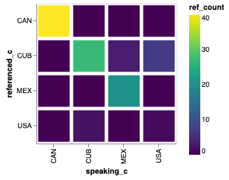
With the narrow representation of the data, it is easy to have Altair make a
heatmap using using a mark_bar and encoding y axis as the speaking_c,
the x axis as the referenced_c, and the color as ref_count.
alt.Chart(narrow_test, height=200, width=200).mark_rect().encode(
    x='speaking_c:O',
    y='referenced_c:O',
    color='ref_count:Q'
)
The graph immediately visualizes that very few countries seem to reference the United States. This seems a bit strange…
Q-3: Can you explain why the United States has so few references? Is it a bug in our code? Is there something else going on? How can we fix it?
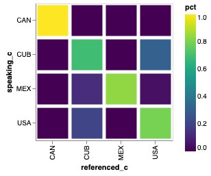
Another issue that the graph brings up is the problem with using the raw counts. Some countries are quite wordy, and others are less so, therefore it would be better to keep track of the percentages. That is, of all the countries referenced, Mexico references itself 87% of the time and Cuba 13% of the time.
Let’s iterate on this analysis and see what we learn.
Update the country name for the USA to be United States instead of United States of America.
Make the values for each country percentage based.
Your new heatmap should look like this.
Now, try to make your heatmap for these countries across all years, then move on to making a heatmap for all countries across all years.
If you inspect the data, you will see that many of the problem country names
follow a pattern of name (something in parens). You can fix a
bunch of these by replacing the name that has the parentheses with just the
name. The str.extract function will be really useful to solve this.
To make a graph of all of the countries is a little overwhelming. So you may want to narrow it down to a group of approximately 12 related countries, just to get something a little more interesting and interpretable. For example, use one of our earlier datasets to get all of the three-letter country codes for countries in the same region.
You should also take a moment to step back and reflect on how we have built this in an incremental fashion, but how it continues to work at full scale. This is a very satisfying part of programming and data analysis! You have to enjoy your victories while you can.
8.6.3. Visualizing the Relationships with a Graph
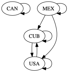
The good news is that we have already done most of the hard work in the last section. This section will be all about how we can visualize that work in a different way. For this visualization, we are going to represent each country with a circle, and when one country talks about another, we’ll represent that by a line between the two circles. Our small example would look like this.
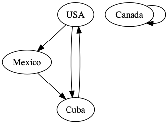
The arrows on the graph indicate which country is referencing another country. Formally, we call the ovals with the country names nodes, and the arrows connecting them edges. One of the most common ways that computer scientists and mathematicians represent a graph is called an adjacency matrix. Don’t worry if this sounds daunting, you have actually already built an adjacency matrix!
| referenced_c | CAN | CUB | MEX | USA |
|---|---|---|---|---|
| speaking_c | ||||
| CAN | 40 | 0 | 0 | 0 |
| CUB | 0 | 27 | 0 | 2 |
| MEX | 0 | 3 | 20 | 0 |
| USA | 0 | 7 | 0 | 1 |
In an adjacency matrix, the cells indicate if there is an edge from the row node to the column node. The values in the cells are often used to represent a weight or cost to go from one node to the other. A 0 in the cell indicates that there is no relationship.
A second common way to represent a graph is through an edge list. Our narrow
representation that we built originally for this project fits that description
perfectly. Even the names we chose for the columns (speaking_c,
referenced_c) suggest a graph like relationship.
There are two graph packages we can use: networkx and graphviz. It’s not
clear that one is preferable over the other; each has some strengths and
weaknesses and in fact they can be used together to some extent. graphviz
may be a little easier to use, since the file format is easy to edit, and can
draw pretty graphs out of the box. The graph above was drawn using graphviz.
You will need to install both networkx and graphviz on your computer.
Both packages are well documented.
Let’s look at some example code that shows how easy it was to build the graph above.
from graphviz import Digraph
g = Digraph()
g.edge('USA', 'Mexico')
g.edge('Mexico', 'Cuba')
g.edge('Cuba', 'USA')
g.edge('USA', 'Cuba')
g.edge('Canada', 'Canada')
g
Using networkx, we can build the graph directly from the DataFrame, but the
graph produced is not very aesthetically pleasing.
g = nx.from_pandas_edgelist(narrow_test[narrow_test.ref_count > 0],
                        'speaking_c',
                        'referenced_c',
                        edge_attr='ref_count',
                       create_using=nx.DiGraph)
pos = graphvix_layout(g)
nx.draw(g, pos)
nx.draw_networkx_labels(g, pos)
The above produces a rather unattractive graph.
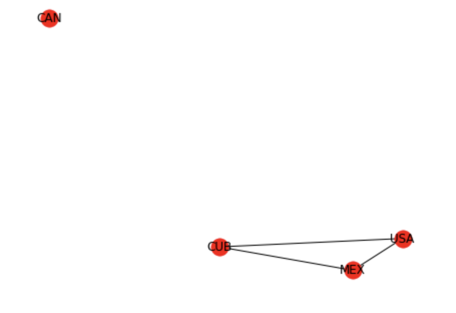
The graph is missing the arrows, the text doesn’t fit, and the bright red is a
bit alarming for no good reason. The layout is also not very easy to understand.
We can immediately do much better by saving the graph we created with
networkx as a dot file and then reading it back again and letting
graphviz render the graph for us.
from networkx.drawing.nx_agraph import write_dot
from graphviz import Source

write_dot(g, 'mydots.dot')
s = Source.from_file('mydots.dot')
s
This produces a much nicer looking graph.
As with many tools, it’s easy to get 80% done in a pretty quick way, but if you want to make a graph worthy of a polished presentation, that last 20% can take some work. If we want to clean up the labels on the nodes to use the real names of the countries and add labels to the edges, we’ll have to combine what we have learned from the above examples and add our edges to a graphviz graph manually.
Pick a subregion to focus on, and build a graph where you label the edges with the fraction of times mentioned, using the real name of the country as the title of each node.
8.6.4. Projects for Further Exploration
Graph visualizations also lend themselves to literature. Check out this visualization of the interactions between the characters in the Lord of the Rings. You could make a similar visualization of a book. Project Gutenberg offers over 58,000 books that you are free to use for nearly any purpose.
Since graphing each country of the world individually is a bit difficult, build a heatmap or graph of how the countries within each subregion reference each other. There are about 22 sub-regions in the country_codes data file, which is quite manageable.
Find or create a group of topics and build a heatmap or a graph to visualize which countries or regions are most interested in those topics. We are defining “interest” to be somehow related to the number of times those topics come up in their UN speeches.
Challenge: A chord diagram is another great way to visualize relationships. Create a chord diagram to visualize the relationships between countries.
Lesson Feedback
-
During this lesson I was primarily in my...
- 1. Comfort Zone
- 2. Learning Zone
- 3. Panic Zone
-
Completing this lesson took...
- 1. Very little time
- 2. A reasonable amount of time
- 3. More time than is reasonable
-
Based on my own interests and needs, the things taught in this lesson...
- 1. Don't seem worth learning
- 2. May be worth learning
- 3. Are definitely worth learning
-
For me to master the things taught in this lesson feels...
- 1. Definitely within reach
- 2. Within reach if I try my hardest
- 3. Out of reach no matter how hard I try