
6.4. Degree
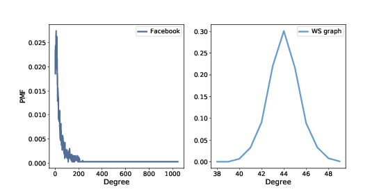
Figure 6.1: PMF of degree in the Facebook dataset and in the WS model.
If the WS graph is a good model for the Facebook network, it should have the same average degree across nodes, and ideally the same variance in degree.
This function returns a list of degrees in a graph, one for each node:
def degrees(G):
    return [G.degree(u) for u in G]
The mean degree in model is \(44\), which is close to the mean degree in the dataset, \(43.7\).
However, the standard deviation of degree in the model is \(1.5\), which is not close to the standard deviation in the dataset, \(52.4\). Oops.
What’s the problem? To get a better view, we have to look at the distribution of degrees, not just the mean and standard deviation.
We will represent the distribution of degrees with a Pmf object, which is defined in the thinkstats2 module. Pmf stands for “probability mass function”.
Briefly, a Pmf maps from values to their probabilities. A Pmf of degrees is a mapping from each possible degree, d, to the fraction of nodes with degree d.
As an example, we construct a graph with nodes \(1\), \(2\), and \(3\) connected to a central node, \(0\):
G = nx.Graph()
G.add_edge(1, 0)
G.add_edge(2, 0)
G.add_edge(3, 0)
nx.draw(G)
Here’s the list of degrees in this graph:
>>> degrees(G)
[3, 1, 1, 1]
Node \(0\) has degree \(3\), the others have degree \(1\). Now we can make a Pmf that represents this degree distribution:
>>> from thinkstats2 import Pmf
>>> Pmf(degrees(G))
Pmf({1: 0.75, 3: 0.25})
The result is a Pmf object that maps from each degree to a fraction or probability. In this example, \(75%\) of the nodes have degree \(1\) and \(25%\) have degree \(3\).
Now we can make a Pmf that contains node degrees from the dataset, and compute the mean and standard deviation:
>>> from thinkstats2 import Pmf
>>> pmf_fb = Pmf(degrees(fb))
>>> pmf_fb.Mean(), pmf_fb.Std()
(43.691, 52.414)
And the same for the WS model:
>>> pmf_ws = Pmf(degrees(ws))
>>> pmf_ws.mean(), pmf_ws.std()
(44.000, 1.465)
We can use the thinkplot module to plot the results:
thinkplot.Pdf(pmf_fb, label='Facebook')
thinkplot.Pdf(pmf_ws, label='WS graph')
Figure 6.1 shows the two distributions. They are very different.
In the WS model, most users have about \(44\) friends; the minimum is \(38\) and the maximum is \(50\). That’s not much variation. In the dataset, there are many users with only \(1\) or \(2\) friends, but one has more than \(1000\)!
Distributions like this, with many small values and a few very large values, are called heavy-tailed.