
Introduction
People often find it easier to learn visually. Colors and patterns can be easier to interpret than words and numbers. Have you ever read an article that does not include some form of picture, or graphic, or map? Visualizations make data easy to access, make articles easy to read, and make findings easy to interpret.
A data visualization is any visual representation of data. Examples include:
Tables
Line graphs
Maps
Pie charts
Infographics
In this chapter, you will learn more about when to use different visualizations and how to ensure that they effectively communicate data to your audience. To start, take a look at the visualizations below. While reviewing them, keep in mind what you like about them and what elements on them guide your understanding of their meaning.
Pie Chart
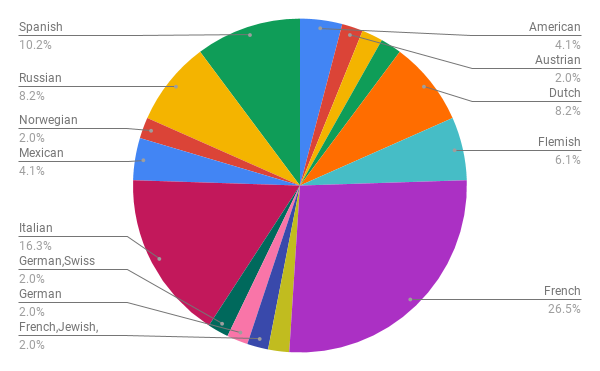
This pie chart example shows the proportion of the backgrounds for the most influential artists of their time from different countries.
Table
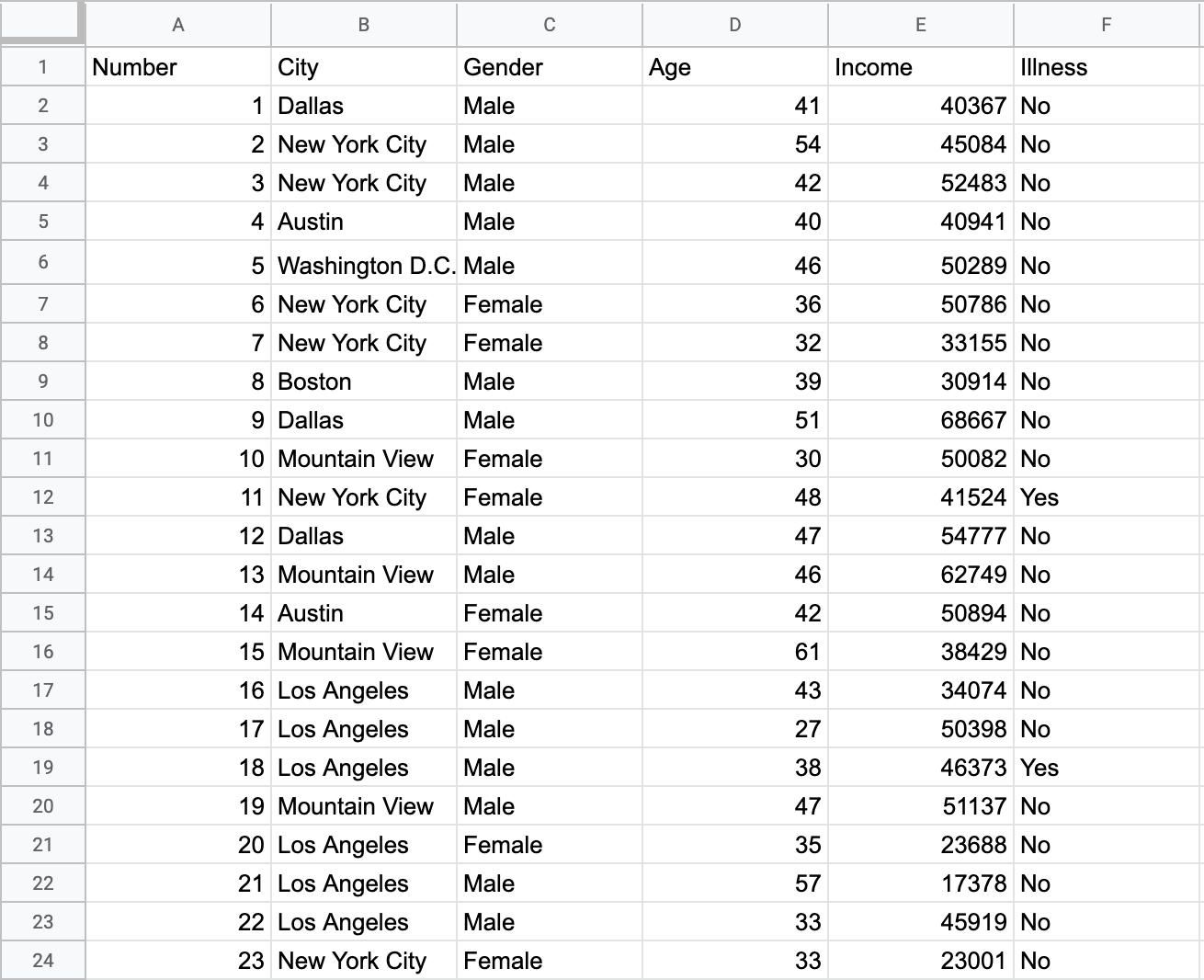
This table holds standard information about people. Each column contains data for a different category.
Bar Chart
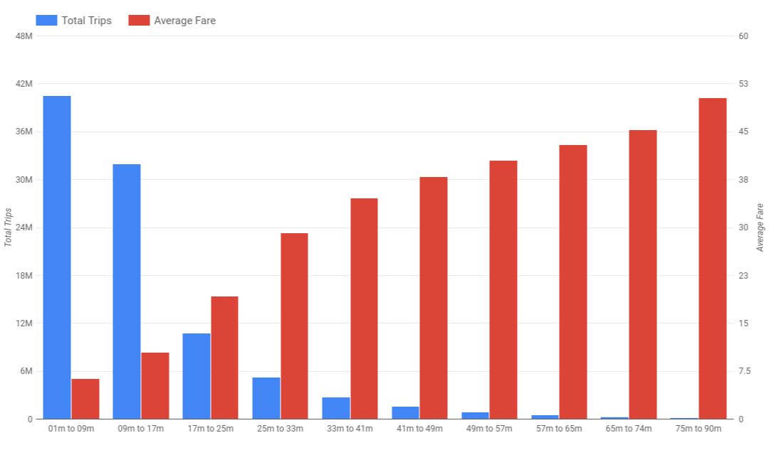
This figure holds information about the amount of trips and average fare depending on the duration of taxi rides in Chicago.