
4.5. Changing your page layout
Before we go any further it is important to stop and think a bit about how the browser renders the html into the browser window. As the browser reads each html tag, it must figure out where on the page it belongs. For the most part, the browser flows each tag from top to bottom and from left to right. As we have mentioned block elements start on a new line, and inline elements flow from left to right, fitting within the horizontal size of the page or else going on to the next line. In this section we will consider several different CSS options that have an impact on the layout of a page.
4.5.1. The CSS Box Model
All HTML elements can be thought of simply as boxes. In fact that is exactly how the browser thinks of them as it begins the process of rendering the page. When doing web page design and layout it is very common to hear designers talk about the CSS box model. Figure 1 illustrates the different components that go into the box model.
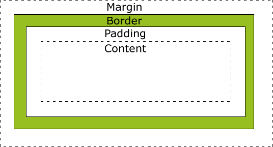
Figure used in accordance with w3schools fair use policy
The different parts of the box model are defined as follows:
Content: The actual text or image content of an html tag
Padding: The space between the content and the border.
Border: This can be an actual drawn border or it can be invisible
Margin: The space outside the border between this box and the boxes next to it in each direction.
Let’s try a simple example:
As a bit of review, add a rule to the example above to make the margin for the second Hello world to be 5px. What does this tell you about how margins work?
The size of content area itself can also be controlled using the following properties:
height
max-height
min-height
width
max-width
min-width
Each of these properties can be specified in terms of pixels (px), points (pt), or as a percentage. In addition the auto keyword can be used, which is the default and allows the browser to figure out the proper height and width.
When you use height and width with a container element, such as one of the semantic elements, it is very useful to know about the overflow property. What if you set your height so small that the content does not fit? The overflow property tells you how to handle that.
Here is an example activecode for you to experiment with:
The possible values for the overflow property are:
visible
hidden
scroll
auto
Give them a try in the example above and see what happens.
Greeking
You may be wondering about the use of latin words in the example paragraph. This is an old tradition in typesetting, to use a bunch of latin words, many of the sentences start with “Lorum Ipsum,” so sometimes it is called Lorum Ipusum as well. The idea is to fill the space with words that obviously have no relationship to the actual webpage. This helps reviewers focus on the style rather than the content. Why do they call it greeking when the words are latin? It’s Greek to me. Obviously they skipped Paideia that day.
4.5.2. Display
With CSS you can take control of how each element is layed out on the page. You can hide elements, you can make block elements inline, and inline elements block. There are two ways to control the visibility of an element. You can completely hide it, as if it is not there and takes up no space on the page, or you can have the leave the space on the page, but it will not have anything in it.
Now change the rule and instead of display: none change it to visibility: hidden Notice that visibility hidden reserves space on the page for the element but does not show it. Whereas the display: none rule removed any trace of the element. Now change the rule to visibility: show to display all of the elements.
The display property can also be used to change block elements into inline elements. Consider the following example.
This technique is often used in the navigation bar to create a “menu” of links. See exercise 5 in the exercises section for some practice with this.
4.5.3. Floating
The CSS float property allows us to push HTML elements to the left or right, so that other elements will wrap around them. This can be extremely useful for images, but will also be very useful when we begin to work on more complex layouts for our pages. Let’s begin with a simple example.
Notice that the logo appears right in the middle of the text in its normal inline flow. Now, add a CSS rule for an img tag that sets the float property to left. Then change the rule to float the image to the right.
Next let’s add a second copy of the norse logo to the page by copying and pasting the image again.
Next, modify the html, and add a CSS rule so that one logo is floated to the left and the other is floated to the right.
The float property can also be applied to block elements. This will cause the block elements to behave more like inline elements.
The clear property is used to undo the effects of the float.
4.5.4. Positioning
There are several different ways to affect the positioning of html elements either inside or outside of the normal flow of the layout.
static
fixed
relative
absolute
Static is the default positioning value for the css position property. The static value simply tells the browser to position this element in the “normal flow” of the document.
Fixed positioning is measured against the frame of the browser window. Elements with a fixed position value do not move even when the contents of the browser window are scrolled. The navigation bar at the top of this page uses the fixed position value so it is always visible. Because fixed elements are outside the flow of the document they can sometimes cause unexpected results that you have to deal with carefully.
A relatively positioned element is measured relative to its normal position in the flow. Using a relative position value lets you create elements that overlap each other.
An absolute element is positioned relative to the first parent element that has a position other than static. If no such element is found, the containing block is the html tag for the entire document. Absolutely positioned elements are positioned outside the normal flow of the document.
4.5.4.1. Fixed
Let’s look at an example of how to use fixed positioning to create an element that stays put on the screen.
When you run the example above you will notice that it’s not quite right! The text is overlapping and the page generally looks ugly. The elements overlap because the fixed positioning takes the paragraph block element out of the flow. Because it’s out of the flow the browser renders the ol as if it should be the first thing at the top of the page.
Your challenge is to fix the example so that the sentence stays nicely anchored to the top, but the ordered list begins below it.
Here is one way to solve this problem. Add a rule for the ol that specifies a top-margin. Make the top margin large enough so that the list starts below the first paragraph. You may need to experiment a little bit with some different values before you find one that works well. Now you should also add some styling to the nav to give it a background color and make it fill the entire width of the window.
4.5.4.2. Relative
Next let’s look at the relative position and how we can use it to make overlapping elements.
Let’s make a stack of cards using the following image:
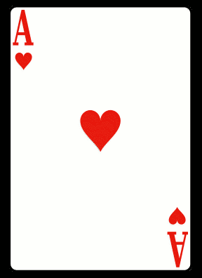
If you run the example you will see the three cards lined up next to each other. As a reminder this is because:
images are inline elements and so do not create a line break.
The browser lays out inline images top to bottom and left to right.
Now let’s use our positioning skills to create a stack. Modify the example above to add the following css rule:
img#b {
    position: relative;
    top: 20px;
    left: -100px;
}
Great, now we have made the second card appear to be on top of the first. Notice that although we have moved the second image, the position of the third image does not change. This is because space is still reserved for the second image in its middle position, we are manually moving it relative to where it would normally be in the flow. So a relative positioning works within the flow of the document. Add a rule for the third image to add it to the stack.
img#c {
    position: relative;
    top: 40px;
    left: -200px;
}
Coordinates
You have no doubt noticed that we are using top and left values to position our box. This box is positioned within the window where the coordinate 0,0 is in the top left corner. The X or first coordinate gets larger as you move to the right across the windo, and the second, or Y coordinate grows larger is you move down the screen. This takes a little adjustment as it is different from what you learned in math class.
Now, what about elements that come after relatively positioned elements? If you add a paragraph after the images do you expect the text to be covered up or flowed beneath all of the cards?
Another important thing to notice is that card 2 appears to be stacked on top of card 1, and card three appears to be stacked on top of cards 1 and 2. This is becuase elements that come later in the document naturally appear on top of elements that come before them.
If we want to change that and make it look like card 1 is on top of card 2 and card 2 is on top of card 3 we can use the css z-index property to position the elements. elements that have a larger z-index will appear to be on top of items with a lower z-index. By default, all elements have a z-idex of zero. So to change the order of the stack we will need to modify the rules for images b and c. Add a z-imaeg property to the img#b and img#c rules giving b a z-index of -1 and c a z-index of -2.
Advanced Topic: Transformation
CSS Provides the ability for us to really get fancy and transform any element by rotating or scaling. We can make our stack of cards look much more like a hand of cards by exploring the transform property. In fact the transform property is still so new that it goes by different names in different browsers. For Chrome, Safari you will want to use the -webkit-transform property while in Firefox you can use transform. If you are Explorer you will need to use -ms-transform. In fact to write your page to work anywhere you would specify all three!
4.5.5. Absolute
Absolutely positioned elements are absolute, but relative to their container! The official rule is that absolute items are positioned using the the upper left corner of the first non-static container as the origin. If there is no non-static container, then the html tag will be used and the origin will be the upper left corner of the page.
OK, what happened to the second card? How can you make a stack that looks like the stack from our relatively positioned element? What happens if you add an h1 in front of the main tag?
4.5.6. Full Page Layout
This looks pretty good. It almost matches the picture in the aside area. This is a pretty typical layout for a good quality page, and you can use this as a template for your own homepage. However it is missing the article area, and there is an ugly black band between the nav and the tops of the aside and section. See if you can do the following:
Remove the black band. Hint: A good way to find out why things look the way they do is to use the “Inspect Element” feature of your browser. If you right click on an area that interests you, you will be able to see all of the css rules including the default style rules that affect a particular element.
Add an article area as shown in the picture. Give it a purple background. As you try to to make this area match the picture think about the effects of the various things you may try.