Pivot Tables
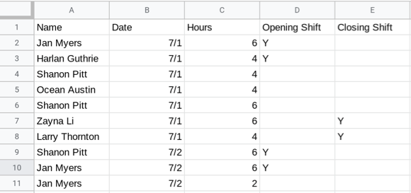
Tables that show the average or total for different groups are often very helpful. Suppose some coworkers at a local company aren’t sure if the hours for which they are each scheduled have been assigned fairly. A table showing each employee, the hours they had been assigned, and how often they opened or closed the business could be used to see if there were big differences in assignments, and decide if those assignments were fair.
A pivot table is a table that allows you to pull relevant summary statistics from a dataset. You could use AVERAGEIF, SUMIF and COUNTIF to make the table, but sheets has a built in tool to create a pivot table that automates this process without having to type out all the formulas.
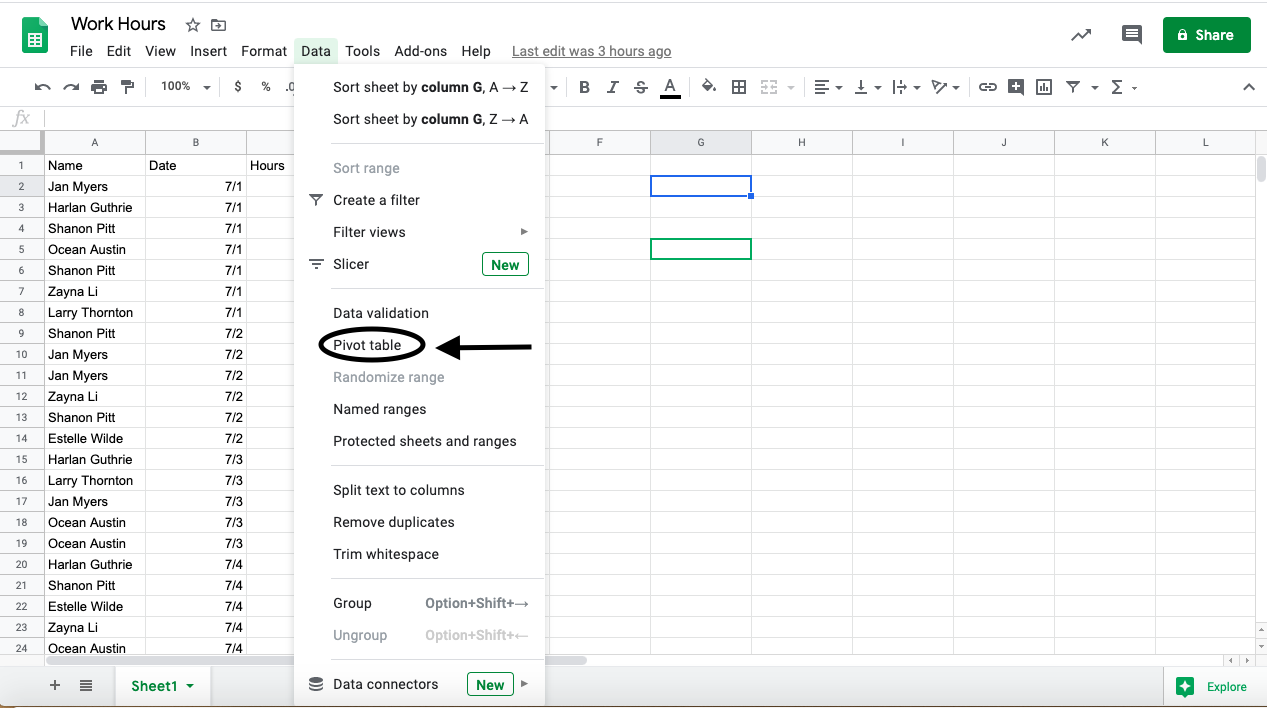
Start by selecting the data you’d like to use. Then navigate to the “Data” menu, and select “Pivot table”. You can place the new pivot table in a new sheet or an existing sheet.
The pivot table editor, which opens on the right, has sections for adding rows, columns, values, and filters.
Adding variables to rows or columns creates groupings based on that variable, displayed either as rows or columns of the pivot table. For example, when you select “Name” as a variable under rows, the pivot table will have one row for each of the employees at the company.
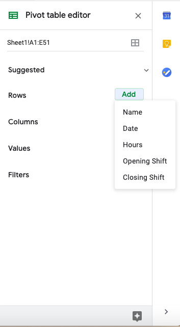
Adding a variable to values populates the cells of the table.
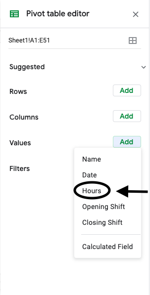
If you want the total number of hours each employee at the company was assigned, select the value “Hours” and summarize by sum. This will add the total number of hours each employee was assigned to the table.
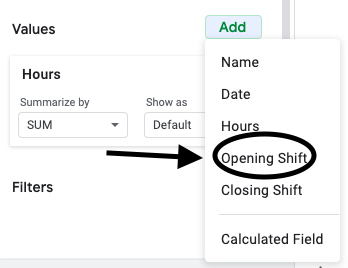
If you want the total number of opening shifts each employee at the company was assigned, select the value “Opening Shift” and summarize by count. This will add the number of opening shifts each employee was assigned to the table as an additional column.
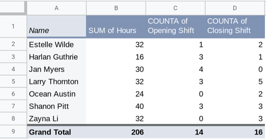
Repeating this process with “Closing Shift” will add a column showing the number of closing shifts for each employee.
Adding a variable to filters subsets the data before the pivot table is constructed. For example, a filter can be added on the “Date” variable for only the days July 4 - July 6.

The resulting pivot table would have the total hours, opening and closing shift for only those three days.
- Jan Myers
- Larry Thornton
- Harlan Guthrie
Q-1: Who was assigned the most opening shifts?
- Harlan Guthrie
- Jan Myers
- Zayna Li
Q-2: Who was assigned the smallest number of hours?
Q-3: What evidence from the table would support the employees’ claim that the assignments have not been assigned fairly?
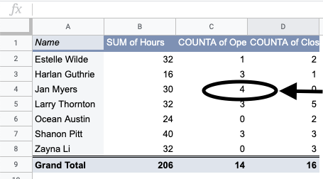
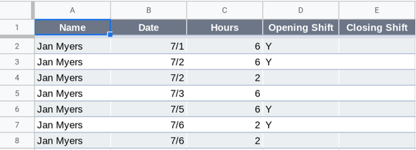
Within a pivot table, double clicking on any value in the table will create a new sheet with the subset of data from that entry in the table. For example, double clicking on the value 4 in cell C4 in the table above creates the sheet below. You can use this subset to look at Jan’s assignments, and ask or answer questions about Jan specifically. This is also a great way to investigate interesting values or patterns in a pivot table.
Example: National Center for Health Statistics
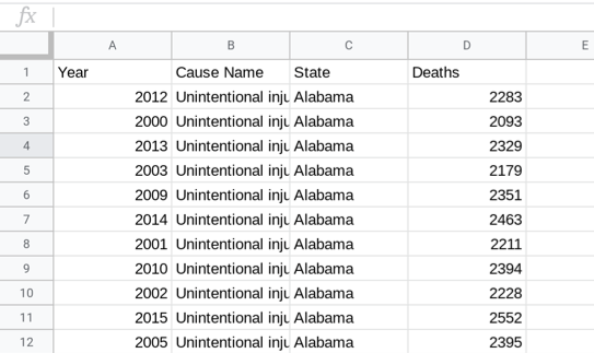
For this example, consider a non-profit organization that works to improve the life expectancy of Americans. You have access to data from The National Center for Health Statistics (NCHS), which is a branch of the Center for Disease Control, that provides statistical information about the health of American people. The dataset below presents the number of deaths for the ten leading causes of death in the USA for each state beginning in 1999.
You are working on a project for your nonprofit to try to find the leading causes of death in the USA, in order to target possible areas of improvement for healthcare and death prevention. This can be done given the NCHS dataset above.
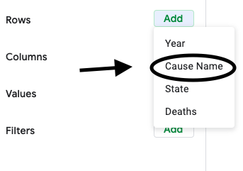
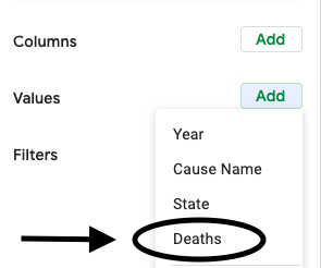
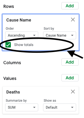
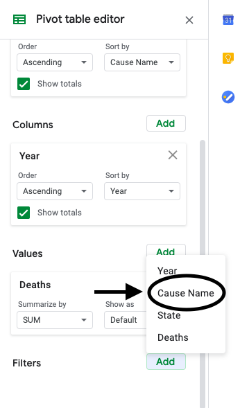
First, construct a pivot table with rows from the variable “Cause Name”.
Then add “Deaths” as a value to the pivot table.
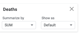
Summarize by SUM. (There are many options under summarize. Sum is the most useful for this context, but average, median, and count are also commonly used statistics in pivot tables.)
Make sure to have “Grand totals” enabled, so you can see the total number of deaths.
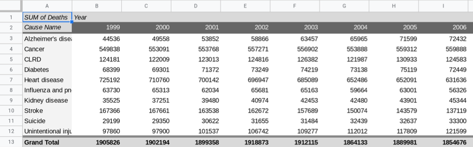
This is what the completed table should look like:
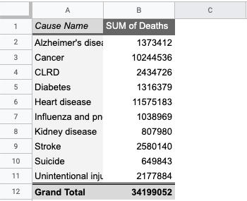
The cause of death responsible for the most deaths in the USA is heart disease. But what percentage of deaths is this? To calculate the percentage, you can add a column next to the pivot table that divides the deaths for each cause by the grand total.(This is an opportunity to use absolute references to make your life simpler.)

This shows that 33.8% (or over one third!) of deaths in the USA are due to heart disease. This is astonishingly high, and shows that efforts towards reducing heart disease or ameliorating symptoms due to heart disease is the highest priority for the nonprofit.
In order to present this information to your teammates, it might be easier to display this information as a chart, rather than a table. A bar chart, constructed from this pivot table, should make the information significantly easier to interpret, compared to the raw pivot table.
To do this, first select the first two coloumns with the relevant data and select “Insert > Chart”.
Then in the chart editor select the chart type to be “Column Chart”.
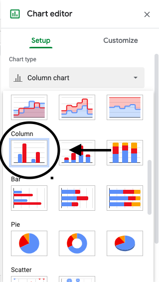
Make sure that the “X-Axis” is set to the cells with the disease names and the “Series” is set to the sum of deaths for each disease.

You should now have the chart below.
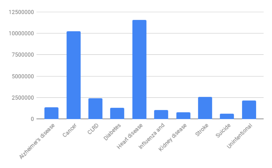
This chart makes it visually clear that heart disease and cancer are the highest causes of death by a substantial amount.
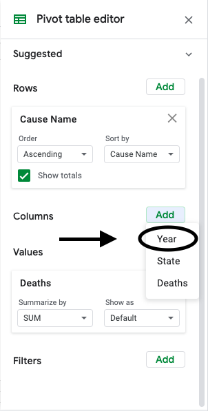
When you present this graph to your teammates, one of them asks how these percentages have changed over time. To look into this, add the variable “Year” as a column. (You’ll have to move or delete the percentage column, or construct a new pivot table.)
Now you should have the table below.
This table is too large to be interpretable. Visualizing this data in a chart is much more helpful. Select the range A2:S12 (the pivot table excluding the first and last rows) and then, under the “Insert” menu, select “Chart”.
Sheets automatically selects a line chart for this data, with “Year” along the horizontal axis and a line for each cause of death, showing how each has varied over time. Line charts display how one or more quantitative variables change ver time. To construct a line chart your dataset must have a time variable. (In this dataset, it is the “Year” column.)
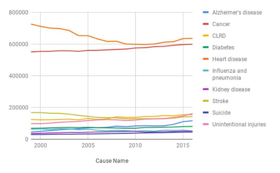
This graph is certainly more interpretable than the table, but it’s still difficult to distinguish the lines towards the bottom. Another issue is that there are several colors, many of which are hard to differentiate. Also, if a viewer were colorblind, this graph would be essentially unreadable. Before presenting this to your teammates, you need to address these issues. Consider reducing the number of causes displayed (perhaps to just the most “interesting” causes), and changing the colors used.
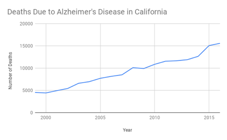
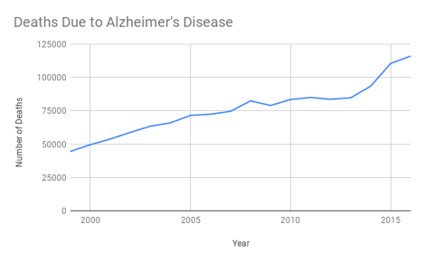
It’s difficult to see in the graph above, but deaths due to Alzheimer’s disease have been steadily increasing. This change is much easier to see if Alzheimer’s is the only cause of death displayed. Pivot tables allow for filtering, so you can restrict the table to Alzheimer’s related deaths only.
In the pivot table editor, the last option is “Filter”. Add a filter to “Cause Name”.
Then under the “Filter by values” option, select only “Alzheimer’s disease”. The pivot table and graph will automatically update and show only Alzheimer’s deaths.

While the raw number of deaths is significantly greater for heart disease and cancer, the growth of Alzheimer’s disease deaths is also very worrying to your nonprofit. Your manager asks you to investigate why the deaths are on the rise so dramatically, so you investigate that more in the next section.
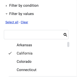
Filtering also works on other values. For example, you can add an additional filter to only use data from California. First, add a filter to “State”.
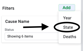
Then under the “Filter by values” option, select only “California”.
Below are two graphs for Alzheimer’s deaths: on the top just for California, on the bottom for the entire country.