
10.5. Visualizing Data
In this section, we will learn how to visualize our work so far.
You can get some inspiration from https://python-graph-gallery.com/.
How can we show top combinations of two things?
Visualize the flow from department to department or from aisle to aisle.
To accomplish this, you will have to dig into some new packages that we have not used so far. But this is all part of the process.
We need to create a square adjacency matrix: Aisle to Aisle. We’ll use this to build our chord diagram and other graph-like visualizations.
Merge the order_product data frame with the aisle data frame so we have the aisle number for each product. (We can drop the aisle name to save memory.)
Iterate over each order.
Order the order by add_to_cart_order.
Increase the count in from aisle (row) to aisle (column); this is a directed graph.
aisle_mat = pd.DataFrame(0, index=range(1, 135), columns=range(1, 135))
flowdf = op.merge(products, on='product_id').merge(adf, on='aisle_id')
%%time

tco = flowdf.groupby('order_id')

for order in tco.groups.keys():
    contents = tco.get_group(order).sort_values('add_to_cart_order')
    rowit = contents.iterrows()
    start_aisle = next(rowit)[1]['aisle_id']

    for ix, row in rowit:
        #print(start_aisle, row['aisle_id'])
        try:
            aisle_mat.loc[start_aisle][row['aisle_id']] += 1
        except:
            print("bad index", start_aisle, row['aisle_id'],
                  type(start_aisle), type(row['aisle_id']))
        start_aisle = row['aisle_id']
CPU times: user 3h 4min 26s, sys: 2min 7s, total: 3h 6min 34s
Wall time: 3h 11min 18s
aisle_mat.to_csv('aisle_mat.csv')

for ix, row in contents.iterrows():
    print(row['product_id'], row['aisle_id'])
x = contents.iterrows()
next(x)[1]['aisle_id']

for i, j in x:
    print(j['product_id'])

sbn.heatmap(aisle_mat)
<matplotlib.axes._subplots.AxesSubplot at 0x22a687e48>
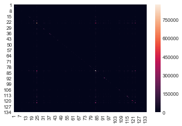
Looks like a lot of small values. Let’s make a histogram of the whole thing and see.
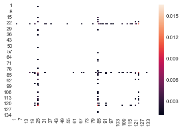
for i in range(1,135):
    aisle_mat.loc[i][i] = 0

x = aisle_mat.values.flatten()
sall = aisle_mat.values.sum()
y = aisle_mat.applymap(lambda x: x/sall)
z = y.applymap(lambda x: x if x > 0.001 else np.nan)

sbn.heatmap(z)
<matplotlib.axes._subplots.AxesSubplot at 0x386ea27f0>
aisle_mat = pd.read_csv('aisle_mat.csv',index_col='aid')
aisle_mat.head()
| 1 | 2 | 3 | 4 | 5 | 6 | 7 | 8 | 9 | 10 | ... | 125 | 126 | 127 | 128 | 129 | 130 | 131 | 132 | 133 | 134 | |
|---|---|---|---|---|---|---|---|---|---|---|---|---|---|---|---|---|---|---|---|---|---|
| aid | |||||||||||||||||||||
| 1 | 5151 | 177 | 621 | 362 | 83 | 74 | 56 | 152 | 336 | 8 | ... | 54 | 20 | 30 | 401 | 388 | 205 | 344 | 8 | 19 | 12 |
| 2 | 216 | 2692 | 464 | 387 | 168 | 62 | 152 | 88 | 882 | 20 | ... | 34 | 30 | 52 | 602 | 322 | 218 | 933 | 8 | 21 | 19 |
| 3 | 632 | 417 | 126287 | 1871 | 311 | 322 | 247 | 380 | 1455 | 47 | ... | 1152 | 128 | 299 | 1509 | 1849 | 2106 | 1800 | 48 | 158 | 33 |
| 4 | 356 | 405 | 1844 | 20762 | 717 | 192 | 186 | 165 | 2519 | 49 | ... | 255 | 122 | 268 | 1234 | 2176 | 1176 | 3130 | 32 | 110 | 27 |
| 5 | 90 | 169 | 266 | 681 | 2325 | 57 | 110 | 47 | 673 | 44 | ... | 31 | 42 | 104 | 639 | 539 | 245 | 744 | 5 | 27 | 8 |
5 rows × 134 columns
aisle_mat['total'] = aisle_mat.apply(lambda x : x.sum(), axis=1)
aisle_mat.sort_values('total', ascending=False, inplace=True)
aisle_mat.head()
| 1 | 2 | 3 | 4 | 5 | 6 | 7 | 8 | 9 | 10 | ... | 126 | 127 | 128 | 129 | 130 | 131 | 132 | 133 | 134 | total | |
|---|---|---|---|---|---|---|---|---|---|---|---|---|---|---|---|---|---|---|---|---|---|
| aid | |||||||||||||||||||||
| 24 | 6545 | 6616 | 33754 | 12545 | 3020 | 2600 | 2829 | 2646 | 13162 | 443 | ... | 709 | 1248 | 16043 | 13076 | 13474 | 16945 | 228 | 910 | 372 | 3324654 |
| 83 | 4473 | 8381 | 17158 | 11751 | 6362 | 2133 | 3818 | 1698 | 20901 | 615 | ... | 693 | 981 | 17890 | 12322 | 10233 | 25437 | 219 | 676 | 294 | 3143603 |
| 123 | 4134 | 4197 | 13228 | 6850 | 2397 | 1204 | 1747 | 1198 | 9405 | 292 | ... | 454 | 764 | 8630 | 7515 | 6414 | 11072 | 173 | 461 | 163 | 1600584 |
| 120 | 2354 | 2498 | 16219 | 5950 | 1080 | 1072 | 801 | 937 | 5231 | 99 | ... | 306 | 668 | 5669 | 5561 | 5921 | 6478 | 106 | 307 | 78 | 1354392 |
| 21 | 1760 | 6626 | 8445 | 6728 | 2257 | 640 | 1038 | 700 | 10388 | 268 | ... | 296 | 659 | 9307 | 6071 | 3891 | 10790 | 100 | 312 | 153 | 888985 |
5 rows × 135 columns
row_order = aisle_mat.index
row_order = row_order.tolist()
aisle_mat.index
Int64Index([ 24,  83, 123, 120,  21,  84, 115, 107,  91, 112,
            ...
            118, 134,  55, 109,  10,  44, 102,  82, 132, 113],
           dtype='int64', name='aid', length=134)
aisle_map = pd.merge(aisle_mat, adf, left_index=True, right_on='aisle_id')['aisle']
aisle_map.values.tolist()[:10]
['fresh fruits',
 'fresh vegetables',
 'packaged vegetables fruits',
 'yogurt',
 'packaged cheese',
 'milk',
 'water seltzer sparkling water',
 'chips pretzels',
 'soy lactosefree',
 'bread']
am = aisle_mat.values.tolist()[:20][:20]
for i in range(len(am)):
    am[i][i] = 0.0

pickle.dump(am,file=open('am.pkl', 'wb'))

depts = pd.read_csv('ecomm/departments.csv')
depts
| department_id | department | |
|---|---|---|
| 0 | 1 | frozen |
| 1 | 2 | other |
| 2 | 3 | bakery |
| 3 | 4 | produce |
| 4 | 5 | alcohol |
| 5 | 6 | international |
| 6 | 7 | beverages |
| 7 | 8 | pets |
| 8 | 9 | dry goods pasta |
| 9 | 10 | bulk |
| 10 | 11 | personal care |
| 11 | 12 | meat seafood |
| 12 | 13 | pantry |
| 13 | 14 | breakfast |
| 14 | 15 | canned goods |
| 15 | 16 | dairy eggs |
| 16 | 17 | household |
| 17 | 18 | babies |
| 18 | 19 | snacks |
| 19 | 20 | deli |
| 20 | 21 | missing |
Lesson Feedback
-
During this lesson I was primarily in my...
- 1. Comfort Zone
- 2. Learning Zone
- 3. Panic Zone
-
Completing this lesson took...
- 1. Very little time
- 2. A reasonable amount of time
- 3. More time than is reasonable
-
Based on my own interests and needs, the things taught in this lesson...
- 1. Don't seem worth learning
- 2. May be worth learning
- 3. Are definitely worth learning
-
For me to master the things taught in this lesson feels...
- 1. Definitely within reach
- 2. Within reach if I try my hardest
- 3. Out of reach no matter how hard I try