
Interpreting Slope
Now that you have reviewed linear equations, this section outlines how that relates to data analysis. As mentioned in the previous section, the slope gives the steepness of a line, but what does this mean?
You can start to answer this question by first understanding what slope is. The slope of a straight line tells you how much the y value changes when the x value is increased by 1. This is also written as the ratio
You’ve already learned about the correlation coefficient, r, which tells you how strong the relationship between two variables is. Slope tells you something different. The slope tells you the magnitude of that relationship. In other words, the correlation helps you answer the question “If variable A changes, how confident are you that variable B will change?”, while the slope helps you answer the question “If variable A changes, by how much will variable B change?”. Analyzing slope becomes useful in scatter plots when looking at the line of best fit.
You can practice this through an example. Below is a scatter plot with median SAT Math score as the explanatory variable, and median earnings after graduation as the explained variable. A line of best fit has already been added to the graph. You can follow along with this example by using the SAT data spreadsheet which contains data from College Scorecard.
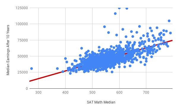
Notice that the data exhibits a general upward trend: in general, schools with higher median SAT Math scores are more likely to graduate students who earn a higher median income after 10 years. This is confirmed by the line of best fit, which has a positive slope. To be more precise, the equation of the line of best fit is \(y = 118.95 x - 20347.55\). Or, to use the names of the x and y variables:
The number multiplied by the x-variable is the slope, in this case 118.95. The constant at the end is the y-intercept, in this case -20347.55. Further breaking down slope gives you the following:
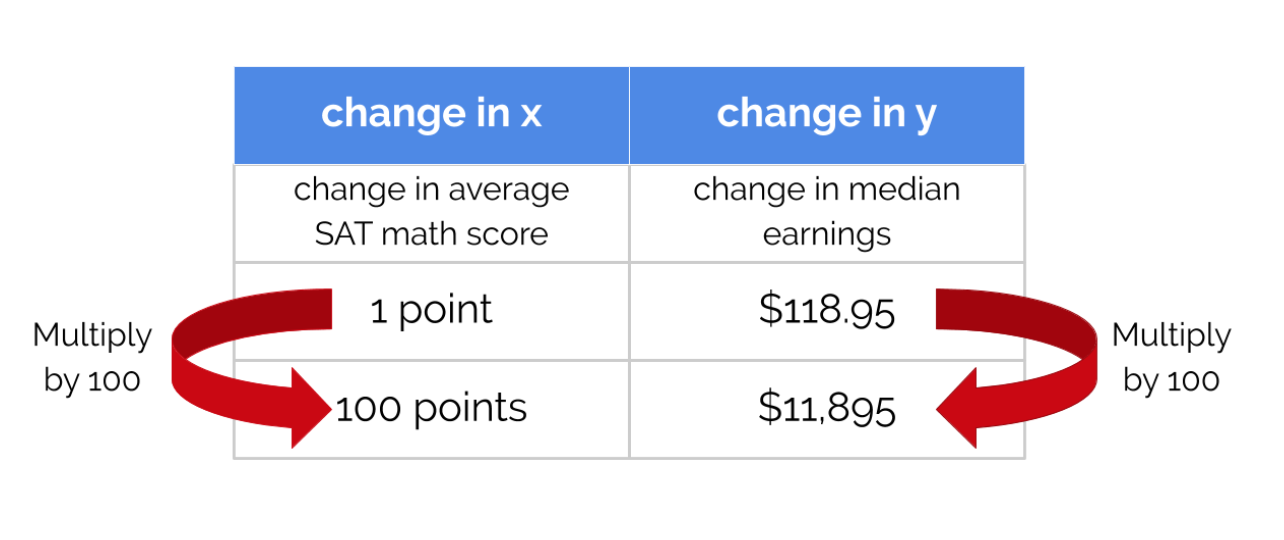
These values quantify how differences in one variable result in differences in the predicted values of other variables. From the equation above, because the slope is 118.95, when the median SAT math score increases by 1, the median earnings increases by 118.95. In other words, for each point increase in median SAT math score, the median earnings increase by $118.95. You can use this information when working through the following example about two different colleges.
Suppose two schools are pretty similar in most regards, except that College X has an average SAT math score that is 100 points higher than University Y. Knowing the slope of the line of best fit in this case is useful to predict how SAT score impacts other variables. Visually, this relationship looks like the following:
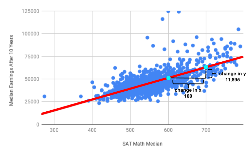
You can incorporate this change into the equation for slope:
In words, this means that every 100 point increase in median SAT math score corresponds with a predicted median earnings increase of $11,895. Another way to think about this is that if the change in median earnings is $118.95 for a 1 point increase in the median SAT Math score, and the trend is linear, the change in median earnings is \(100 \times $118.95\) (or $11,895) for a 100 point increase in the median SAT Math score. You can see this depicted in the following chart:
If College X had median SAT Math scores 100 points higher than University Y, their graduates will make on average $11,895 more per year, after 10 years.
Example: SAT Scores and Loans
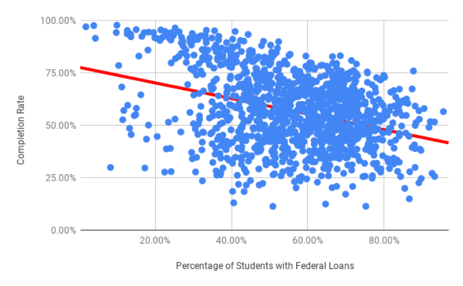
This dataset has many other variables, and many other relationships to examine. For example, does the percentage of students with federal loans at a college impact its completion rate? Suppose your friend has been accepted to College A and College B, and is very determined to graduate within four years. However, she has to take some student loans, and is trying to decide where to go. You don’t know much about either school, but College A has 10% more students with federal loans than College B. This scatter plot shows the percentage of students receiving federal loans as the explanatory variable, and completion rate as the explained variable.
School A
-
Correct: Because the direction of the scatter plot is negative, the school with the higher percentage of students with federal loans will have a lower completion rate. So College A will have a lower percentage of students graduating within 6 years.
School B
-
Incorrect: Try again! Because the direction of the scatter plot is negative, the school with the higher percentage of students with federal loans will have a lower completion rate. So, College A will have a lower percentage of students graduating within 6 years.
Q-1: Using the scatter plot above, which school will have a lower completion rate? (Specifically, which school will have fewer students graduating within 6 years?)
The slope of the line of best fit this time is negative. The slope of this line is negative because the line moves down from left to right, just like the scatter plot which has a negative direction. This means that in general, the higher the federal loans taken out to go to a college, the lower the completion rate.
The equation of the line of best fit is:
You can interpret the slope as you have done before by breaking it into the change in y over the change in x.
Therefore for every 1% increase in the percentage of students with federal loans, the predicted completion rate drops by 0.37%. College A and B have a difference of 10% in their federal loans percentage. To determine how much that impacts the predicted completion rate, you can multiply the slope by 10.
Another way to think about this is that any change to x has to change y proportionally. Therefore, if the change in x is multiplied by 10, the change in y must also be multiplied by 10.
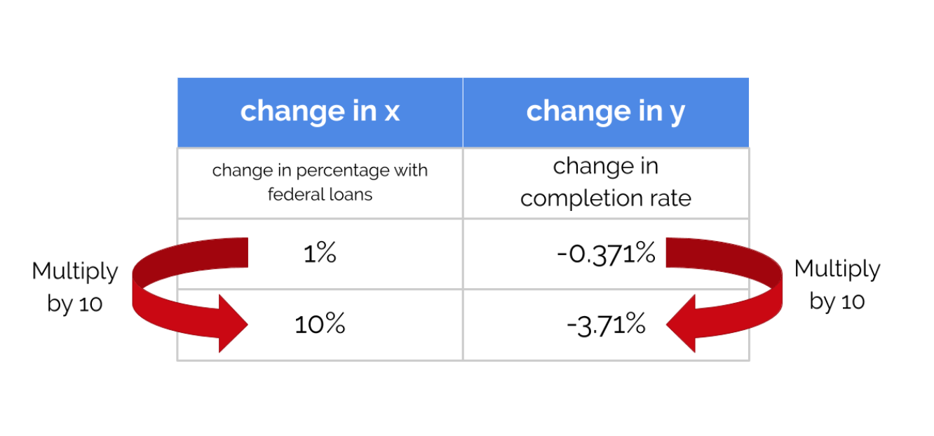
So College A and College B should differ in their completion rate by 3.71%. The negative value indicates that as the x value increases by 10%, the y value decreases by 3.71%.
However, that doesn’t mean that students who have federal loans graduate less often than students who don’t! One issue is that this dataset is about schools, not students. There are also many other factors at play. For example, a school’s financial resources is certainly a lurking variable. Schools where students don’t need federal loans often have large endowments and give loans or scholarships directly to their students. These same schools may also have other resources that contribute to increased graduation rates.
For every dollar that median debt increases by, average net tuition increases by .209 dollars.
-
Incorrect
For every dollar that average net tuition increases by, median debt increases by 20.9%.
-
Correct
For every dollar that median debt increases by, average net tuition increases by 20.9%.
-
Incorrect
For every dollar that average net tuition increases by, median debt increases by .209 dollars.
-
Correct
Q-2: Which of the following is the correct interpretation of the slope of the line of best fit?
\((Predicted Median Debt of Graduates) = 0.209 \times (Average Net Tuition) + 19043\)